After two first blogs (here and here) on how to launch Stata in a Jupyter Notebook. In the following file, you will see that Stata can be helpful to visualize high-frequency data. When you have high-frequency data, you cannot use Excel to visualize the data due to the high number of observations. In the following, we will see that importing high-frequency data into a Jupyter Notebook using Stata allows you to visualize the data without the line limit of Excel. You can click on the following link to access to the content:
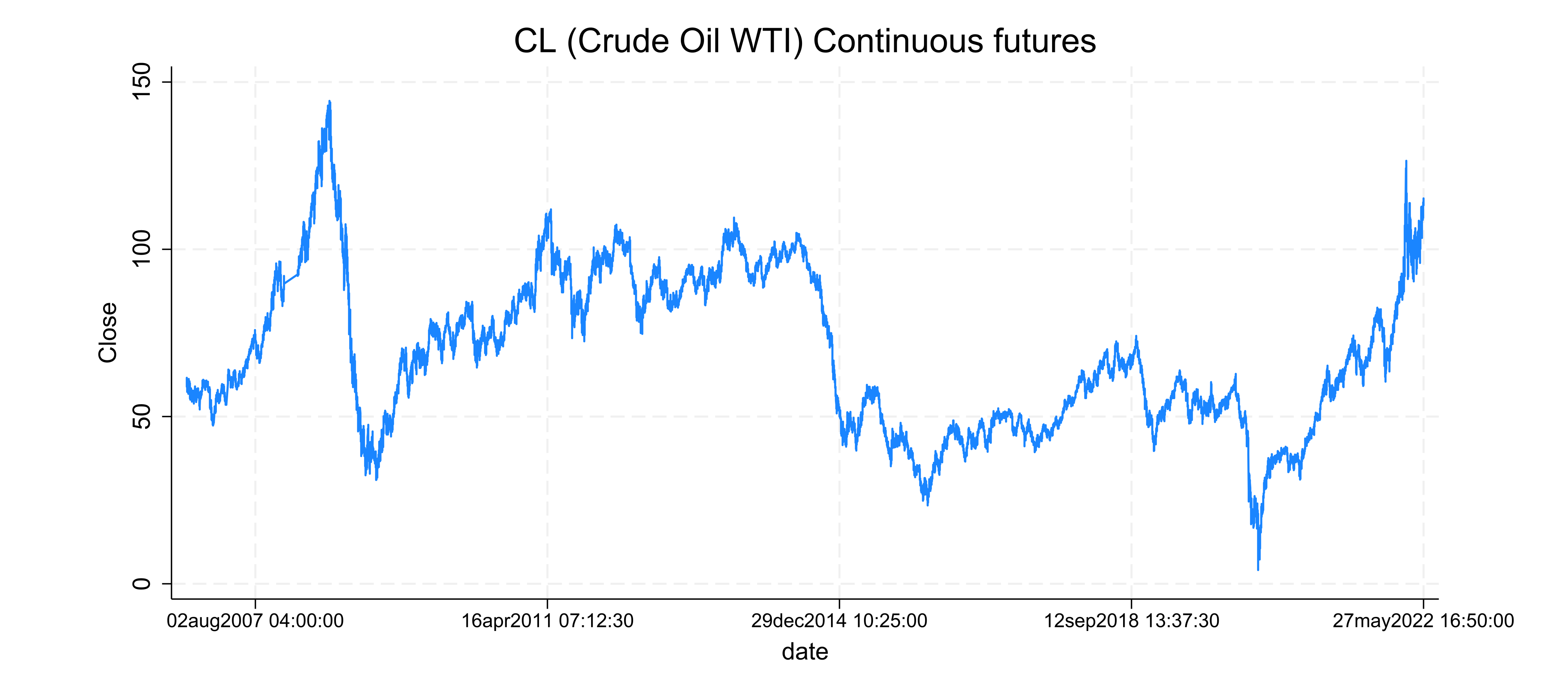
You will see that in a few steps that visualizing high-frequency data becomes more simple than in Excel.
Reference
- Riley, A. Stata 17 released. The Stata Blog: Not Elsewhere Classified. https://blog.stata.com/2021/04/20/stata-17-released/
2 Comments
[…] Visualizing high-frequency data using a Jupyter Notebook and Stata 18 […]
[…] first blogs on how to launch Stata and visualize high-frequency data in a Jupyter Notebook. In the following example, you will first see that Mathematica offers a very […]