Using maps can be a good way to visualize the spatial dispersion of the data. I made a series of blogs on drawing maps on Stata available in the following links:
Besides, I also made a series of blogs on how to use dbnomics package to download data directly from the DBnomics website and merge data coming from different providers using the kountry package:
Today, I will show you how to draw a map with Stata in a few simple steps.
(Step A) First, we will use the dbnomics package to retrieve the data of general government gross debt in percent of GDP coming from the last edition of the IMF’s WEO:
dbnomics import, pr(IMF) d(WEO:2023-10) ///
sdmx(.GGXWDG_NGDP.pcent_gdp) clear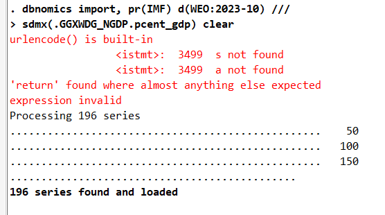
I make some cleaning described in my previous blogs:
destring value, force replace

rename value debt

order period weo_country debt

split series_name, parse(–)

rename series_name1 country

keep period weo_country debt country

kountry weo_country, from(iso3c) to(cown)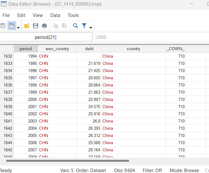
(Step B) I need to rename the COW code to merge it with the id file.dta. Besides, I compute the average debt:
rename _COWN_ COWcode

drop if COWcode==.

xtset COWcode period

isid COWcode period

bysort COWcode period: assert _N == 1

drop if period<2015

by COWcode: egen mean_debt=mean(debt)

keep if period==2022

merge 1:m COWcode using "idfile.dta", nogenerate

format mean_debt %12.2f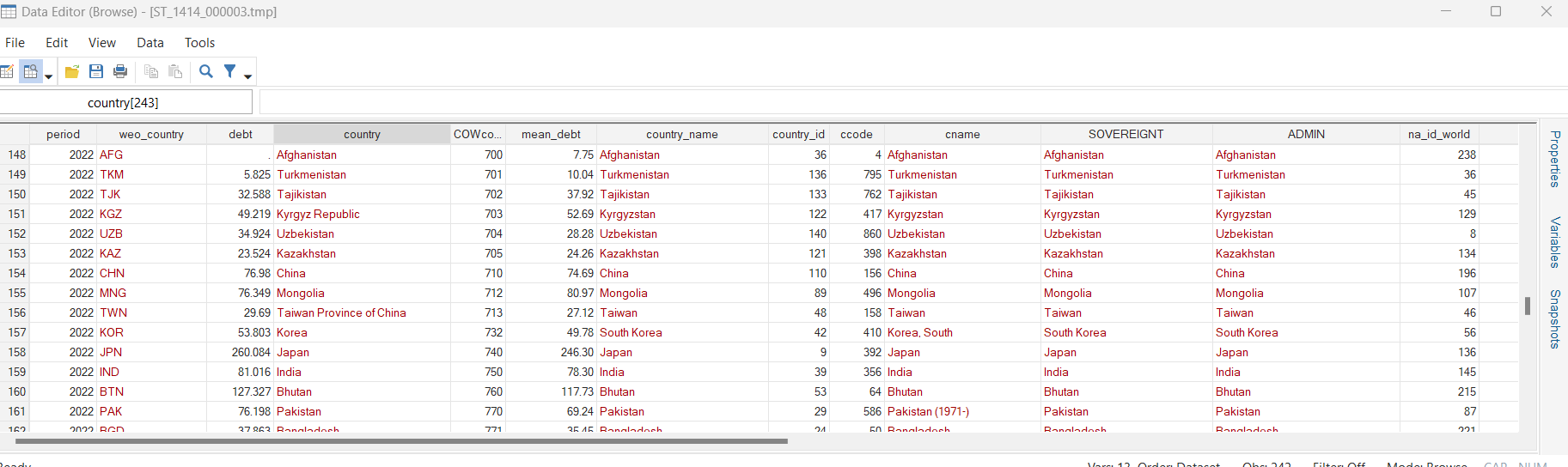
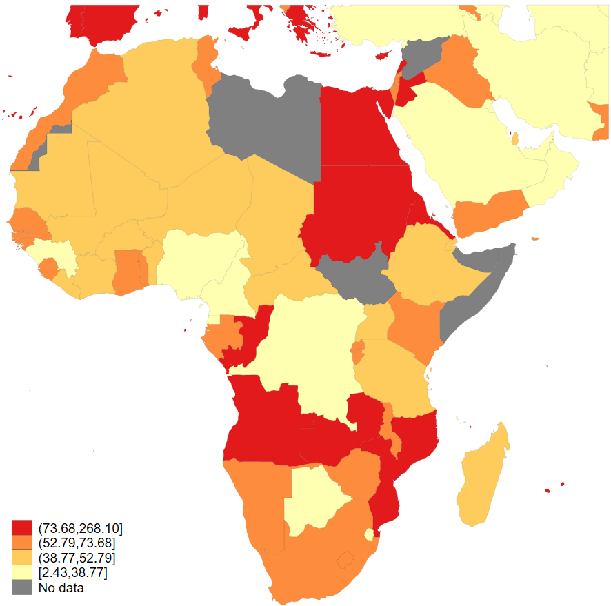
(Step C) Draw the map with the spmap package and the file for the coordinates: coord_mercator_afr.dta, export it to PNG and PDF format, and save the data in the file map.dta:
spmap mean_debt using "coord_mercator_afr.dta", id(na_id_world) fcolor(YlOrRd) ///
osize(vvthin vvthin vvthin vvthin) ndsize(vvthin) ndfcolor(gray)

///
// title("Average central government debt as a percentage of GDP in Africa (2015-2023)", size(small)) // clmethod(custom) clbreaks(0 100 150 200 250 300)

graph rename Graph map_Africa, replace

graph export map_Africa.png, as(png) width(4000) replace
graph export map_Africa.pdf, as(pdf) replace

save map, replace
The result:
Special thanks to Anders Sundell: https://www.stathelp.se/en/spmap_world_en.html.
As we have seen in this blog, it is possible to draw a map in Stata in three simple steps. The files for replicating the results in this blog are available on my GitHub.
2 Comments
[…] Drawing Maps with Stata… Again! Drawing Maps with Stata for Africa […]
[…] Drawing Maps with Stata for Africa […]