After first blogs on how to launch Stata and visualize high-frequency data in a Jupyter Notebook. In the following example, you will first see that Mathematica offers a very simple syntax for visualizing interactions terms. In a second step, you will see that you can launch Python within Mathematica to produce the same figure.
Suppose that your empirical estimate gives the following result:
y = (-0.1610) x + (-2.0514) z + 0.0449 (x*z)
It might be a little tricky to interpret and to find the turning points for this nonlinear equation, especially when one of the explanatory variables can take negative values.
In Mathematica, enter the following commands to produce the figure (the “;” allows hiding the output for a particular line):
y = (-0.1610) x + (-2.0514) z + 0.0449 (x*z);
m = Plot3D[y, {x, 44, 48}, {z, 2, -5}, ColorFunction -> "Rainbow",
  AxesLabel -> {"Reserves", "FX Inter.", "dFX"},
  FormatType -> StandardForm, PlotLegends -> Automatic, Mesh -> 3,
  ImageSize -> Large, BoxRatios -> {1, 1, 0.5}]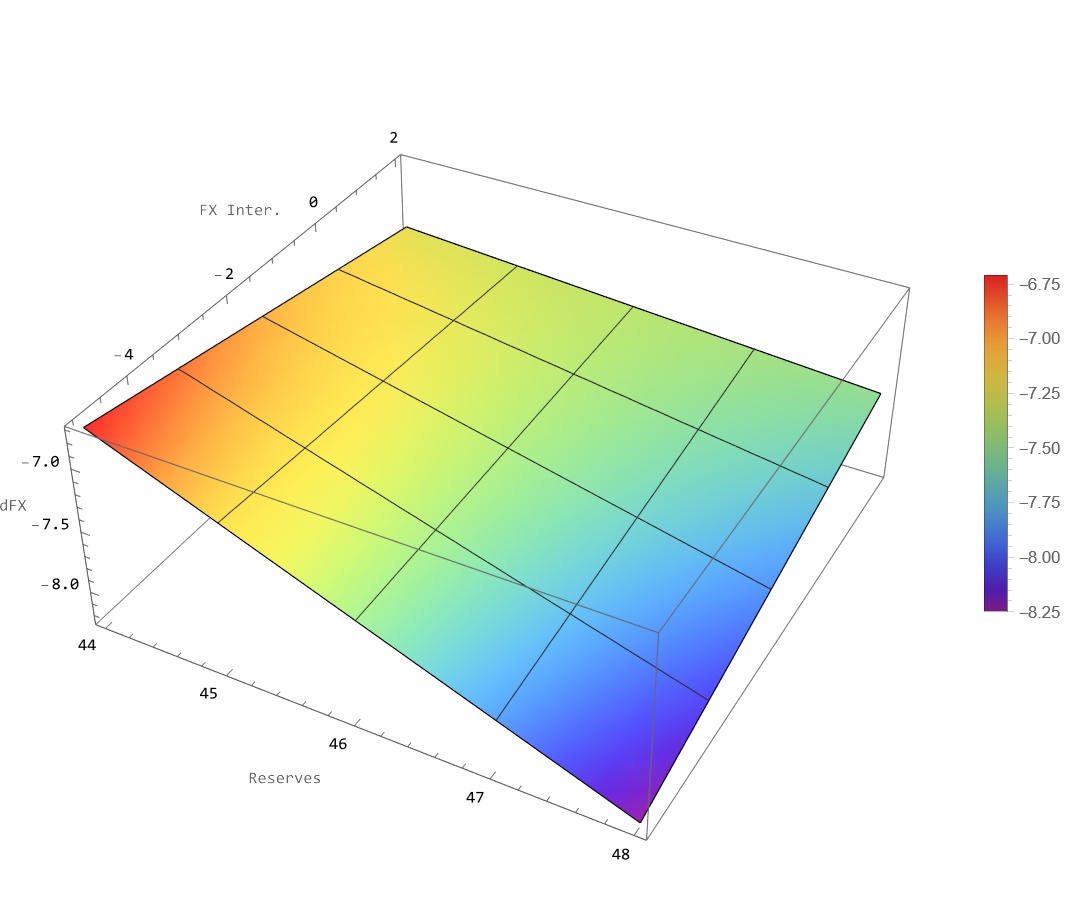
Before saving the figure in PNG format (I recommend PNG format with a large ‘ImageSize’), you can find your working directory with the following commands:
NotebookDirectory[];
Export[NotebookDirectory[] <> "3Dplot.png", m, ImageSize -> 1600]
Now, you need to find the folder where Python is installed in your computer:
FindExternalEvaluators["Python"]On my computer, I have multiple installations, so I choose the one in the Anaconda folder:
RegisterExternalEvaluator["Python", "C:\\ProgramData\\anaconda3\\python.exe"]Then, I launch an External Session of Python from my Mathematica notebook:
session = StartExternalSession["Python"]Choose an “External Language” cell in the toolbar and then enter the following Python code:
import numpy as np
import matplotlib.pyplot as plt

# Define the range for x and z
x_vals = np.linspace(44, 48, 100)
z_vals = np.linspace(-5, 2, 100)

x, z = np.meshgrid(x_vals, z_vals)
y = (-0.1610 * x) + (-2.0514 * z) + 0.0449 * (x * z)

fig = plt.figure(figsize=(10, 7))
ax = fig.add_subplot(111, projection='3d')

# Use colormap as "rainbow" and add labels to the axes
surf = ax.plot_surface(x, z, y, cmap='rainbow', edgecolor='none')

# Adjust box ratio
ax.set_box_aspect([1, 1, 0.5])  # Adjust the box ratio here

# Add a smaller color bar
colorbar = fig.colorbar(surf, ax=ax, pad=0.1, shrink=0.5, aspect=20)  # Adjust the shrink value

# Add labels
ax.set_xlabel("Reserves")
ax.set_zlabel("dFX")
ax.set_ylabel("FX Inter.")

# adjust the view angle

ax.view_init(elev=20, azim=-42)

# Apply tight layout
plt.tight_layout()

# Specify the folder path to save the plot
save_folder = 'C:\\Users\\jamel\\Dropbox\\Documents\\Wolfram Mathematica\\Webinars\\WolframLanguageForPythonUsers\\WolframLanguageForPythonUsers\\'

# Save the plot as a PNG image in the specified folder
plt.savefig(save_folder + '3d_surface_plot.png', dpi=300)  # Specify the file name and DPI

# Display the plot
plt.show()
Finally, I produced a similar picture as with the Mathematica notebook:
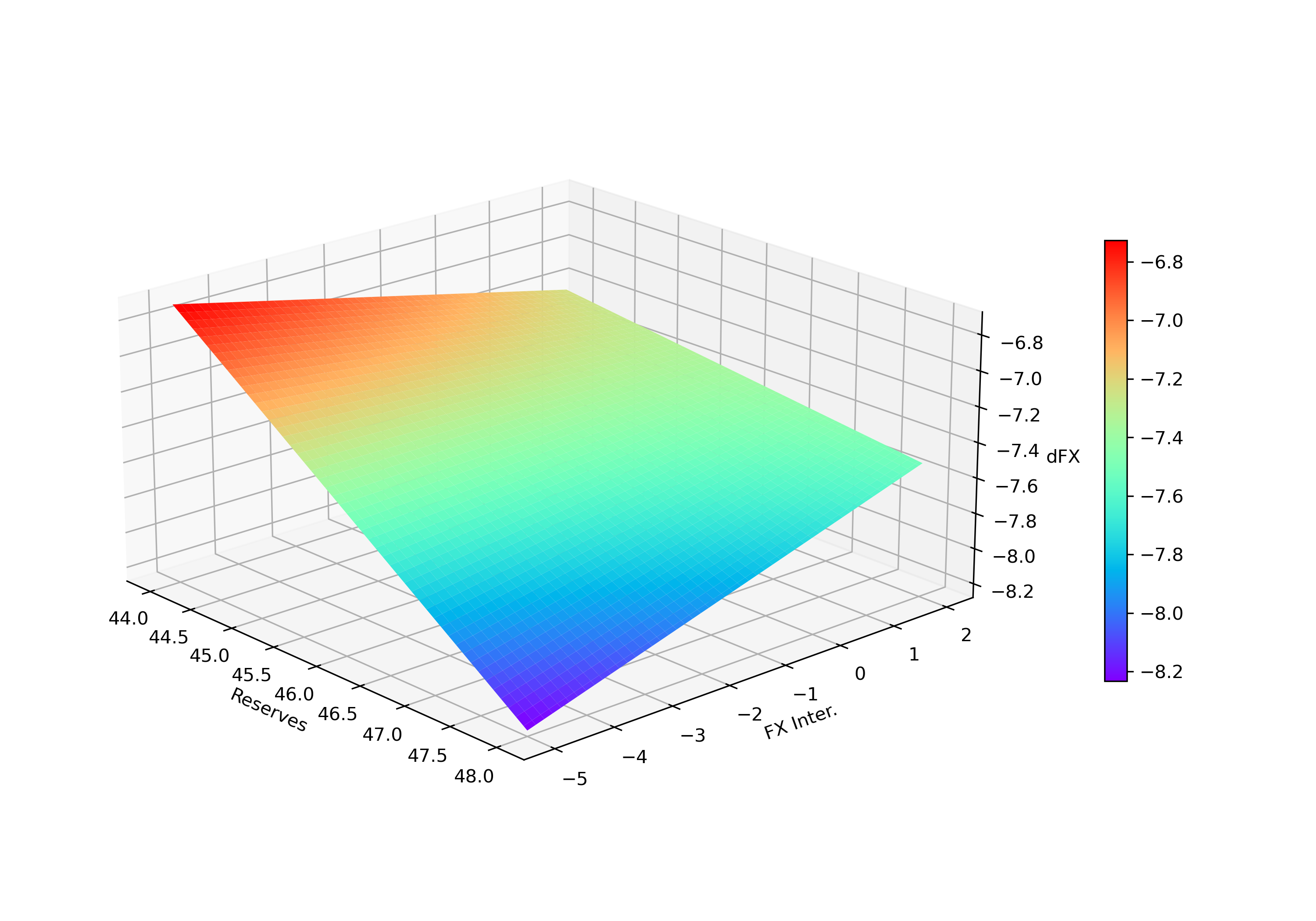
You have seen in a few steps that visualizing an interaction is accessible using Mathematica and Python. Besides, it could help you to understand the implications of your nonlinear model.
Exchange rate interventions are more powerful for large holders of International Reserves (above around 46% of Reserves-to-GDP ratio).
More information about the variables used in this example: https://www.nber.org/papers/w30935.
Reference
- Wolfram U. Wolfram Language for Python Users, https://www.wolfram.com/wolfram-u/courses/programming-applications/wolfram-language-for-python-users-dev925/
- Rashad Ahmed, Joshua Aizenman, Jamel Saadaoui, Gazi Salah Uddin (July 2023), On the Effectiveness of Foreign Exchange Reserves During the 2021-22 U.S. Monetary Tightening Cycle. NBER Working Paper Series, 30935, https://www.nber.org/papers/w30935.
1 Comment
[…] of blog on how to use different languages in a unique environment. We already saw that we can use Python from Mathematica. Now, I will show how to use the Wolfram Language in a Jupyter Notebook, in a few very simple […]