Today, I will build on my previous blog to show you how to merge two macroeconomic series, draw maps and think about some correlations in three simple steps:
(Step A) We use the data of this aforementioned blog and convert the COW codes (https://correlatesofwar.org/) into IFS codes (https://www.imf.org/):
**#***** Convert COW into IFS **********************************

clear
cls

capture log close _all
log using map_again, name(map_again) text replace

use data\map.dta, clear

*drop if country==""

sort COWcode

kountry COWcode, from(cown) to(imfn)

rename _IMFN_ IFScode
order IFScode COWcode, first

save data\maps_again.dta, replace
(Step B) I use the financial openness index built by Menzie Chinn and Hiro Ito (https://web.pdx.edu/~ito/Chinn-Ito_website.htm) to generate average financial openness for the period 2011-2021:
**#****** Generate Average Financial openness ******************

use data\kaopen_2021.dta, clear

rename cn IFScode

keep if year>=2011

by IFScode: egen mean_ka_open=mean(ka_open)

keep if year==2021

save data\kaopen_again.dta, replace
(Step C) I merge the databases and draw maps for the central government debt and financial openness:
**#****** Merge and draw the Maps ******************************
use data\maps_again.dta, clear
duplicates list IFScode
*drop if IFScode==.
drop ccode
merge m:1 IFScode using data\kaopen_again.dta, nogenerate
format mean_ka_open %12.2f
spmap mean_ka_open using data\coord_mercator_world.dta, ///
id(na_id_world) fcolor(Blues2) ///
osize(vvthin vvthin vvthin vvthin) ndsize(vvthin) ///
ndfcolor(gray) clmethod(custom) ///
clbreaks(0 0.17 0.5 0.97 1) ///
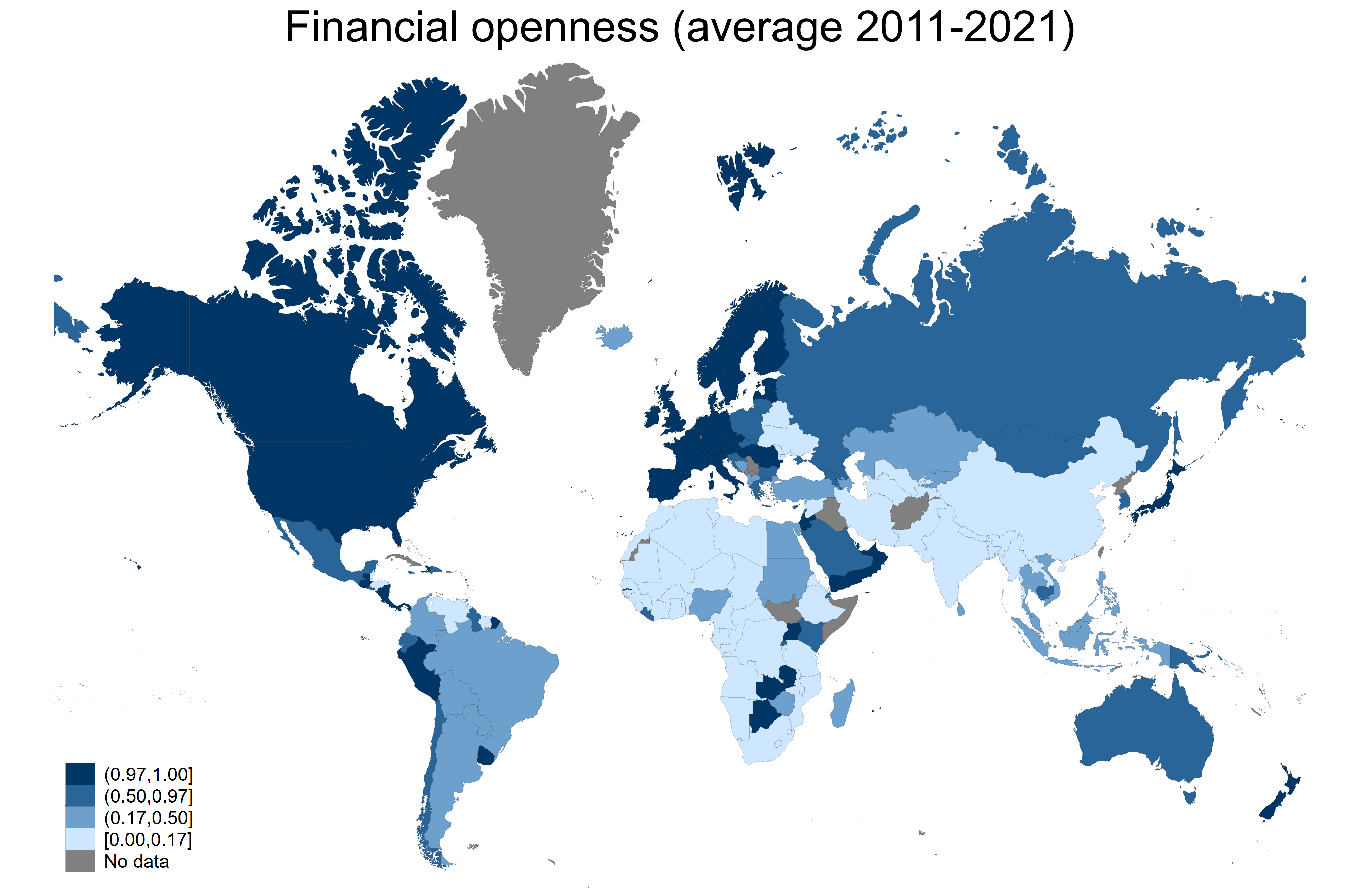
title("Financial openness (average 2011-2021)")
graph rename Graph map_ka_open, replace
graph export figures\map_ka_open.png, as(png) width(4000) replace
graph export figures\map_ka_open.pdf, as(pdf) replace
format mean_debt %12.0f
spmap mean_debt using data\coord_mercator_world.dta, ///
id(na_id_world) fcolor(YlOrRd) ///
osize(vvthin vvthin vvthin vvthin) ///
ndsize(vvthin) ndfcolor(gray) clmethod(custom) ///
clbreaks(0 38 52 97 300) ///
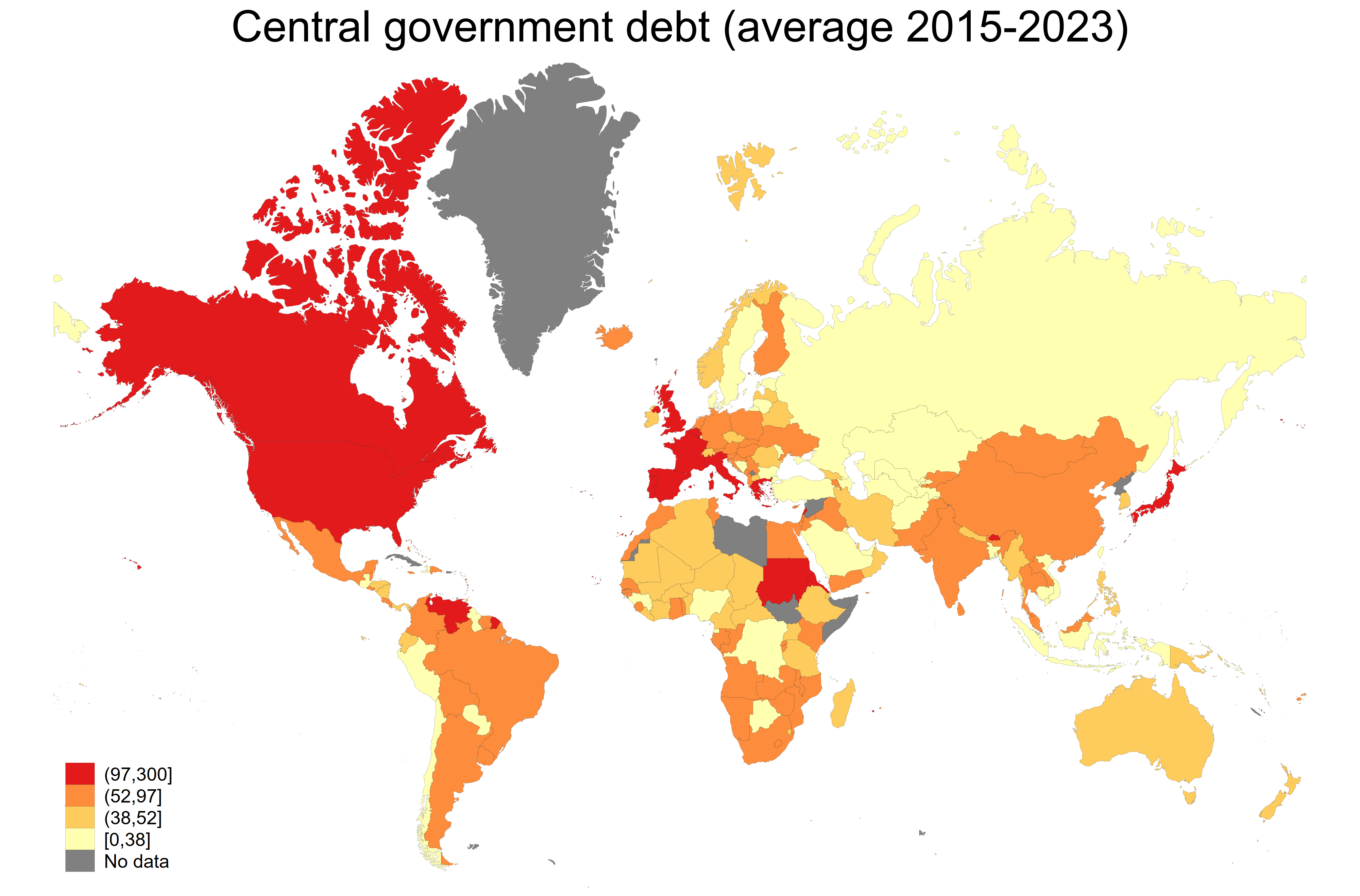
title("Central government debt (average 2015-2023)")
graph rename Graph map_debt, replace
graph export figures\map_debt.png, as(png) width(4000) replace
graph export figures\map_debt.pdf, as(pdf) replace
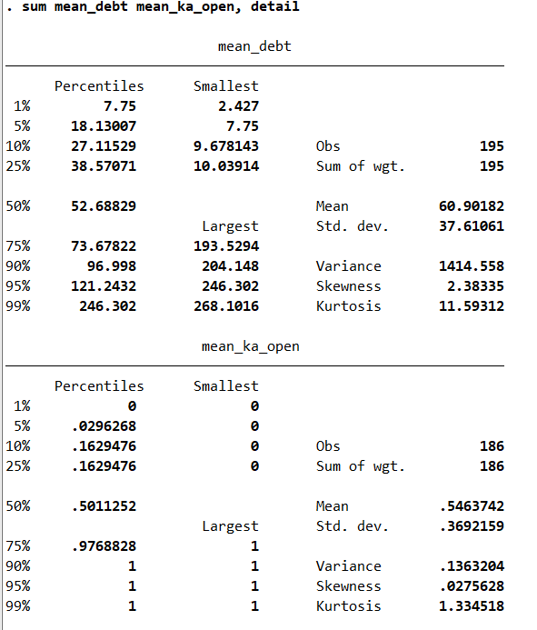
sum mean_debt mean_ka_open, detail
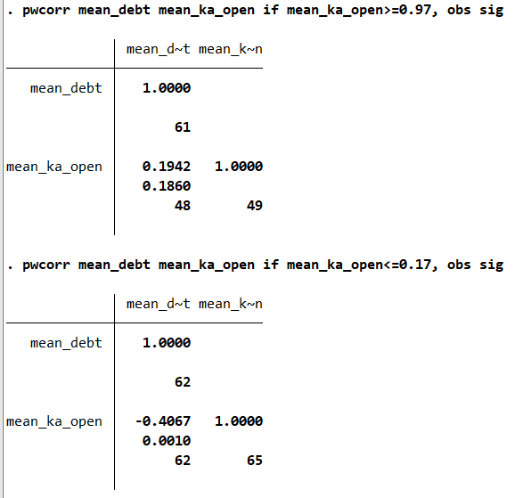
pwcorr mean_debt mean_ka_open if mean_ka_open>=0.97, obs sig
pwcorr mean_debt mean_ka_open if mean_ka_open<=0.17, obs sig
// Save the data
save data\map_again_final.dta, replace
log close map_again
exit
****************************************************************We can see that a few countries have a central government debt above 97% of GDP:
Besides, numerous developing countries remain closed or semi-closed to capital flows:
We can start to think about some cross-country correlations between average financial openness and central government debt:
It seems that for lower levels of financial openness (below the first quartile), we have a negative correlation between debt and financial openness. Something that I did not observe in for higher levels of financial openness (above the third quartile):
As we have seen in this blog, it is possible to draw maps in Stata in three simple steps. These maps could help you to think about some cross-country correlations. The files for replicating the results in this blog are available on my GitHub.
1 Comment
[…] Drawing Maps with Stata… Again! Drawing Maps with Stata for Africa […]