Today, I will build on my previous blogs to show you how to draw a map of United Nations General Assembly Voting Data with Stata (see here for a full description of the data and the article introducing the methodology for computing ideal points is available here):
(Step A) I will put the following files ne_10m_admin_0_countries.dbf, ne_10m_admin_0_countries.shp into the data folder; then I will produce the COW codes from the ne_10m_admin_0_countries.dta using the kountry package:
**# *** Maps of Ideal Points ************************

cd C:\Users\jamel\Documents\GitHub\EconMacroBlog\
cd Maps_Political_Ties\

spshape2dta data\ne_10m_admin_0_countries, replace

use ne_10m_admin_0_countries.dta, replace

**#******** Generate country codes *****************************

kountry ADM0_A3, from(iso3c) to(cown)

rename _COWN_ COWcode
order COWcode ADM0_A3, first

save data\maps.dta, replace
(Step B) I generated the file for the ideal points. Note that already prepared this file in the data folder to merge it with vote data:
**#****** Generate UNvotes for Session 77 **********************

use data\IdealpointestimatesAll_Jul2023_merged.dta, clear

drop if COWcode==.

drop if session!=77

sort COWcode period_

collapse (mean) idealpointall, by(COWcode IFScode country session)

save data\Idealpoint77.dta, replace
(Step C) I merge the data with the file that contains the coordinates and draw the maps:
**#****** Merge and draw the Maps ******************************
merge 1:m COWcode using data\maps.dta, nogenerate
format idealpointall %12.2f
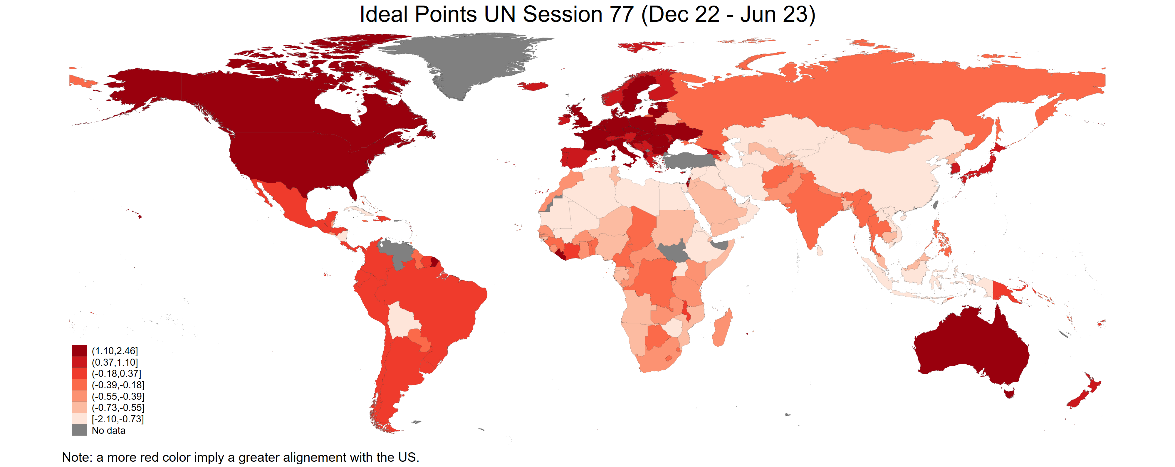
// World
spmap idealpointall using ne_10m_admin_0_countries_shp.dta ///
if ADMIN!="Antarctica", id(_ID) ///
fcolor(Reds) osize(vvthin vvthin vvthin vvthin vvthin ///
vvthin vvthin) ///
ndsize(vvthin) ///
ndfcolor(gray) clnumber(7) ///
title("Ideal Points UN Session 77 (Dec 22 - Jun 23)")
graph rename Graph map_ideal_points_world, replace
graph export figures\map_ideal_points_world.png, as(png) ///
width(4000) replace
graph export figures\map_ideal_points_world.pdf, as(pdf) ///
replace
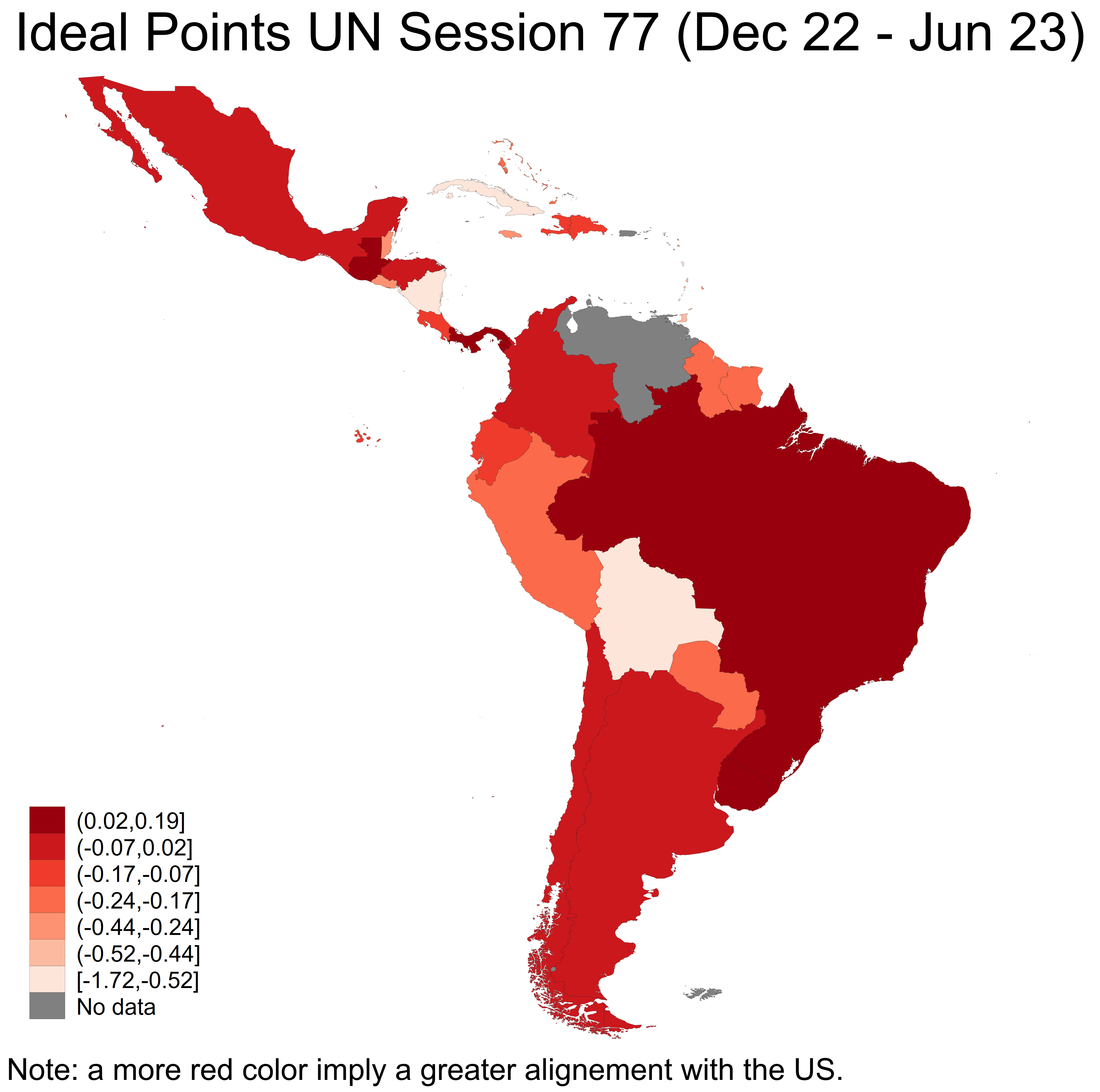
// Latin America & Caribbean
spmap idealpointall using ne_10m_admin_0_countries_shp.dta ///
if REGION_WB=="Latin America & Caribbean", id(_ID) ///
fcolor(Reds) osize(vvthin vvthin vvthin vvthin vvthin ///
vvthin vvthin) ///
ndsize(vvthin) ///
ndfcolor(gray) clnumber(7) ///
title("Ideal Points UN Session 77 (Dec 22 - Jun 23)")
graph rename Graph map_ideal_points_latam, replace
graph export figures\map_ideal_points_latam.png, as(png) ///
width(4000) replace
graph export figures\map_ideal_points_latam.pdf, as(pdf) ///
replace
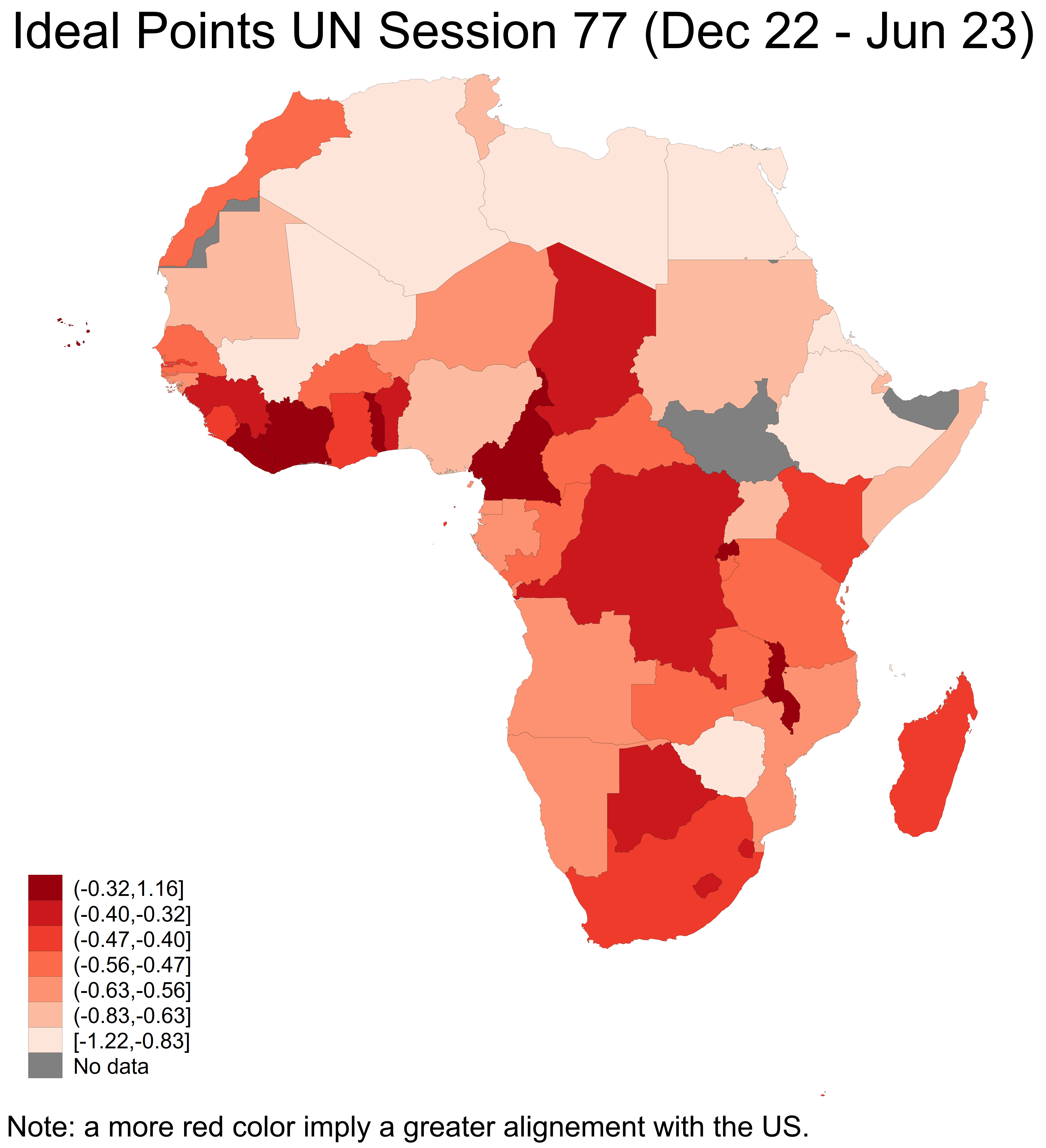
// Africa
spmap idealpointall using ne_10m_admin_0_countries_shp.dta ///
if CONTINENT=="Africa", id(_ID) ///
fcolor(Reds) osize(vvthin vvthin vvthin vvthin vvthin ///
vvthin vvthin) ///
ndsize(vvthin) ///
ndfcolor(gray) clnumber(7) ///
title("Ideal Points UN Session 77 (Dec 22 - Jun 23)")
graph rename Graph map_ideal_points_africa, replace
graph export figures\map_ideal_points_africa.png, as(png) ///
width(4000) replace
graph export figures\map_ideal_points_africa.pdf, as(pdf) ///
replace
save data\maps_unvotes77_final.dta, replace
****************************************************************
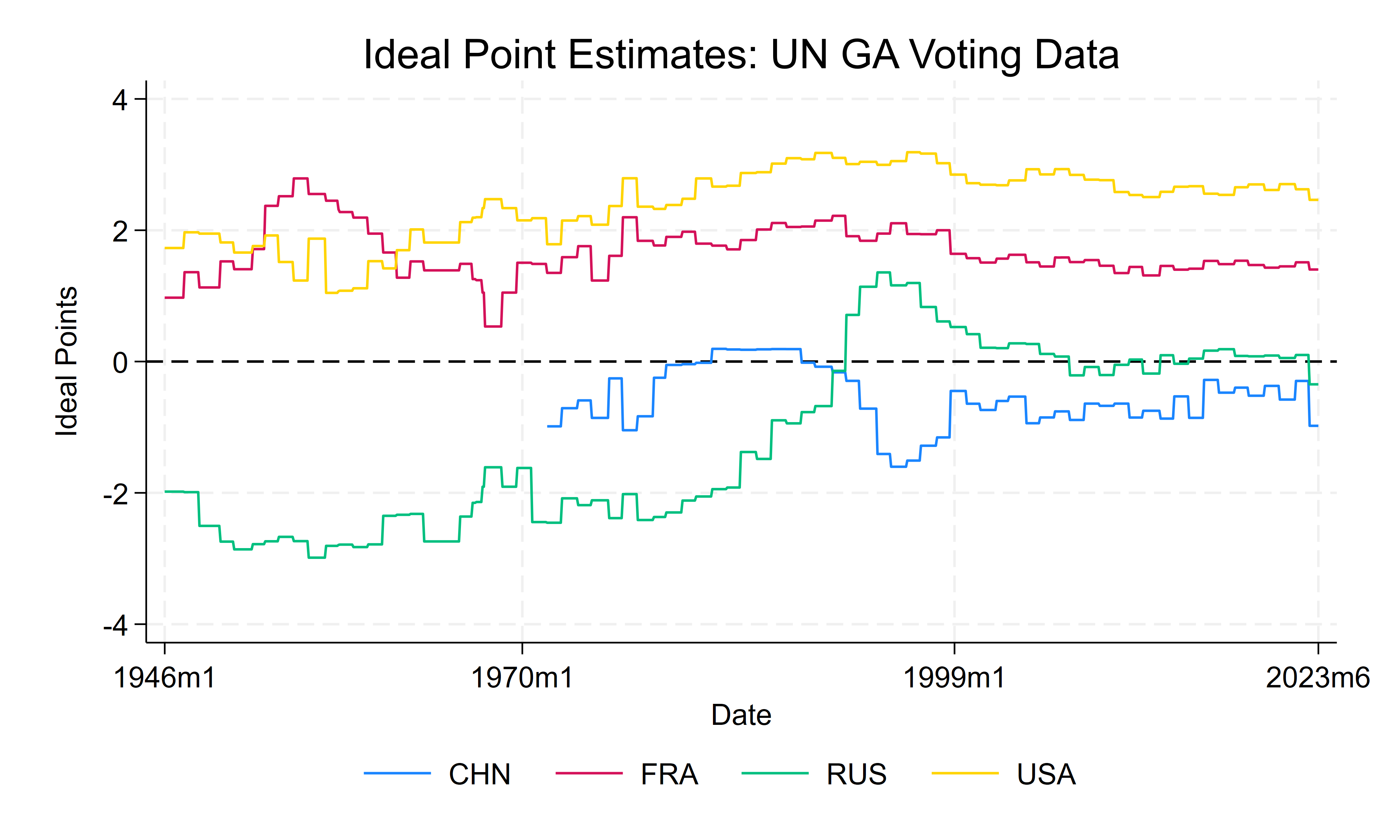
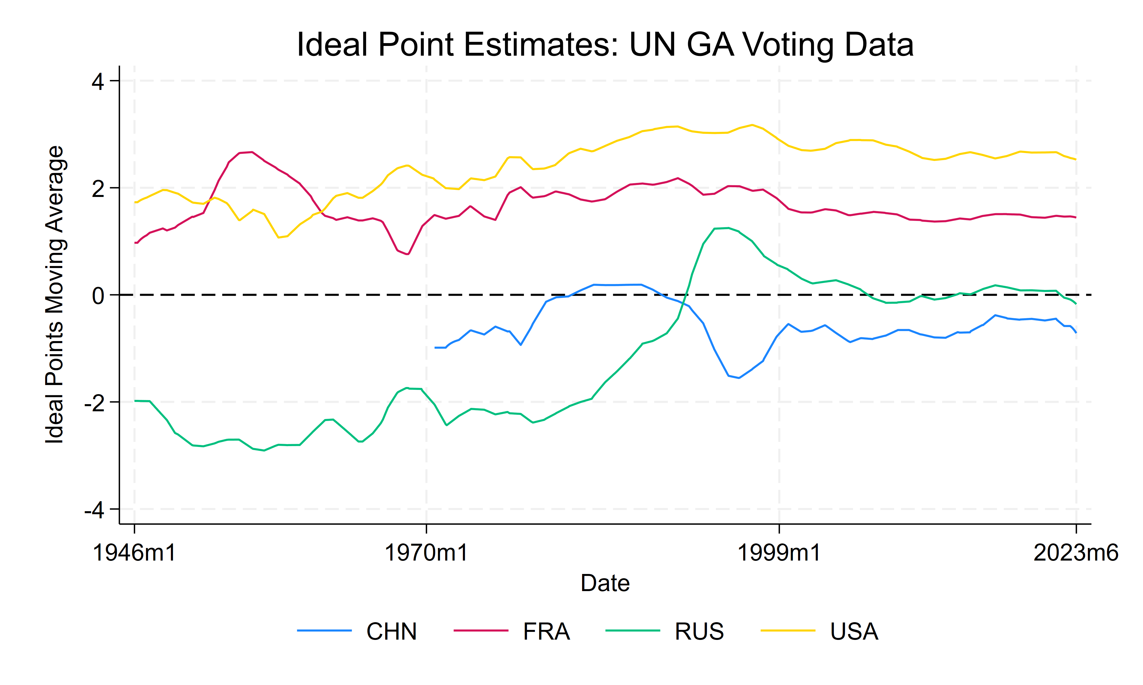
Finally, with a bit of more coding, you can build the time series for the voting data:
As we have seen in this blog, it is possible to draw maps in Stata in some simple steps at different levels. These maps could help you to visualize the United Nations General Assembly Voting Data. The files for replicating the results in this blog are available on my GitHub.
2 Comments
[…] Create a variable with a reference to a specific country Drawing Maps for Political Ties with Stata […]
[…] Drawing Maps for Political Ties with Stata […]