When I wanted to make some simple graphs on quantile regressions, I was quite surprised to not find a nice blog where each step is clearly explained over the web and also on YouTube. However, I found a very informative book that provides some applications with Stata and other pieces of software in the Appendix (freely available online): Quantile Regression: Theory and Applications. Today, I will use the data of the following working paper, written with Valérie Mignon, to illustrate some commands of this book. Here, the objective is to give visual intuitions about the usefulness of quantile regressions.
Step A
I load the data, label and declare the series has time series:
**#*************  Graphs for quantiles *************************

cls
clear

set scheme stcolor
*set scheme sj

version 18.0
set more off
cd "C:\Users\jamel\Documents\GitHub\"
cd "EconMacroBlog\Quantile_Graphs"

import excel .\data\mydata.17.03.2024.xlsx,/*
*/ sheet("Feuil1") firstrow clear

generate Period = tm(1958m1) + _n-1
format %tm Period

des

label variable pri "Political Relationship Index"
label variable lwti "WTI price in log"
label variable Period "Time"

des

tsset Period, monthly
Step B
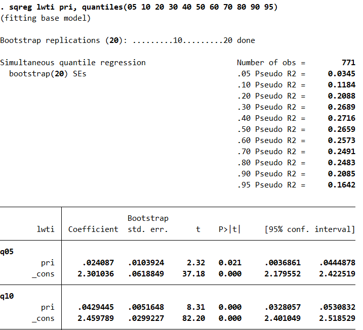
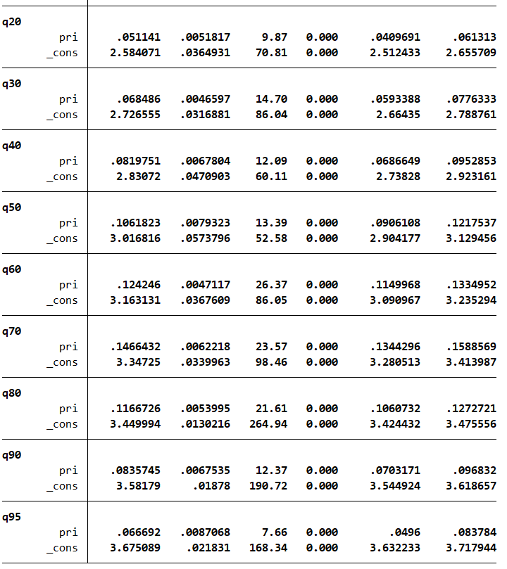
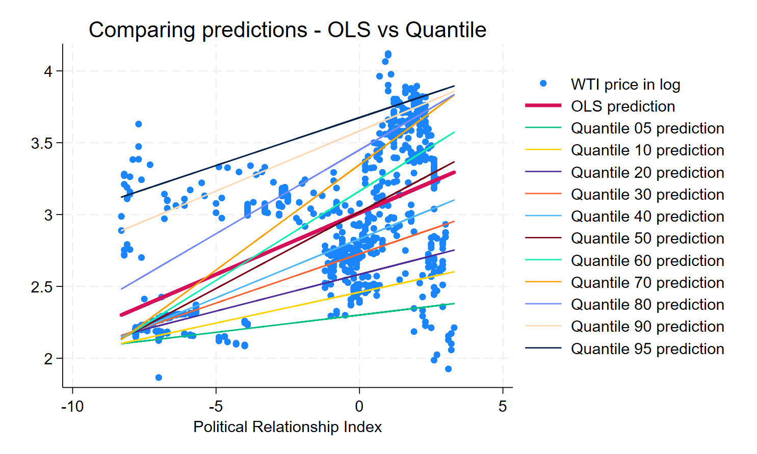
Now, I will compare the predictions between OLS and quantiles regressions. You will observe that the OLS prediction does not do a good job for higher quantile of oil prices. The slopes have a higher value for high quantiles of the oil price.
**#************  Compare predictions ***************************

reg lwti pri
predict yfit_OLS, xb
label variable yfit_OLS "OLS prediction"

sqreg lwti pri, quantiles(05 10 20 30 40 50 60 70 80 90 95)

foreach v in 05 10 20 30 40 50 60 70 80 90 95 {
	predict yfit`v', equation(q`v') xb
	label variable yfit`v' "Quantile `v' prediction"
}


twoway (scatter lwti pri, ///
 title("Comparing predictions - OLS vs Quantile")) ///
       (line yfit_OLS pri, lwidth(thick))   ///
       (line yfit05 pri) (line yfit10 pri)
       (line yfit20 pri) ///
       (line yfit30 pri) (line yfit40 pri)  ///
       (line yfit50 pri) (line yfit60 pri)  ///
       (line yfit70 pri) (line yfit80 pri)  ///
       (line yfit90 pri) (line yfit95 pri)

graph rename Graph graph_quantiles, replace
// to export a graph in pdf format
graph export figures\graph_quantiles.pdf, as(pdf) replace
// to export a graph in png format
graph export figures\graph_quantiles.png, as(png) replace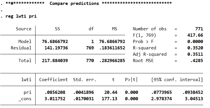
Step C
Finally, I will use the package grqreg written by João Pedro Azevedo to visualize the asymmetries at higher level of the WTI price of oil in logarithms. We can clearly see the coefficients differ from OLS for several quantiles.
**#************  Graphs for the coefficients *******************

// to install the grqreg module
*ssc install grqreg
// after the installation, the grqreg command allows
// to plot the QR coefficients
// it works after the commands: qreg, bsqreg, sqreg
// it has the option to graph the confidence interval,
// the OLS coefficient and the OLS confidence interval
// on the same graph

qreg lwti pri

// QR coefficient plot for the slope
// by default the graph for all the estimated
// coefficients except the intercept are produced
grqreg
// QR coefficient plot for the intercept
grqreg, cons

// to set the minimum and maximum values, and the
// steps for the quantiles
// minimum (qmin) default = .05
// maximum (qmax) default = .95
// increment (qstep) default = .05
grqreg lwti pri, qmin(.01) qmax(.99) qstep(.01)
// to draw the QR confidence intervals
grqreg, ci level(90)
graph rename Graph graph_quantiles_ci, replace

// to draw the OLS line, the OLS confidence intervals
// along with their QR counterpart
grqreg, ols olsci ci level(99)
graph rename Graph graph_quantiles_ci_ols, replace
// to export a graph in png format
graph export figures\graph_quantiles_ci_ols.png, as(png) replace

// Save the data with the predictions

save data\mydata_predictions.dta, replace

**#************  End of the program ****************************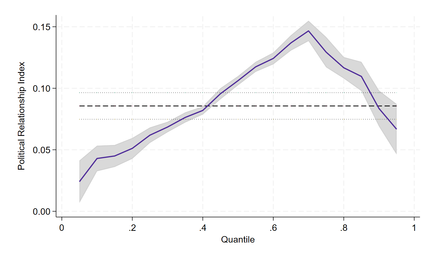
As we have seen in this blog, it is possible to visualize the usefulness of quantile regressions in some simple steps. The files for replicating the results in this blog are available on my GitHub.
5 Comments
Thank you Prof Jamel! Very helpful
Thank you, Emna, for your interest.
Thank-you. I agree that I was surprised not to find examples for this visualization and your outline was very useful.
Thanks, Drew, for your interest!
[…] Visualizing quantile regressions with Stata […]