In this post, I will show how it is simple to visualize production functions with Wolfram Alpha. I build upon the very pedagogical YouTube video of Klaus Prettner on the basic properties of the neoclassical production function, available here: https://www.youtube.com/watch?v=4Q_tMWRdAUQ
In his video, he recalls the basic properties of the neoclassical production function. I present the equations below:
- Constant return to scale:
[\lambda K(t), \lambda L(t)]=\lambda Y
Interpretation: Building the same firm at the the other side of the street doubles output.
- Positive but diminishing marginal products:
\begin{aligned}
\small
F_K&=\frac{\partial F[K(t), L(t)]}{\partial K(t)}>0 \\ &\frac{\partial F[K(t), L(t)]}{\partial^2 K(t)}<0, \\
F_L&=\frac{\partial F[K(t), L(t)]}{\partial L(t)}>0 \\ & \frac{\partial F[K(t), L(t)]}{\partial^2 L(t)}<0 .

\end{aligned}
Interpretation: Positive but diminishing marginal products: Assume a firm has one assembly line and no workers. Then, increasing employment raises output strongly. But the additional output decreases when ever more workers operate the line.
- Fulfills the so-called “Inada-conditions”:
\begin{aligned}
\lim _{K \rightarrow \infty} F_K=0, & \lim _{K \rightarrow 0} F_K=\infty \\
\lim _{L \rightarrow \infty} F_L=0, & \lim _{L \rightarrow 0} F_L=\infty
\end{aligned}
Interpretation of the Inada conditions: The first unit of capital or labor allows production. The marginal product is infinity when the production factor is zero. Additional output converges to zero when one production factor becomes overly abundant.
OK, it seems quite intuitive and realistic. Now, I will show how to plot it using Wolfram Alpha. You have to go the Wolfram Alpha website and enter one the two formulas:
Plot3D[10 Sqrt[x] Sqrt[y], {x, 0, 100}, {y, 0, 100}]

f(x,y) = 10 x^0.5 y^0.5 from 0 to 100
This code will produce two figures, the first one is a 3D figure and the second one is a contour plot.
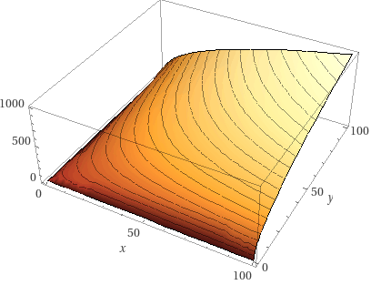
Suppose that the stock of capital is held constant at x = 50, adding new workers amounts to move on the y axis. When there are a few workers, say y = 10, adding a worker allows increasing the production and the slope tends to be steep (moving from a reddish area to a yellowish area), but when there are numerous workers, say y=90, adding a worker will not increase so much the production and the slope tends to be flat (we stay in a yellowish area).
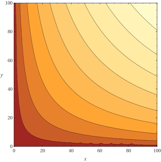
The reddish areas indicate lower values and yellowish areas indicate higher values in Figure 2. Contour plots are 3D plots seen from above. It is a nice way to visualize 3D plots in a Cartesian plan.