Local projections have become one of the most widely used tools to study dynamic causal effects in macroeconomics. Their flexibility and robustness make them particularly attractive when researchers want to avoid strong assumptions about the data-generating process. In Stata 18, the new lpirf command automates Jordà’s local projections and produces impulse response functions directly from the estimated system.
The default graphs produced by irf graph are serviceable, but many empirical applications require clearer and more structured visualizations. Journal submissions, presentations, and policy briefs often demand figures that are more informative and visually coherent. This post shows how to improve the appearance of impulse response functions by customizing confidence bands, axis scaling, and panel layout. It also illustrates how to construct a matrix of impulse responses where rows identify the shock variable and columns identify the response variable.
The example uses Stata’s built-in usmacro dataset.
1. Estimating Local Projections
We begin by loading the data and estimating a system of local projections for inflation, the output gap, and the federal funds rate.
webuse usmacro, clear
tsset

* Estimate local projections
lpirf inflation ogap fedfunds, lags(1/12) step(24)

* Store IRFs
irf set myirfs.irf, replace
irf create model1
Stata now contains a full set of impulse responses for each shock and each variable in the system.
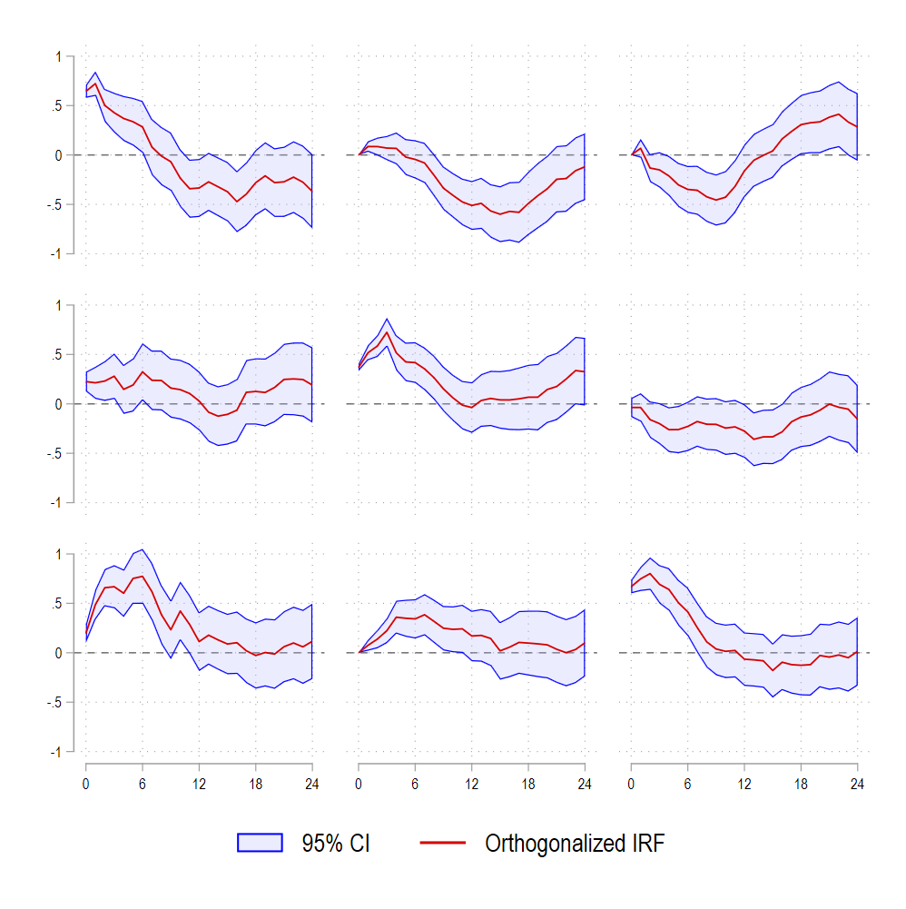
2. A Simple Improvement of the Default IRF Plot
Before constructing a full grid of IRFs, it is useful to improve the base graph. A few graph options provide more control over confidence bands and axis labels.
irf graph oirf, yline(0) ///
    ciopts(fcolor(blue%25) lcolor(blue)) xlabel(0(6)24) ///
    xscale(range(0 24)) byopts(note("") ti(, size(small))) xti("") ///
    subtitle("") ysize(4) xsize(4) legend(cols(2))
The ciopts() option replaces the solid blue shading with a semi-transparent band that improves readability. The x-axis is restricted to horizons 0 to 24, and extraneous notes are removed for a cleaner appearance.
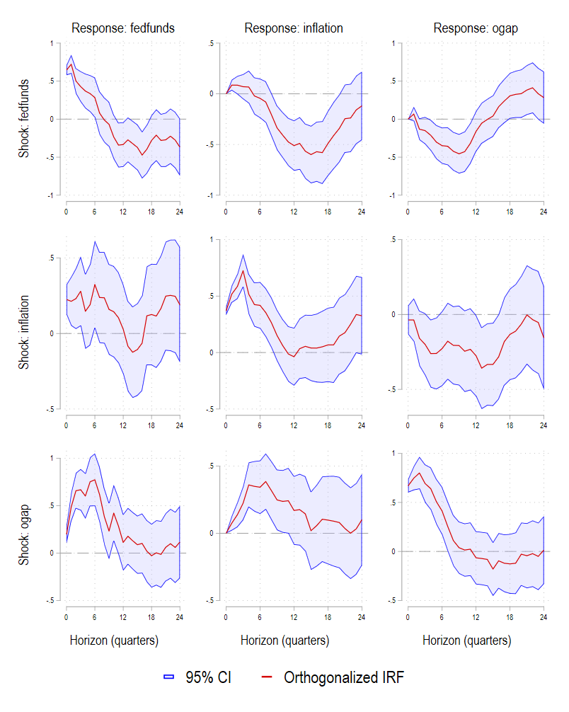
3. Building a Structured 3×3 IRF Matrix
A widely used presentation format is the impulse-by-response matrix. Each row corresponds to a shock (for example the federal funds rate shock), while each column corresponds to a response variable. This requires generating one graph per pair of variables and then combining them.
The code below constructs nine IRF panels and automatically assigns appropriate titles depending on panel position.
local impvars "fedfunds inflation ogap"
local resvars "fedfunds inflation ogap"

foreach i of local impvars {
    foreach j of local resvars {

        local gname g_`i'_`j'
        local mytitle ""
        local myytitle ""
        local myxtitle ""

        * column headings: response variables
        if "`i'" == "fedfunds" {
            local mytitle "Response: `j'"
        }

        * row headings: impulse variables
        if "`j'" == "fedfunds" {
            local myytitle "Shock: `i'"
        }

        * x-axis title only on last row
        if "`i'" == "ogap" {
            local myxtitle "Horizon (quarters)"
        }

        irf graph oirf, ///
            impulse(`i') response(`j') ///
            title("`mytitle'", size(large)) ///
            ytitle("`myytitle'", size(normal)) ///
            xtitle("`myxtitle'") ///
            yline(0, lpattern(dash) lcolor(gs10)) ///
            ciopts(fcolor(blue%25) lcolor(blue)) xlabel(0(6)24) ///
            xscale(range(0 24)) byopts(note("")) ///
            subtitle("") ysize(4) xsize(4) legend(size(large) col(2)) ///
            name(`gname', replace) nodraw
    }
}
This loop produces nine graphs but stores them without displaying them.
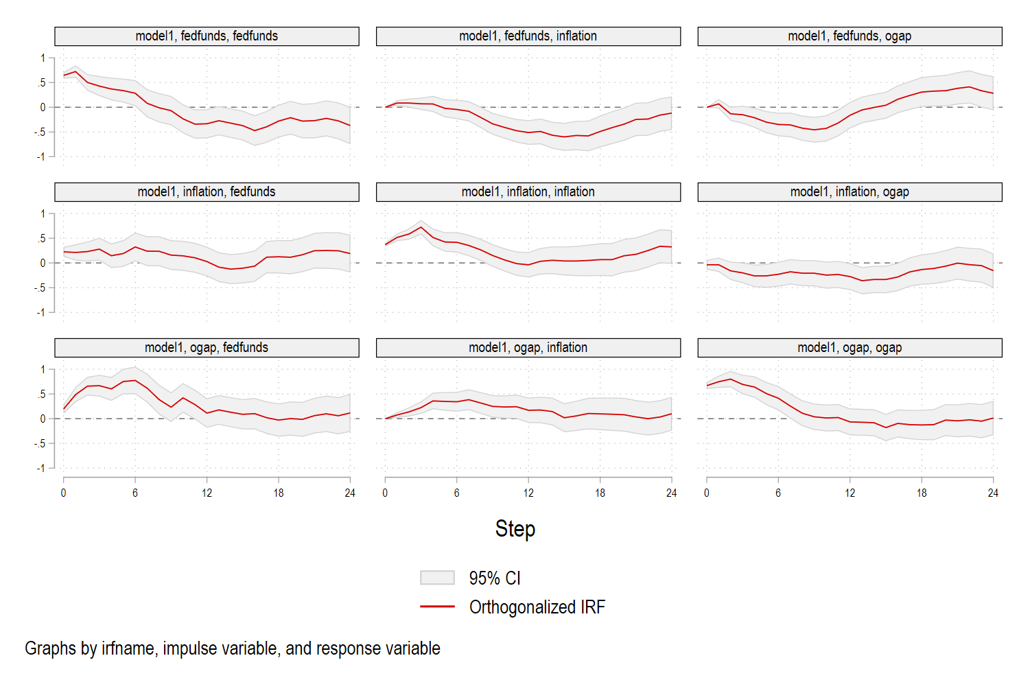
4. Combining the IRFs into a Single Figure
The last step is to assemble the individual panels into a 3×3 grid using grc1leg2. The legend is taken from the upper-left panel and scaled for visibility.
grc1leg2 ///
    g_fedfunds_fedfunds g_fedfunds_inflation g_fedfunds_ogap ///
    g_inflation_fedfunds g_inflation_inflation g_inflation_ogap ///
    g_ogap_fedfunds g_ogap_inflation g_ogap_ogap, ///
    rows(3) cols(3) legendfrom(g_fedfunds_fedfunds) ///
    ysize(5) xsize(4) imargin(tiny)
The resulting figure is compact, readable, and structured in a way that allows the reader to interpret each impulse and each response at a glance.
Which is better than:
5. Why This Approach Matters
Clear figures help convey empirical results efficiently. Local projections are often estimated over wide horizons where the shape of the confidence band is as informative as the median response itself. Customizing the color intensity, panel structure, and axis range improves interpretability and helps align the output with academic or policy standards. The procedure described above is flexible and can be adapted to larger systems or alternative shock identifications.
This workflow also demonstrates how Stata’s graphing tools can be extended beyond defaults. Local projections are increasingly used in research on monetary policy, energy economics, climate shocks, and geopolitical risk. A polished graphical representation is now an integral part of any empirical study.
Full code below also available on GitHub:
webuse usmacro, clear
tsset

* Estimate local projections
lpirf inflation ogap fedfunds, lags(1/12) step(24)

* Store IRFs
irf set myirfs.irf, replace
irf create model1

* Graph with custom confidence band color
irf graph oirf, yline(0) ///
    ciopts(fcolor(blue%25) lcolor(blue)) xlabel(0(6)24) ///
    xscale(range(0 24)) byopts(note("") ti(, size(small))) xti("") ///
	  subtitle("") ysize(4) xsize(4) legend(cols(2))

* Loop

local impvars "fedfunds inflation ogap"
local resvars "fedfunds inflation ogap"

foreach i of local impvars {
    foreach j of local resvars {

        local gname g_`i'_`j'
        local mytitle ""
        local myytitle ""
        local myxtitle ""

        * column headings: response variables
        if "`i'" == "fedfunds" {
            local mytitle "Response: `j'"
        }

        * row headings: impulse variables
        if "`j'" == "fedfunds" {
            local myytitle "Shock: `i'"
        }

        * x-axis title only on last row
        if "`i'" == "ogap" {
            local myxtitle "Horizon (quarters)"
        }

        irf graph oirf, ///
            impulse(`i') response(`j') ///
            title("`mytitle'", size(large)) ///
            ytitle("`myytitle'") ///
            xtitle("`myxtitle'") ///
            yline(0, lpattern(dash) lcolor(gs10)) ///
			ciopts(fcolor(blue%25) lcolor(blue)) xlabel(0(6)24) ///
            xscale(range(0 24)) byopts(note("")) ///
	        subtitle("") ysize(4) xsize(4) legend(size(large) col(2)) ///
            name(`gname', replace) nodraw
    }
}

grc1leg2 ///
    g_fedfunds_fedfunds g_fedfunds_inflation g_fedfunds_ogap ///
    g_inflation_fedfunds g_inflation_inflation g_inflation_ogap ///
    g_ogap_fedfunds g_ogap_inflation g_ogap_ogap, ///
    rows(3) cols(3) legendfrom(g_fedfunds_fedfunds) ysize(5) xsize(4) imargin(tiny)