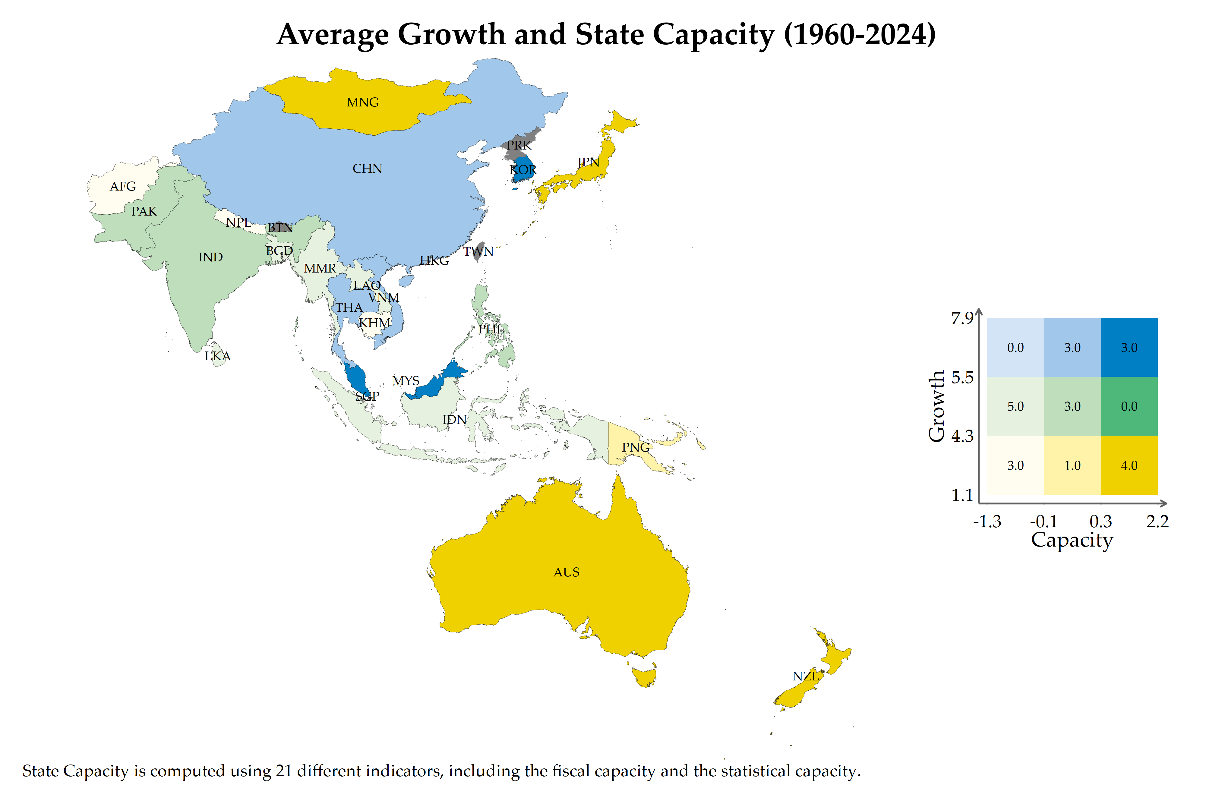
The present example focuses on the joint distribution of economic growth and state capacity over the period 1960 to 2024. The dataset contains country-level averages for the East Asia and Pacific and South Asia groups, including economies such as China, Indonesia, Malaysia, the Philippines, Thailand, Vietnam, and several Pacific island states. The objective is to use a two-dimensional color gradient in order to capture the interaction between these variables. The result provides an intuitive representation of the spatial pattern of growth and administrative effectiveness in the region.
Key takeaways
- The long time span from 1960 to 2024 provides a stable view of structural patterns in the region. Averaging across decades removes short-term volatility and reveals the underlying relationship between growth performance and institutional effectiveness.
- The country-level averages are consistent with a flying geese development pattern in East Asia. Japan and the first generation of newly industrialized economies led the initial industrial and institutional upgrading, followed by later comers such as China, Malaysia, Thailand, and Vietnam that have progressively moved up the value chain. In contrast, many Pacific economies are located outside this manufacturing ladder and are more characterized by service-based and resource-based specialization, which the bivariate map captures through their different combinations of growth and state capacity.
- The bivariate color grid offers a coherent way to visualize the joint distribution of growth and state capacity. The horizontal gradient encodes institutional effectiveness, the vertical gradient encodes growth, and their intersection creates a compact and interpretable representation of the interaction between the two variables.
- The spatial structure of the map reveals clear regional patterns. Most Southeast Asian and East Asian economies cluster along trajectories of moderate to high-growth and improving capacity, consistent with long-run development literature. The Pacific island states generally appear in lower capacity segments, which aligns with empirical findings on administrative and geographic limitations.
- The bivariate layout is particularly useful for comparative analysis. By placing all countries within the same two dimensional grid, the map highlights how regional neighbors situate themselves relative to one another, allowing for a direct and intuitive comparison of long run institutional and economic profiles.
Let me show you how to do a bivariate map. But, before I strongly recommend you to read my previous blogs on this topic. In particular, these two following blogs where I used Ben Jann’s geoplot Stata package:
The full code is reproduced below:
** Bivariate Map

set scheme white_tableau

geoframe create capital asian_map.dta, coord(_CX _CY) replace

geoframe create asia ///
 asian_map.dta, id(_ID) ///
 coord(_CX _CY) ///
 shp(ne_10m_admin_0_countries_shp_nz.dta) ///
 replace
/// Replace shpfile() by shp()

geoframe describe asia

frame change asia

gen GR = 100*growth
format GR  %4.1f

preserve

keep if eap==1 | sa==1

bimap GR Capacity, frame(asia) cut(pctile) ///
    palette(census) lc(black) lw(0.03) ///
    geo( (label capital ADM0_A3 if eap==1 | sa==1, color(black) size(vsmall) ) ) ///
    polygon(data("ne_10m_admin_0_countries_shp_nz") ///
        select(keep if eap==1 | sa==1) ocolor(black) osize(0.05) lcolor(black)) ///
    title("{bf: Average Growth and State Capacity (1960-2024)}") ///
	note("State Capacity is computed using 21 different indicators, including the fiscal capacity and the statistical capacity.", size(vsmall)) ///
    texty("Growth") textx("Capacity") texts(3.5) textlabs(3) count

graph rename Graph GR2, replace

graph export GR2.png, as(png) replace width(4000)

restore