After a series of blogs on maps, today, I will show how to draw a map for the East Asian and Pacific Region, following the World Bank classification. If you want to refresh your mind, you can have a look:
https://www.jamelsaadaoui.com/tag/maps
This time it might be a bit tricky because some islands are crossing the International Date Line (IDL). It is even worse, some countries have the sovereignty over islands that cross the IDL.
For illustrative purposes, I will use the data of this paper. Please refer to this paper to know more about the data:
https://www.nber.org/papers/w32303
Let us start by not considering the IDL problem:
**# Create the maps
spshape2dta ne_10m_admin_0_countries, replace
use ne_10m_admin_0_countries.dta, replace
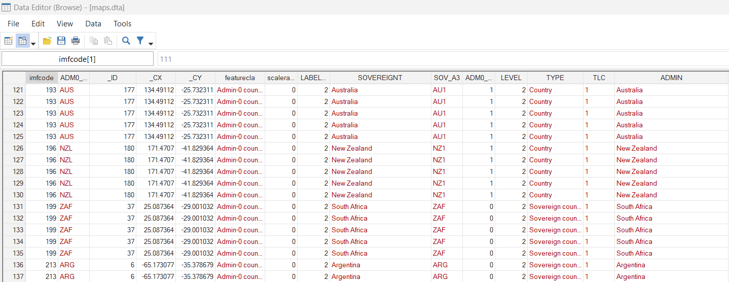
kountry ADM0_A3, from(iso3c) to(imfn)
rename _IMFN_ imfcode
order imfcode ADM0_A3, first
replace imfcode=998 if ADM0_A3=="SDS"
replace imfcode=999 if ADM0_A3=="PRK"
drop if imfcode==.
save maps.dta, replaceIn my database, I don’t have any cells for the South Sudan and for North Korea, so I will add the cell to merge the maps’ dataset with my dataset:
use DXR_peusdo_panel.dta, replace
set obs 1030
replace imfcode = 998 in 1026/1030
replace time = 1 in 1026
replace time = 2 in 1027
replace time = 3 in 1028
replace time = 4 in 1029
replace time = 5 in 1030
set obs 1035
replace imfcode = 999 in 1031/1035
replace time = 1 in 1031
replace time = 2 in 1032
replace time = 3 in 1033
replace time = 4 in 1034
replace time = 5 in 1035
save DXR_peusdo_panel_maps.dta, replace
**# Merge with the resilience variables
use maps.dta, clear
merge 1:m imfcode using DXR_peusdo_panel_maps.dta, nogenerate
xtset imfcode time
format DXR_A %4.0f
winsor2 DXR_A, suffix(_w) cuts(5 95) by(time)
format DXR_A_w %4.0f
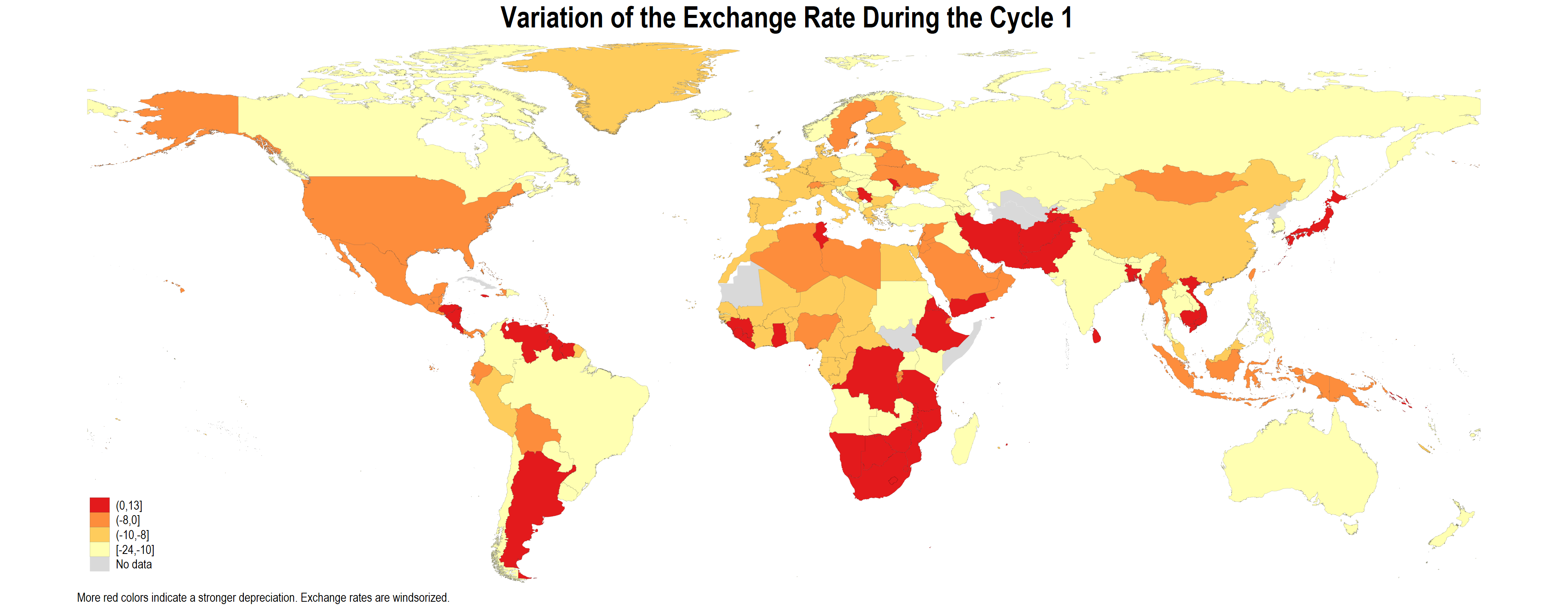
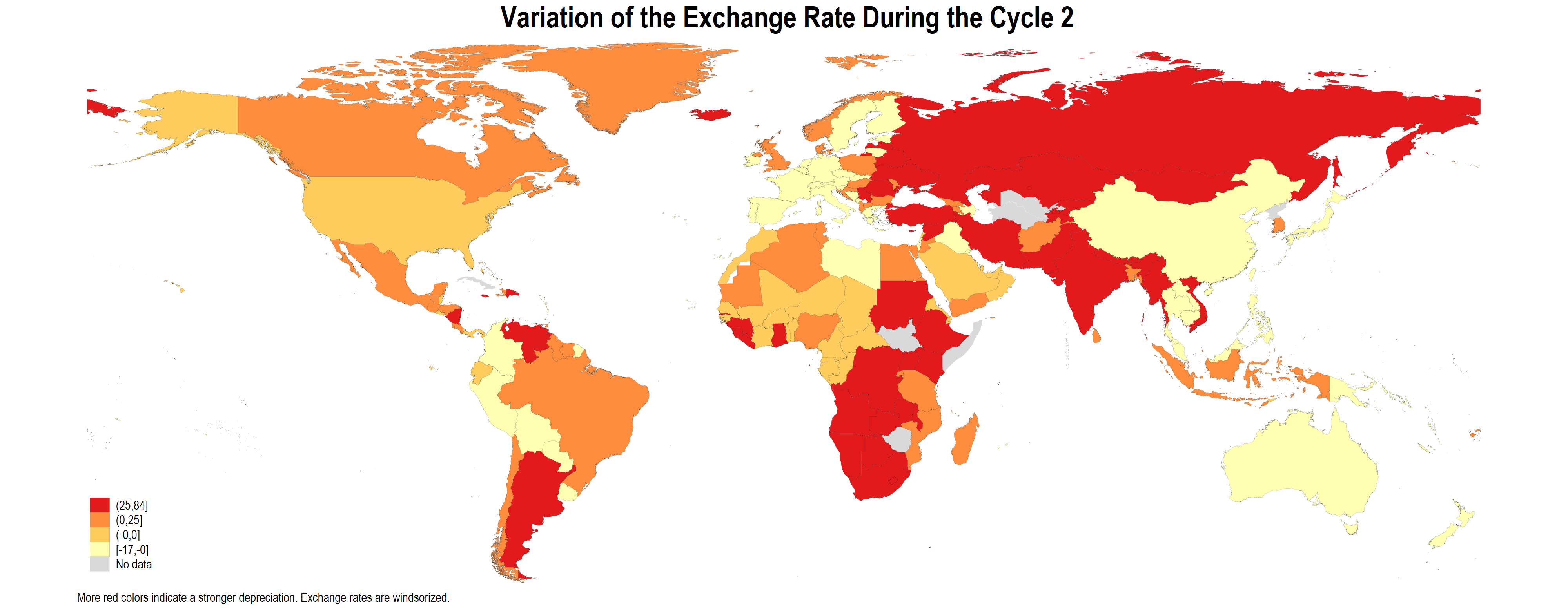
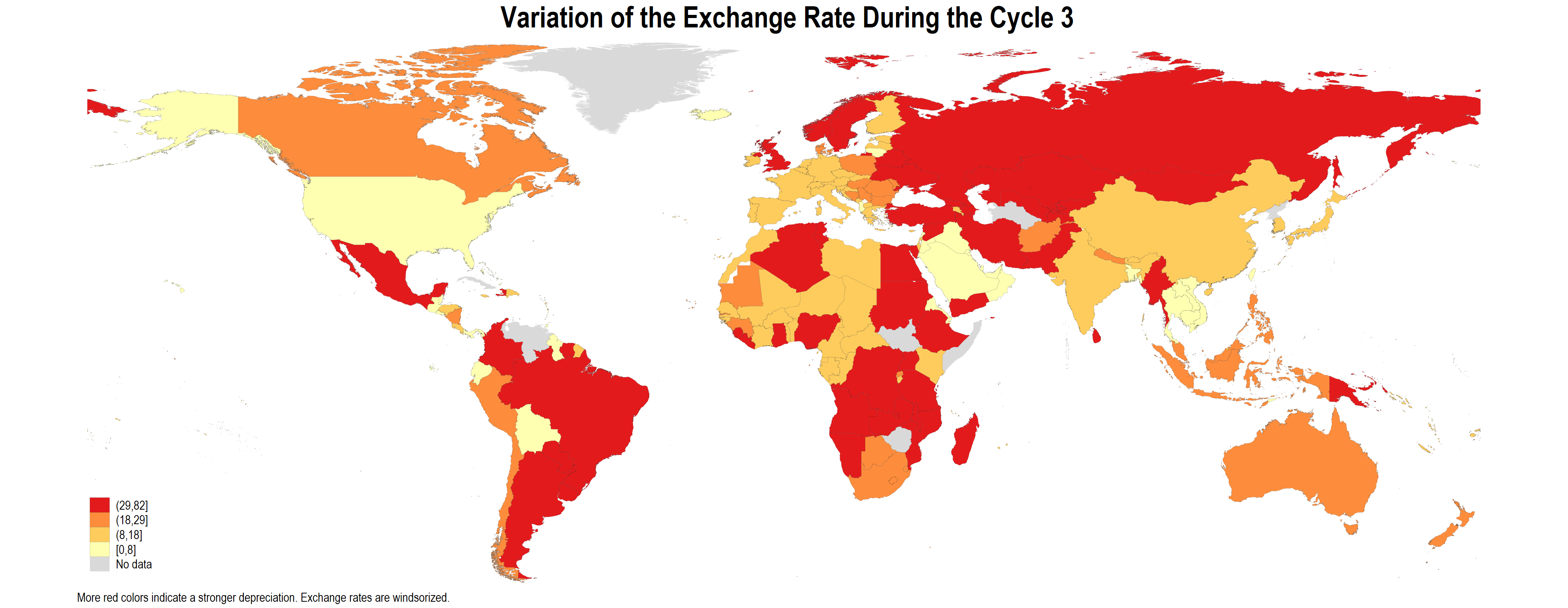
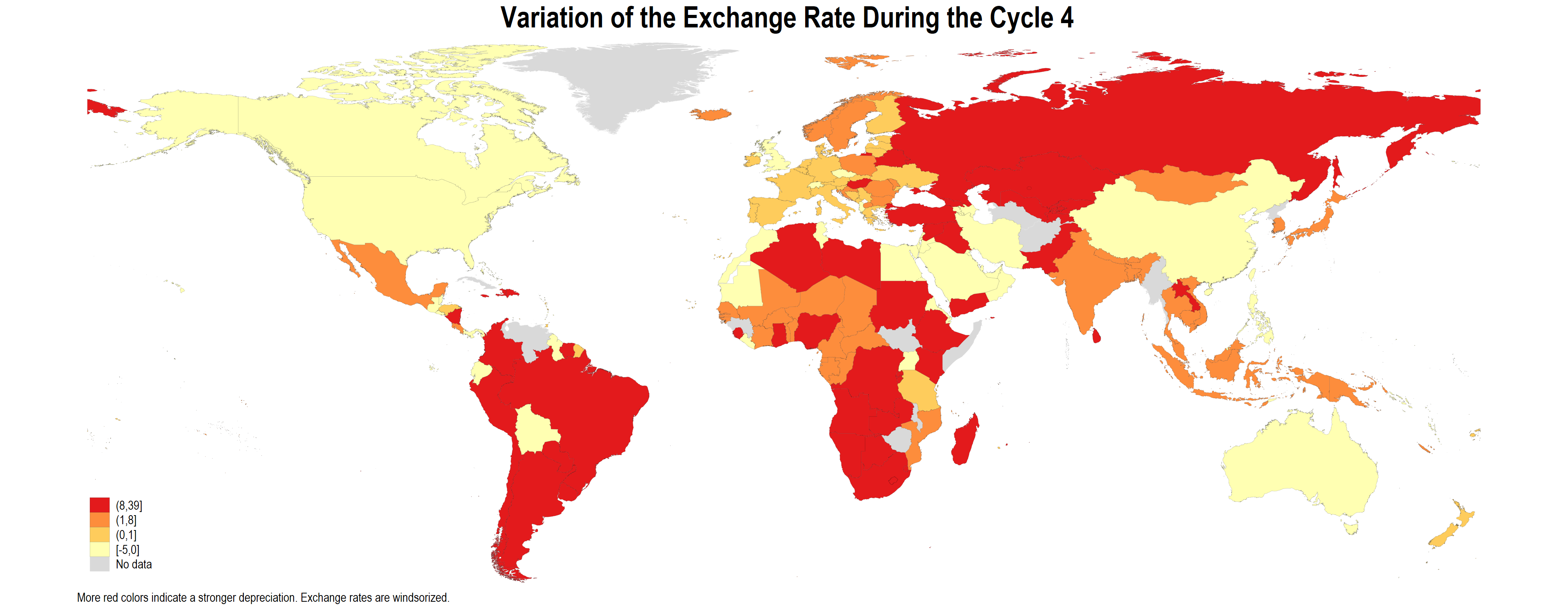
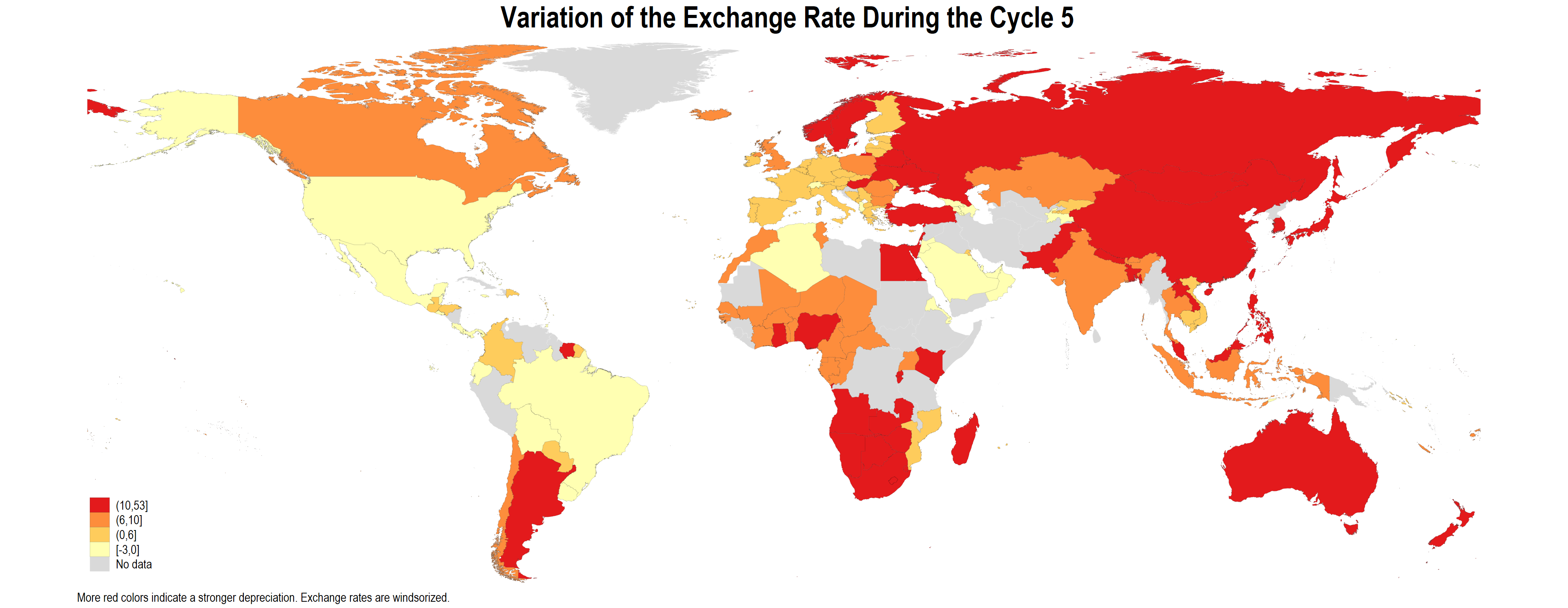
forvalues i = 1(1)5 {
spmap DXR_A_w using ne_10m_admin_0_countries_shp.dta ///
if time==`i', id(_ID) ///
fcolor(YlOrRd) osize(vvthin ..) ///
ndsize(vvthin) clmethod(quantile) ///
ndfcolor(gray%30 ..) ndocolor(white ..) ///
title("{bf: Variation of the Exchange Rate During the Cycle `i'}") ///
note("More red colors indicate a stronger depreciation. Exchange rates are windsorized.", ///
size(vsmall))
graph rename Graph DXR_A_maps`i', replace
graph export DXR_A_maps`i'.png, as(png) replace width(4000)
}The previously mentioned code produces the following pictures:
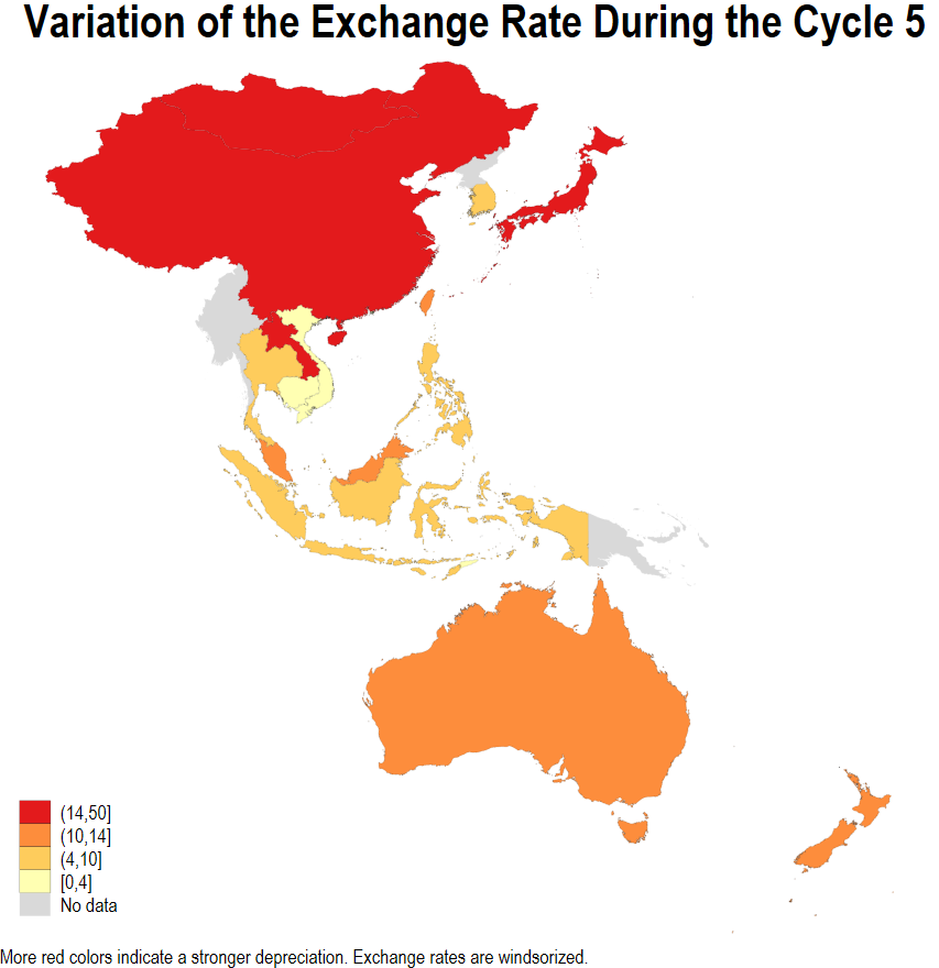
Now, if I want to draw the maps only for the East Asia & Pacific, I will face the “IDL crossing” problem. Let us try the code below:
forvalues i = 1(1)5 {

spmap DXR_A_w using ne_10m_admin_0_countries_shp.dta ///
 if time==`i' & REGION_WB=="East Asia & Pacific" ///
 & _CX>0 & POP_EST>1000000, id(_ID) ///
 fcolor(YlOrRd) osize(vvthin ..) ///
 ndsize(vvthin) clmethod(quantile)  ///
 ndfcolor(gray%30 ..) ndocolor(white ..) ///
 title("{bf: Variation of the Exchange Rate During the Cycle `i'}") ///
note("More red colors indicate a stronger depreciation. Exchange rates are windsorized.", ///
  size(vsmall))

graph rename Graph DXR_A_mapsEAP`i', replace

graph export DXR_A_mapsEAP`i'.png, as(png) replace width(4000)

}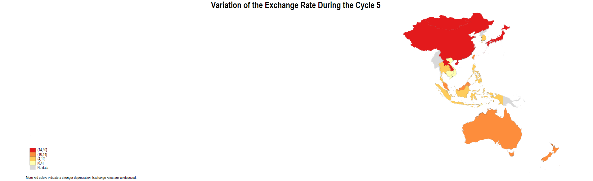
To solve the problem, you need to remove the islands that cross the IDL and the part of New Zealand that crosses the IDL. New Zealand _ID is 180:
I will look in the shape file, which parts of New Zealand cross the IDL and remove them with:
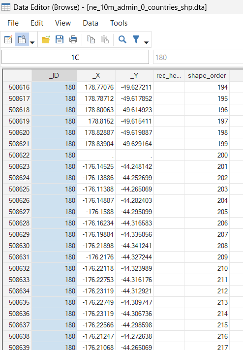
// Drop some part of the New Zealand

use ne_10m_admin_0_countries_shp.dta, clear

drop if _ID==180 & _X<0

save ne_10m_admin_0_countries_shp_nz.dta, replace
Now, I will re-run the code with the new shapefile that I just saved and with an option on the population size that will remove the small islands (some of them cross the IDL):
forvalues i = 1(1)5 {

spmap DXR_A_w using ne_10m_admin_0_countries_shp_nz.dta ///
 if time==`i' & REGION_WB=="East Asia & Pacific" ///
 & _CX>0 & POP_EST>1000000, id(_ID) ///
 fcolor(YlOrRd) osize(vvthin ..) ///
 ndsize(vvthin) clmethod(quantile)  ///
 ndfcolor(gray%30 ..) ndocolor(white ..) ///
 title("{bf: Variation of the Exchange Rate During the Cycle `i'}") ///
note("More red colors indicate a stronger depreciation. Exchange rates are windsorized.", ///
  size(vsmall))

graph rename Graph DXR_A_mapsEAP`i', replace

graph export DXR_A_mapsEAP`i'.png, as(png) replace width(4000)

}
I was inspired by this discussion in the Stata Forum (thanks to Scott Merryman):