Sometimes, you need to draw histograms using two variables, with one variable containing the frequencies. Using fictional data, I will show you, in some simple steps, how to proceed to draw a histogram with varying bin widths.
We will reproduce this figure:

I was inspired by this FAQ on the Stata website answered by Nicholas J. Cox:
First step, import the data:
**# Import the data

*https://www.stata.com/support/faqs/graphics/histograms-with-varying-bin-widths/

*cd C:\Users\jamel\Dropbox\PC\Downloads

import excel "Data.xlsx", sheet("Feuil1") firstrow clear 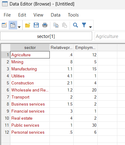
Second, you have to sort the data and create the frequency class:
**# Sort the data and create frequency class

gsort +Relativeproductivity

gen freq = 0

replace freq = sum(Employmentshare)

gen Employmentshare_ = 0

replace Employmentshare_ = freq[_n-1]

replace Employmentshare_ = .0 in 1

set obs 13

replace Employmentshare_ = 100 in 13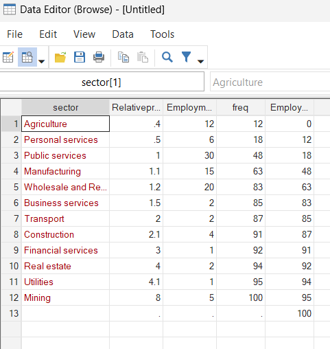
Thirdly, draw the two-way histogram and export the figure as a PNG file:
**# Draw the histogram

set scheme Cleanplots

summ Relativeproductivity

lab var Relativeproductivity "Relative Productivity"

lab var Employmentshare_ "Employment Share in %"

twoway ///
(bar Relativeproductivity Employmentshare_ ///
 if Relativeproductivity>=Relativeproductivity[1] ///
 & Relativeproductivity<=Relativeproductivity[2], ///
 bartype(spanning) bstyle(histogram) yscale(range(0)) ///
 bcolor(blue%20) legend(label(1 "Personal services")) ///
 yline(4.462122)) ///
(bar Relativeproductivity Employmentshare_ ///
 if Relativeproductivity>=Relativeproductivity[2] & ///
 Relativeproductivity<=Relativeproductivity[3], ///
 bartype(spanning) ///
 bcolor(red%20) legend(label(2 "Agriculture"))) ///
(bar Relativeproductivity Employmentshare_ ///
 if Relativeproductivity>=Relativeproductivity[3] & ///
 Relativeproductivity<=Relativeproductivity[4], ///
 bartype(spanning) ///
 bcolor(green%20) legend(label(3 "Wholesale and Retail"))) ///
(bar Relativeproductivity Employmentshare_ ///
 if Relativeproductivity>=Relativeproductivity[4] & ///
 Relativeproductivity<=Relativeproductivity[5], ///
 bartype(spanning) ///
 bcolor(pink%20) legend(label(4 "Manufacturing"))) ///
(bar Relativeproductivity Employmentshare_ ///
 if Relativeproductivity>=Relativeproductivity[5] & ///
 Relativeproductivity<=Relativeproductivity[6], ///
 bartype(spanning) ///
 bcolor(yellow%20) legend(label(5 "Public services"))) ///
(bar Relativeproductivity Employmentshare_ ///
 if Relativeproductivity>=Relativeproductivity[6] & ///
 Relativeproductivity<=Relativeproductivity[7], ///
 bartype(spanning) ///
 bcolor(pink%20) legend(label(6 "Business services"))) ///
(bar Relativeproductivity Employmentshare_ ///
 if Relativeproductivity>=Relativeproductivity[7] & ///
 Relativeproductivity<=Relativeproductivity[8], ///
 bartype(spanning) ///
 bcolor(lime%20) legend(label(7 "Transport"))) ///
(bar Relativeproductivity Employmentshare_ ///
 if Relativeproductivity>=Relativeproductivity[8] & ///
 Relativeproductivity<=Relativeproductivity[9], ///
 bartype(spanning) ///
 bcolor(gold%20) legend(label(8 "Construction"))) ///
(bar Relativeproductivity Employmentshare_ ///
 if Relativeproductivity>=Relativeproductivity[9] & ///
 Relativeproductivity<=Relativeproductivity[10], ///
 bartype(spanning) ///
 bcolor(purple%20) legend(label(9 "Utilities"))) ///
(bar Relativeproductivity Employmentshare_ ///
 if Relativeproductivity>=Relativeproductivity[10] & ///
 Relativeproductivity<=Relativeproductivity[11], ///
 bartype(spanning) ///
 bcolor(red%20) legend(label(10 "Financial services"))) ///
(bar Relativeproductivity Employmentshare_ ///
 if Relativeproductivity>=Relativeproductivity[11] & ///
 Relativeproductivity<=Relativeproductivity[12], ///
 bartype(spanning) ///
 bcolor(black%60) legend(label(11 "Real estate"))) ///
(bar Relativeproductivity Employmentshare_ ///
 if Relativeproductivity>=Relativeproductivity[12] & ///
 Relativeproductivity<=Relativeproductivity[13], ///
 bartype(spanning) ///
 bcolor(blue%50) legend(label(12 "Mining")) ///
 title("{bf:Productivity and Employment Share in Ghana}"))

**# Export the Graph

graph rename twowayhist, replace
graph export twowayhist.png, as(png) width(4000) replace

**# End of Program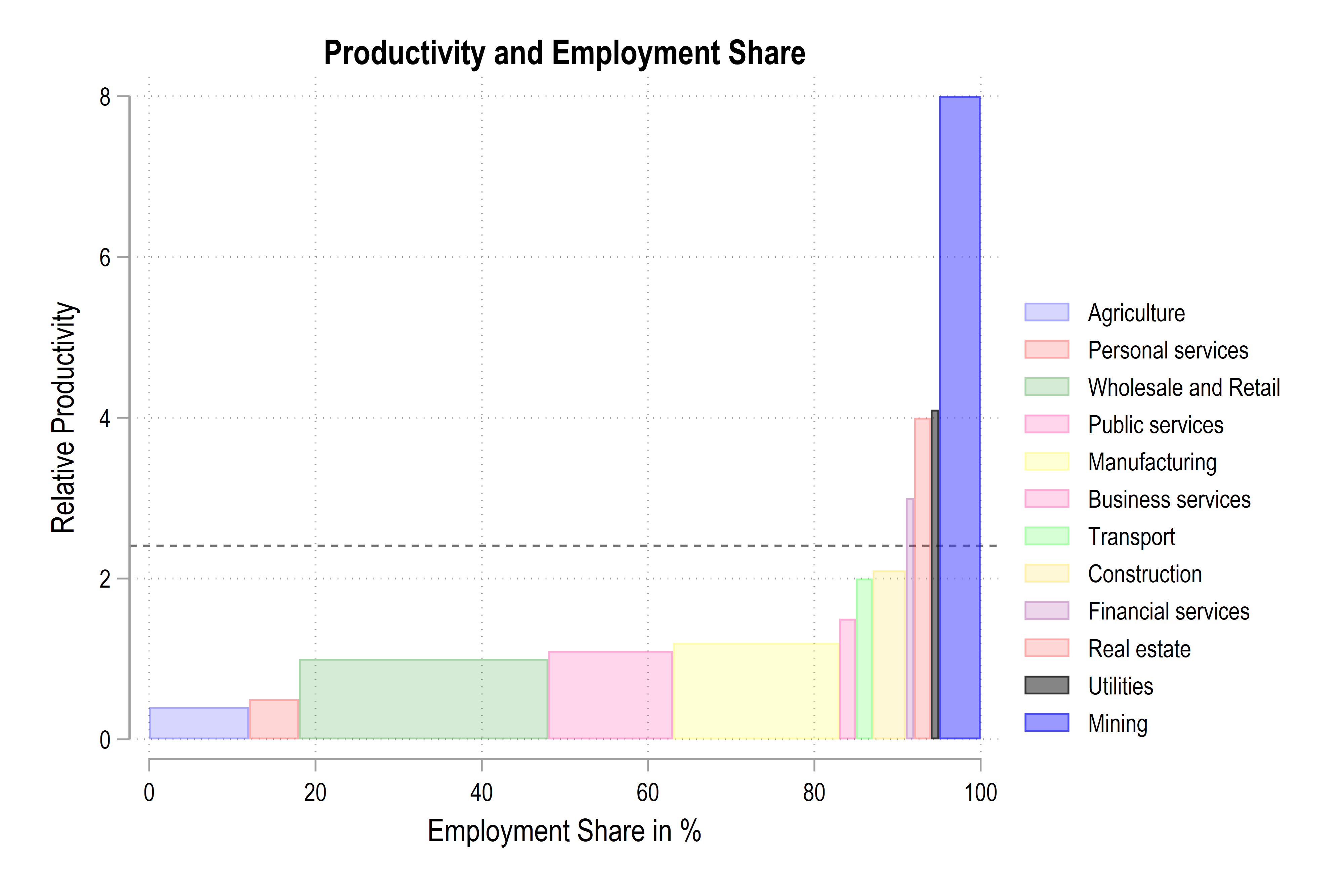
As we have seen in this blog, it is possible to visualize the usefulness of two-way histograms in some simple steps. The files for replicating the results in this blog are available on my GitHub.