As some of you may know, I have growing interests in the field of Political Economy. It appeared that the set of explained variables that I studied in the following article, Joshua Aizenman, Donghyun Park, Irfan A. Qureshi, and Gazi Salah Uddin, were the same that in this article written by Lena Lee Andresen and Jan-Egbert Sturm. Of course, the set of explanatory variables were not the same. Besides, the research questions were quite different. However, I found some overlapping issues in these two papers.
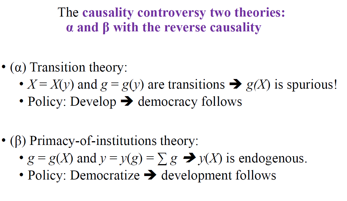
During the April 2024 edition of the European Public Choice Society (EPCS 2024) annual conference, I attended the presentation of Martin Paldam on the following question: Do relatively democratic countries grow faster? During his presentation, I discovered the very interesting theory of the Transition of Institutions. That’s a very interesting alternative to the Primacy-of-Institutions theory (PoI). The following slide coming from Martin Paldam’s presentation summarizes TI and PoI views.

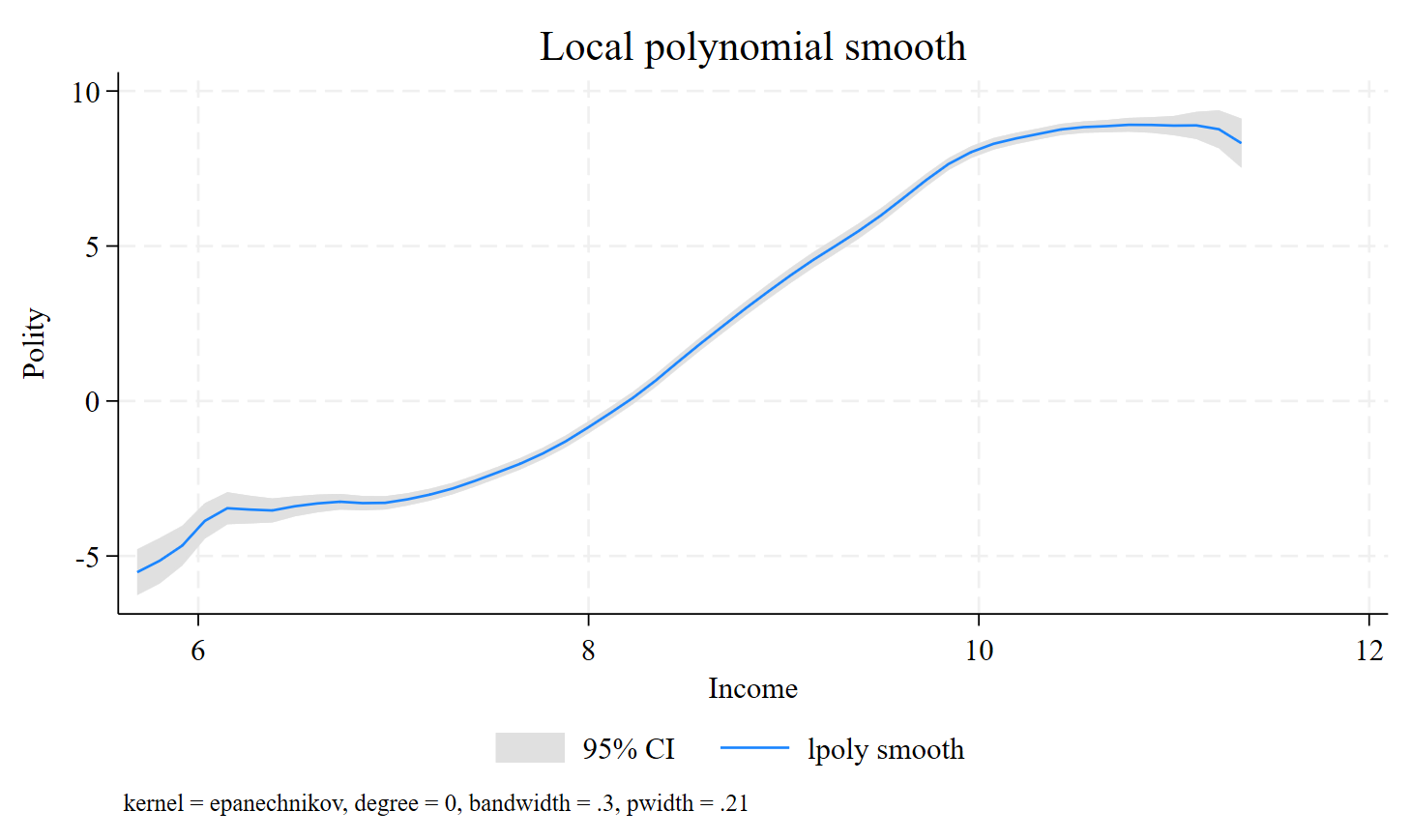
Martin Paldam recommended reading his book “The Grand Pattern of Development and the Transition of Institutions” (CUP, 2021) that gathers several of his previous articles. To model the transition, you need two ingredients, first the equivalence hypothesis, to build a long string of data, and second, kernel regressions. In the following, I will use Stata to show how to reproduce Figure 2.4 in the book. According to the TI view, low-income observations (both low-income countries in the present and in the past, like, say, Italy in the 1920s and Tunisia in the 1960s) will have more authoritarian regimes (negative Polity scores). Then, the transition to the high-income observations will produce transitions to more democratic regimes (positive Polity scores). The object of this blog is to reproduce the following figure:

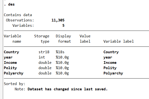
I start by closing the logs that have been previously opened. It may be useful to add capture in order to not have an error message if no log is open. Then, I open a log called book_gt, clear the previously opened data (if any) with clear, and clear the main screen with cls. I import the data with import excel and display some descriptive statistics with des, the abbreviation for describe.
**#************ Book GT ****************************************

capture log close _all

#delimit ;
log using book_gt,
 name(book_gt) text replace ;
#delimit cr

clear

cls

**#************* Prepare ***************************************

cd C:\Users\jamel\Dropbox\Latex\BookMartinPaldam\

#delimit ;
import excel
 "All-all-non-OPEC.xlsx",
 sheet("Sheet1") cellrange(A1:E11306) firstrow clear ;
#delimit cr

des
Then, I choose the font, with graph set window fontface, and the theme, with set scheme, for the graphs. Saving the data at this stage allows saving time if you would rather not replicate the import excel part.
**#************* Choose font and theme *************************

graph set window fontface "Times New Roman"
set scheme stcolor
*set scheme Cleanplots

save gt-book-data-1.dta, replace
I start by opening a Word file and I select the font and the font size. Then, I summarize the data with summ, the abbreviation for summarize. The command lpoly is used to estimate the transition curve, which is a nonlinear relationship. The income level will explain the nature of the political system. The produced graph will be included in the Word file by opening a paragraph thanks to putdocx paragraph. I can display the confidence intervals with ci and remove the scatter with nosc. The rest of the code is straightforward.
**#*********** Regressions *************************************

putdocx begin, font("Times New Roman", 12)

summ Income-Polyarchy

lpoly  Polity Income, bw(0.3) ci legend(pos(6) col(3))
lpoly  Polity Income, bw(0.3) ci nosc legend(pos(6) col(3))

graph rename Polity_Income, replace
graph export Polity_Income.png, as(png) width(4000) replace

putdocx paragraph, halign(center)

putdocx image Polity_Income.png

putdocx save book_gt, replace

**#*********** Regressions Again *******************************

#delimit ;
import excel
  "All-all-non-OPEC.xlsx",
 sheet("Sheet2") cellrange(A1:E11120) firstrow clear ;
#delimit cr

save gt-book-data-2.dta, replace

putdocx begin, font("Times New Roman", 12)

summ Income-Polyarchy

lpoly  Polity Income, bw(0.3) ci legend(pos(6) col(3))

lpoly  Polity Income, bw(0.3) ci nosc legend(pos(6) col(3))

graph rename Polity_Income, replace

graph export Polity_Income2.png, as(png) width(4000) replace

putdocx paragraph, halign(center)

putdocx image Polity_Income2.png

putdocx save book_gt, append

**#*************************************************************

log close book_gt
exit 
Finally, you can download the two produced files: