Today, I will show how to add shaded areas for NBER recession dates with Stata. I begin by importing the data of the Sahm Rule with Stata:
**# ****** Shaded areas for recessions *************************

/*
set fredkey key, permanently // Add your own key
*/

/*
fredsearch sahm rule
*/

import fred SAHMREALTIME SAHMCURRENT, clear

display=td(01jan2000)

keep if daten>=td(01jan2000)

generate datem = mofd(daten)

tsset datem, monthly

label variable SAHMREALTIME ///
 "Real-time Sahm Rule"

label variable SAHMCURRENT ///
 "Current Sahm Rule"

label variable datem ///
 "Time"
The Sahm recession rule is described on the FRED website:
https://research.stlouisfed.org/publications/research-news/fred-adds-sahm-rule-recession-indicators
We will replicate the steps that you will find on this website and change a bit the code to have some controls over the recession dates:
https://blog.stata.com/2020/02/13/adding-recession-shading-to-time-series-graphs/
* Recession dates
display tm(2001m3)
display tm(2001m11)
display tm(2007m12)
display tm(2009m6)
display tm(2020m2)
display tm(2020m4)

tsset datem

tsline SAHMCURRENT SAHMREALTIME, tlabel(, format(%tmCCYY))
graph rename sahm, replace

display tm(2001m1) tm(2024m1)

generate REC = 0
replace REC = 1 if datem>=tm(2001m3) & datem<=tm(2001m11) | ///
                   datem>=tm(2007m12) & datem<=tm(2009m6) | ///
		   datem>=tm(2020m2) & datem<=tm(2020m4)

gen REC13=REC*13 // Scale up the bars

label variable recession "NBER Recession"

label variable REC13 ///
 "NBER recessions"

set scheme white_jet
summarize SAHMREALTIME
generate recession = 13 if REC13 == 13 // 13 is the max of the y-axis
replace  recession = -0.5 if REC13 == 0

twoway (bar recession datem, color(gs14%50) lstyle(none) ///
        barwidth(1) bargap(0) base(-0.5)) ///
 (tsline SAHMCURRENT SAHMREALTIME, lcolor(gold blue) ///
  xlabel(482 542 602 666 726 776) ///
  tlabel(482 542 602 666 726 776, ///
  format(%tmCCYY))), yline(0.5) legend(pos(1) row(1)) ///
 text(14 508 "{bf:Internet Krach}" "{it:NBER dates}", ///
  size(small)) ///
 text(14 590 "{bf:Global Financial Crisis}" ///
  "{it:NBER dates}", size(small)) ///
 text(14 722 "{bf:Pandemic Crisis}" "{it:NBER dates}", ///
  size(small)) ///
 text(1.5 770 "{bf:Dec. 2023}""{it:0.23}", size(small)) ///
 note("Recession = 3-month average UR rises a 0.5 point above prior 12 months lower point.", size(small)) ///
 graphregion(margin(l+2 r+2))

// Export the graph in two different formats

graph rename sahmrule, replace
graph export figures\sahmrule.png, as(png) ///
 width(4000) replace
graph export figures\sahmrule.pdf, as(pdf) ///
 replace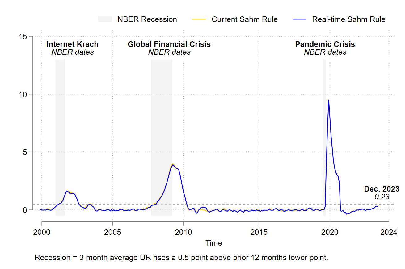
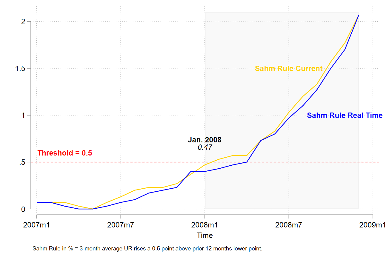
With a bit of a coding effort, I will replicate the graph on the last post on the topic on the EconBrowser website:
https://econbrowser.com/archives/2024/01/are-we-in-recession-the-sahm-rule-now-2007
// Run everthing between preserve and restore
***
preserve
keep if datem>=tm(2007m1) & datem<=tm(2008m12)
generate Rec = 0
replace Rec = 2.1 if datem>=tm(2008m1) & datem<=tm(2008m12)
twoway (area Rec datem if datem>=tm(2008m1) & ///
datem<=tm(2008m12), color(gs14%25)) ///
(tsline SAHMCURRENT SAHMREALTIME, lcolor(gold blue) ///
xlabel()), yline(0.5, lcolor(red)) legend(off) ///
text(0.6 566 "{bf:Threshold = 0.5}", size(small) ///
color(red)) ///
text(0.7 576 "{bf:Jan. 2008}""{it:0.47}", size(small)) ///
text(1.5 582 "{bf:Sahm Rule Current}", size(small) ///
color(gold)) ///
text(1 586 "{bf:Sahm Rule Real Time}", size(small) ///
color(blue)) ///
note("Sahm Rule in % = 3-month average UR rises a 0.5 point above prior 12 months lower point.", size(vsmall)) ///
graphregion(margin(l+2 r+2))
graph rename sahmruleGFC, replace
graph export figures\sahmruleGFC.png, as(png) ///
width(4000) replace
graph export figures\sahmruleGFC.pdf, as(pdf) ///
replace
restore
***
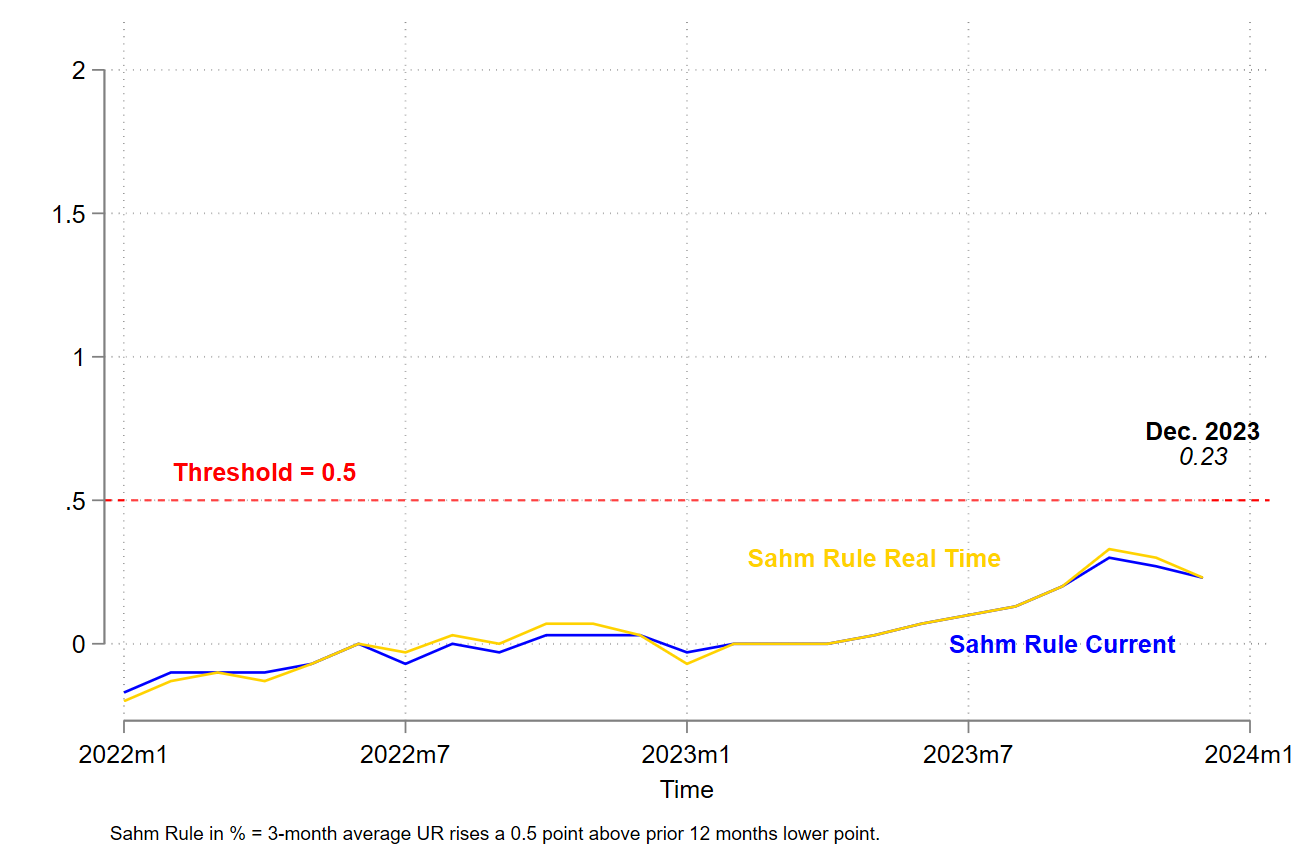
// Run everthing between preserve and restore
***
preserve
keep if datem>=tm(2022m1) & datem<=tm(2023m12)
generate Rec = 0
replace Rec = 2.1 if datem>=tm(2022m1) & datem<=tm(2023m12)
twoway (area Rec datem if datem>=tm(2022m1) & ///
datem<=tm(2023m12), color(white%25)) ///
(tsline SAHMCURRENT SAHMREALTIME, lcolor(blue gold) ///
xlabel()), yline(0.5, lcolor(red)) legend(off) ///
text(0.6 747 "{bf:Threshold = 0.5}", size(small) ///
color(red)) ///
text(0.7 767 "{bf:Dec. 2023}""{it:0.23}", size(small)) ///
text(0 764 "{bf:Sahm Rule Current}", size(small) ///
color(blue)) ///
text(0.3 760 "{bf:Sahm Rule Real Time}", size(small) ///
color(gold)) ///
note("Sahm Rule in % = 3-month average UR rises a 0.5 point above prior 12 months lower point.", size(vsmall)) ///
graphregion(margin(l+2 r+2))
graph rename sahmruleNow, replace
graph export figures\sahmruleNow.png, as(png) ///
width(4000) replace
graph export figures\sahmruleNow.pdf, as(pdf) ///
replace
restore
***
// Save data
save data\sahmrule.dta, replace
Then, we will produce the same kind of figure for a variable with positive and negative value. I will use the US current account balance in percent of GDP:
**# *********** Current account balance ************************

fredsearch USAB6BLTT02STSAQ

import fred USAB6BLTT02STSAQ, clear

*display=td(01jan2000)

*keep if daten>=td(01jan2000)

generate datem = mofd(daten)

generate dateq = qofd(daten)

tsset dateq, quarterly

label variable USAB6BLTT02STSAQ ///
"US current account balance in percent"

label variable dateq ///
 "Time"

*keep if dateq>=tq(2000q1)

capture drop REC
generate REC = 0
replace REC = 1 if datem>=tm(1960m4) & datem<=tm(1961m2)  | ///
                   datem>=tm(1969m12) & datem<=tm(1970m11) | ///
		   datem>=tm(1973m11) & datem<=tm(1975m3) | ///
		   datem>=tm(1980m1) & datem<=tm(1980m7)  | ///
                   datem>=tm(1981m7) & datem<=tm(1982m11) | ///
		   datem>=tm(1990m7) & datem<=tm(1991m3)  | ///
		   datem>=tm(2001m3) & datem<=tm(2001m11) | ///
                   datem>=tm(2007m12) & datem<=tm(2009m6) | ///
		   datem>=tm(2020m2) & datem<=tm(2020m4)

summarize USAB6BLTT02STSAQ
generate recession = 2 if REC == 0 // 2 is the max of the y-axis
replace  recession = r(min) if REC == 1
*local max = r(max)

label variable recession ///
 "NBER Recession dates"

twoway (bar recession dateq, color(gs14%50) lstyle(none) ///
 barwidth(1) bargap(0) base(2)) /// 2 is the max of the y-axis
 (tsline USAB6BLTT02STSAQ, lcolor(blue) ///
  , yline(0) legend(pos(1)) xsize(8) ///
   tlabel(#11 , format(%tqCCYY))), ///
   text(1 156 "{bf:Internet Krach}" "{it:NBER dates}", ///
    size(small)) ///
   text(1 196 "{bf:Financial Crisis}" "{it:NBER dates}", ///
    size(small)) ///
   text(1 240 "{bf:Pandemic Crisis}" "{it:NBER dates}", ///
    size(small))

// Export the graph in two different formats

graph rename uscab, replace
graph export figures\uscab.png, as(png) ///
 width(4000) replace
graph export figures\uscab.pdf, as(pdf) ///
 replace

save data\uscab.dta, replace

**# ** The end of program ************************************** 
As we have seen in this blog, it is possible in some simple steps to add NBER recession shading in time series graphs. The files for replicating the results in this blog are available on my GitHub.
2 Comments
[…] Adding shaded areas for NBER recessions with Stata […]
[…] Adding shaded areas for NBER recessions with Stata […]