In his last book, La Défaite de l’Occident, Emmanuel Todd, a French historian and demographer, argues that the infant morality rate is higher in the US than in Russia.
Emmanuel Todd is famous for having “predicted” the fall of the USSR in his essay, La Chute Finale, in 1976. At that time, most of the observers still considered the USSR as a superpower together with the US. However, the massive increase in the infant mortality rate in the URSS was a harbinger of its fall in 1991.
Today, I will show how to use the labmask command to plot graphs that compare the infant mortality rate of the US and Russia. The data will be retrieved directly from the World Bank’s thanks to the Dbnomics package. I will build on the following two previous blogs:
First, I download the data, the infant mortality series (SP.DYN.IMRT.IN), thanks to the DBnomics package. I specify the provider, the World Bank (WB), and the database, The World Development Indicators (WDI). After removing the unnecessary information, I use the package kountry to generate IMF codes. Finally, I declare my data as a panel dataset with the command xtset.
**#****** On the use of labmask ********************************

cd C:\Users\jamel\Documents\GitHub\EconMacroBlog\Labmask

// Use dbnomics to import data

dbnomics import, pr(WB) d(WDI) ///
         indicator("SP.DYN.IMRT.IN") clear
rename   value INF_MORT
destring INF_MORT, replace force
split    series_name, parse(–)
encode   series_name3, generate(cn)
keep     cn country period INF_MORT
order    cn country period INF_MORT
kountry  country, from(iso3c) to(imfn) m
list     cn country _IMFN_ MARKER ///
         if period == 2020 & MARKER == 0
drop     if MARKER == 0
drop     NAMES_STD MARKER
rename   _IMFN_ imfcode
order    cn country imfcode period
drop     if imfcode==.
xtset    imfcode period
xtdes
Now, I will plot the graph without using the labmask command. Here, I will see that the countries’ names will not be displayed because the identifiers of the data are the IMF codes, a numeric value, and the period.
// Without labmask

label variable INF_MORT ///
 "Mortality rate, infant (per 1,000 live births)"

xtline INF_MORT if imfcode==111 | imfcode==922, ///
 overlay xline(2017) note(series: SP.DYN.IMRT.IN)

// Export the graph in two different formats

graph rename withoutlab, replace
graph export figures\without.png, as(png) ///
 width(4000) replace
graph export figures\without.pdf, as(pdf) ///
 replace
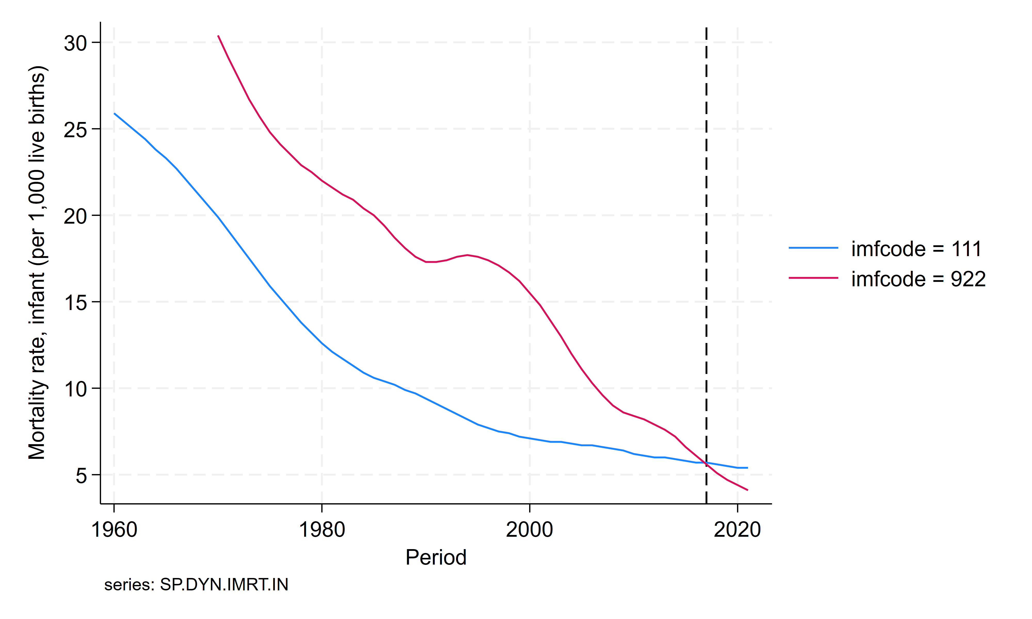
In the previous graph, you can see that the IMF codes of the US and Russia are displayed because the country identifier, imfcode, contains no information about the country’s name. I will use the command labmask in order to attach the information contained in the string variable country into the country identifier, imfcode.
// With labmask


labmask imfcode, values(country)

label variable INF_MORT ///
 "Mortality rate, infant (per 1,000 live births)"

xtline INF_MORT if imfcode==111 | imfcode==922, ///
 overlay xline(2017) note(series: SP.DYN.IMRT.IN)

// Export the graph in two different formats

graph rename withlab, replace
graph export figures\with.png, as(png) ///
 width(4000) replace
graph export figures\with.pdf, as(pdf) ///
 replace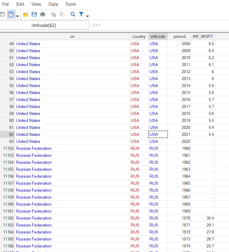

Now, the graph displays the names of the countries. The imfcode variable has value labels coming from the country variable. The country with the code 111 will be displayed as the USA in the graphs. The country with the code 922 will be displayed as the Russian Federation. After 2017, the infant mortality is higher in the US than in the Russian Federation.
As we have seen in this blog, it is possible in some simple steps to add value labels for country names in time series graphs. The files for replicating the results in this blog are available on my GitHub.