In this blog, I will show you how to plot a 3D plot based on a two-way fixed effect panel model with an interaction term. The data and the code used in this blog are available in the following GitHub folder: Aizenman Ho Huynh Saadaoui Uddin 2024.
It is based on the following publication in the Journal of International Money and Finance: Aizenman, J., Ho, S. H., Huynh, L. D. T., Saadaoui, J., & Uddin, G. S. (2024). Real exchange rate and international reserves in the era of financial integration. Journal of International Money and Finance, 141, 103014, doi: 10.1016/j.jimonfin.2024.103014.
Start by opening a log file and loading the data:
**# Replicaction package for
* "Real exchange rate and international reserves in the era of financial integration"

capture log close _all
log using RERTOT_JIMF.smcl, name(RERTOT_JIMF) smcl replace

use datafintransformed-22-11-17, clear
Then, estimate the model with
**# Fig. 2. 3-D plot for the buffer effect.

**One lag for reserves + Balanced panel**
areg lreer lgdppk_m100 lgovexp c.etot##c.L1lres yr* ///
if count_lgovexp==20, ///
absorb(cn) vce(bootstrap, reps(200))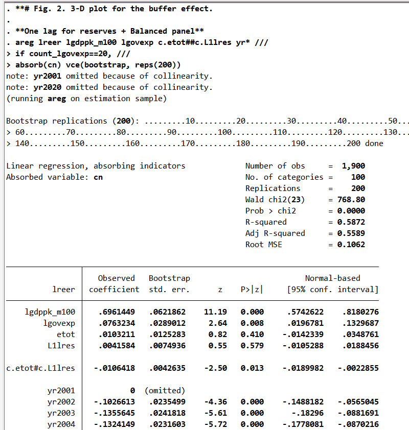
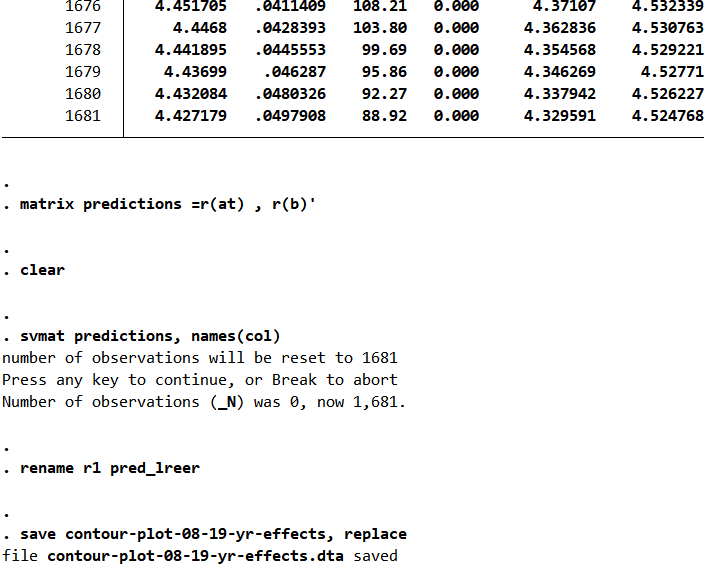
Create the prediction and store them:
// Create predictions for the interaction and store them
margins, at( L1lres=(1(0.1)5) etot=(1(0.1)5))

matrix predictions =r(at) , r(b)'

clear

svmat predictions, names(col)

rename r1 pred_lreer

save contour-plot-08-19-yr-effects, replace
It takes time, so please be patient.
For the next step, you need to have Python installed on your PC. Use the following to search the path of your Python installation and (re-)install the matplotlib package. Load the marginal effects with pandas:
// Use python to plot the 3-D figure

python search

*cmd then, "C:\Users\jamel\AppData\Local\Programs\Python\Python313\python.exe" -m pip install matplotlib

clear

python:

import pandas as pd
data = pd.read_stata("contour-plot-08-19-yr-effects.dta")
data[['etot','L1lres','pred_lreer']]

end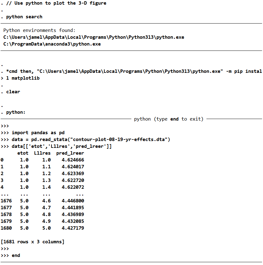
Plot the 3D Figure:
// Create the three-dimensional surface plot with Python
// Install matplotlib with conda (cmd)
python:
import pandas as pd
import numpy as np
import matplotlib.pyplot as plt
from mpl_toolkits.mplot3d import Axes3D  # Needed for 3D plots

# Load the Stata dataset
data = pd.read_stata("contour-plot-08-19-yr-effects.dta")

# Create a new 3D figure
fig = plt.figure()
ax = fig.add_subplot(111, projection='3d')

# Plot the 3D surface using triangular surface interpolation
ax.plot_trisurf(
    data['etot'],
    data['L1lres'],
    data['pred_lreer'],
    cmap=plt.cm.Spectral_r
)

# Set axis ticks
ax.set_xticks(np.arange(1, 5, step=1))
ax.set_yticks(np.arange(1, 5, step=1))
ax.set_zticks(np.arange(4.42, 4.62, step=0.04))

# Set title and axis labels (only once!)
ax.set_title("Buffer Effect")
ax.set_xlabel("Log of effective terms of trade")
ax.set_ylabel("Log of lagged reserves")
ax.zaxis.set_rotate_label(False)
ax.set_zlabel("Predicted REER", rotation=90)

# Set the view angle (elevation and azimuth)
ax.view_init(elev=30, azim=75)

# Save the figure in high resolution
plt.savefig("Margins3d.png", dpi=1200)
plt.savefig("Margins3d.pdf", dpi=1200)

# Close the plot to prevent duplicate displays
plt.close()
end
The result is now available in PNG and PDF format in the same folder in which you ran the code:
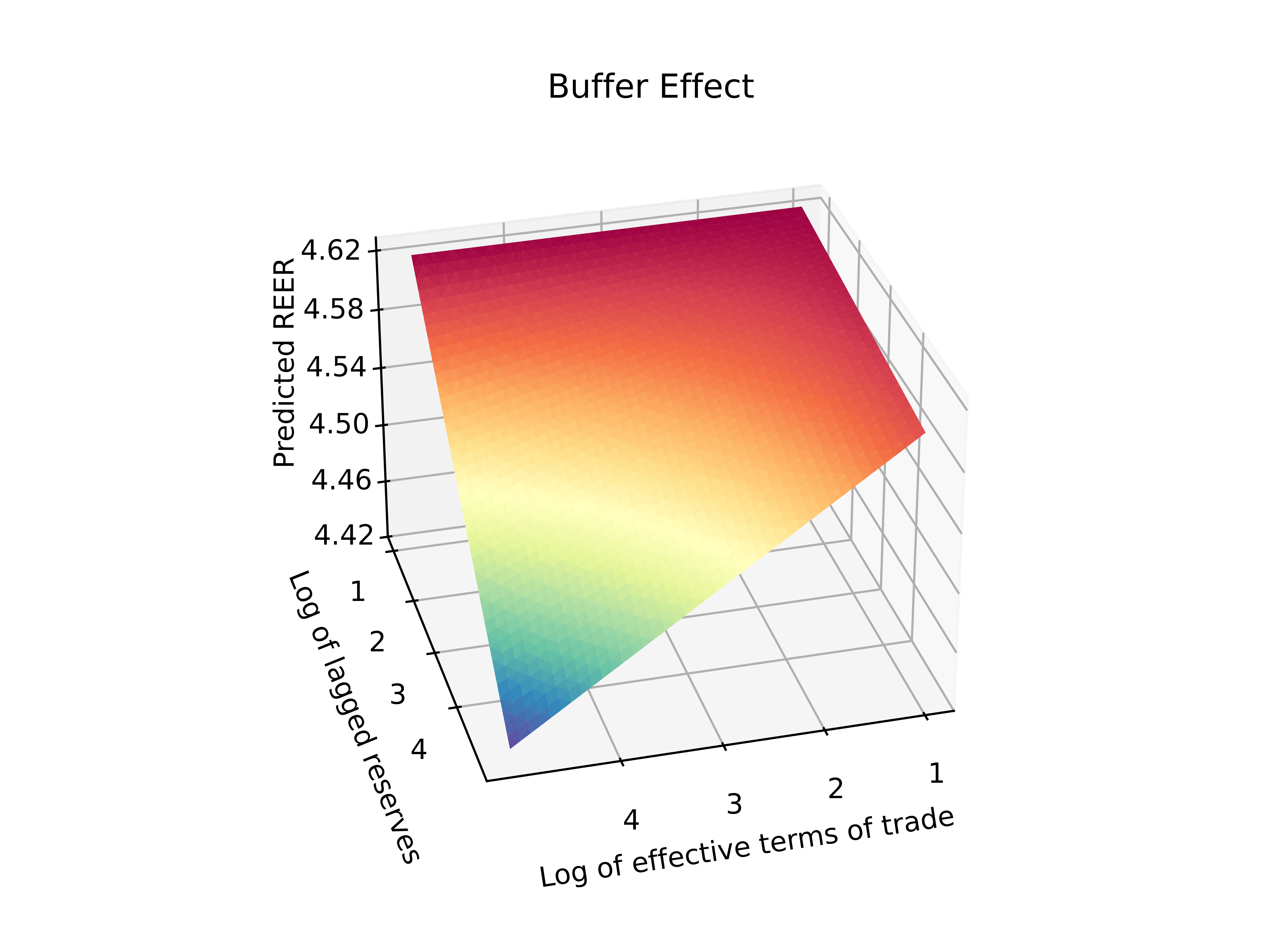
From the article: In Fig. 2, we provide the 3-D plot to illustrate the interaction between the effective terms of trade and the lagged international reserves.15 Visualizing the interaction between two continuous variables can be difficult because there are no discrete values for which we could interpret the influence of a first explanatory variable, which is the effective terms of trade, for different levels of a second explanatory variable, which is the lagged level of reserves, on the real exchange rate. On the one hand, we can see in Fig. 2 that the effect of terms of trade shocks is stronger when countries have a low level of reserves (red areas). On the other hand, we can see in Fig. 2 that the effect of trade shock terms is weaker when countries have a high level of reserves (blue area).