Allow me to share a very nice interactive map of World Bank’s top 10 biggest debtors: https://www.fdiintelligence.com/content/686944bf-3818-5791-9f76-b97856fb8607
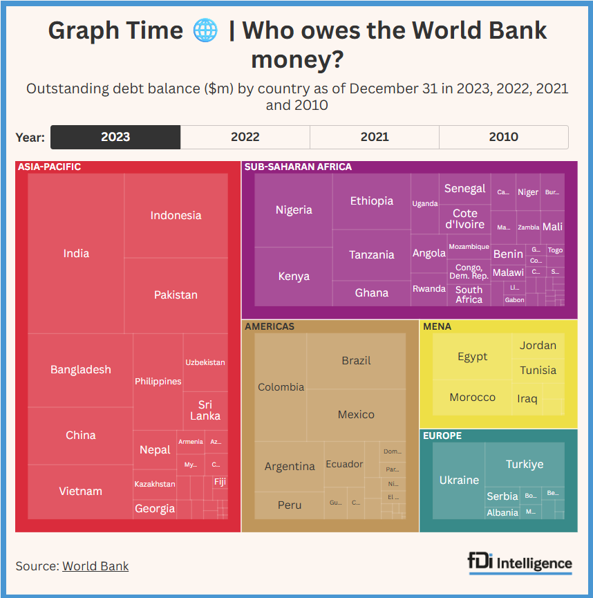
Allow me to share a very nice interactive map of World Bank’s top 10 biggest debtors: https://www.fdiintelligence.com/content/686944bf-3818-5791-9f76-b97856fb8607
In this blog, I will show how to estimate Panel VAR with the new command xtvar introduced in StataNow. The dataset comes from a paper of mine on…
Let me show you how to add a third dimension on a bivariate maps in this second update of my blog on drawing bivariate maps for the Chinese…
In previous research of mine, I proposed a simple and efficient method to identify what I called the geopolitical turning points — unexpected change in bilateral geopolitical relationships.…
If you are familiar with the heatmaps with Stata, you might have encountered an annoying problem. When you want to make the legend, the title is the name…