If you are familiar with the two-way graphs with Stata, you might have encountered an annoying problem. When you want to make a two-way graph more readable, the overlaid graphs may mask each other. This is not something that you necessarily want. The objective of this blog is to reproduce the picture below and make the bar chart less opaque.
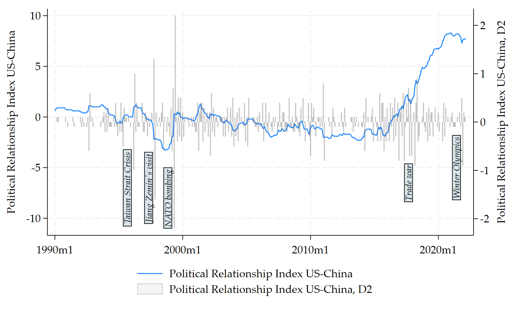
tw (tsline spri) ///
(bar d2.pri Period, yaxis(2) bcolor(black%20) ///
        fintensity(inten20) ///
        lcolor(black)), ///
 legend(col(1) pos(6)) ylabel(#5) ///
 xlabel(#5) xti("") yscale(range(-11 10)) ///
 name(CZ_OxREP, replace)  ///
  text(-7 428 "{it:Taiwan Strait Crisis}", ///
  size(small) orient(vertical) box) ///
    text(-7 448 "{it:Jiang Zemin's visit}", ///
  size(small) orient(vertical) box) ///
    text(-8 466 "{it:NATO bombing}", ///
  size(small) orient(vertical) box) ///
    text(-6.5 692 "{it:Trade war}", ///
  size(small) orient(vertical) box)  ///
    text(-5 737 "{it:Winter Olympics}", ///
  size(small) orient(vertical) box)


graph export CZ_OxREP.png, as(png) width(4000) replace
You have to use the options in bold. If you do not do that, you will end up with the less readable two-way graph below:
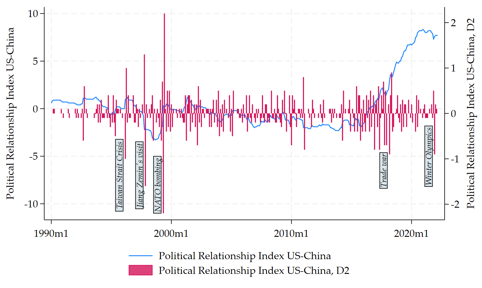
I hope this is useful for some of you. That is it for today.