The most complete blog of mine on maps with Stata. I used spmap, grmap, geoplot with one frame and multiple frames. Other examples are given for regions of Austria, France, Tunisia, and Ghana. The name of the regions can be in the local language or in English.
I am grateful to Friedrich Hübler, Anders Sundell, Ben Jann, Asjad Naqvi, PhD, Fahad Mirza (فہد مرزا) for their very nice blogs, and all the guys (Andrew Chan, Robert Picard, Andrea Berni, Scott Merryman, Aziz Essouaied, Jared Greathouse) that posted very useful tips on the Stata forum. The full code available on my GitHub.
Today, I will build on my previous blogs to show you how to draw a map of the Chinese regions. You have to download the “Admin 1 – States, Provinces” on the Natural Earth website:
(Step A) We will download the files to build the map on the following website:
https://www.naturalearthdata.com/
**#******** Download the map files *****************************

/*
https://www.naturalearthdata.com/
http//www.naturalearthdata.com/download/10m/cultural/
ne_10m_admin_1_states_provinces.zip
*/

spshape2dta data\ne_10m_admin_1_states_provinces, replace

use ne_10m_admin_1_states_provinces.dta, replace
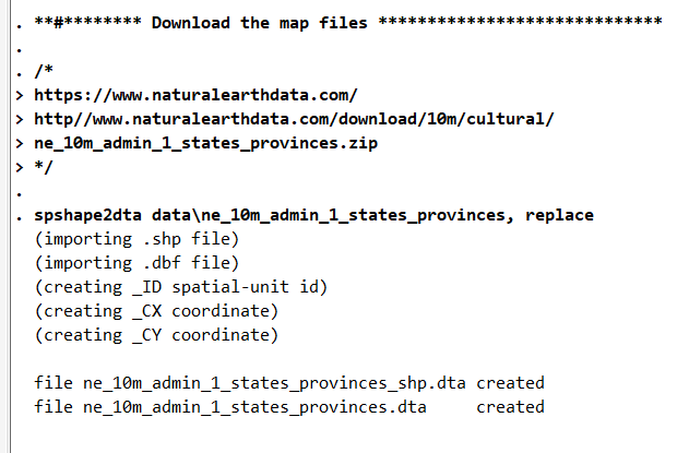
The spshape2dta package will build the files necessary to draw the maps, as you can see in the last two lines of the image below:
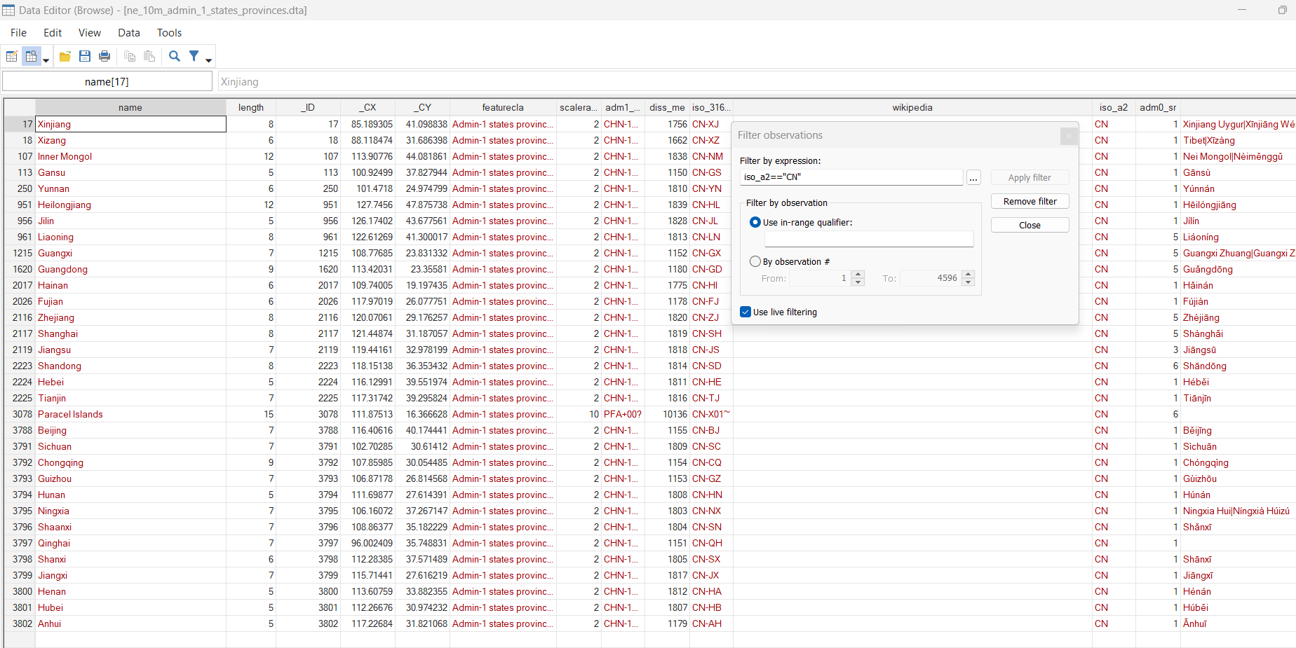
Then, in the image below, we can see that the Stata database built at the first step, ne_10m_admin_1_states_provinces.dta, contains (a) the name of the region, (b) its ID (_ID) and (c) its Cartesian coordinates in _CX and _CY. For example, I filtered the Chinese province with the command, iso_a2==”CN”:
(Step B) We draw a first map of with the length of the region’s name using Stata function length(). Let me draw your attention to the following point. The grmap command is the official version of spmap command and has the same functioning. The format command allows having the desired number of decimals in the legends of the maps:
**#*** Generate a variable with the length of the name *********

generate length = length(name)

format LPOP %4.0f

order name length, first

**#*** Draw the map ********************************************

grmap, activate

grmap length using ne_10m_admin_1_states_provinces_shp.dta ///
 if iso_a2 == "CN", id(_ID) ///
 fcolor(Blues)  ///
 osize(vvthin vvthin vvthin vvthin) ///
 ndsize(vvthin) ///
 ndfcolor(gray) clmethod(quantile) ///
 title("Region name length")

graph rename Graph map_china_regions, replace

graph export figures\map_china_regions.png, as(png) ///
 width(4000) replace
graph export figures\map_china_regions.pdf, as(pdf) ///
 replace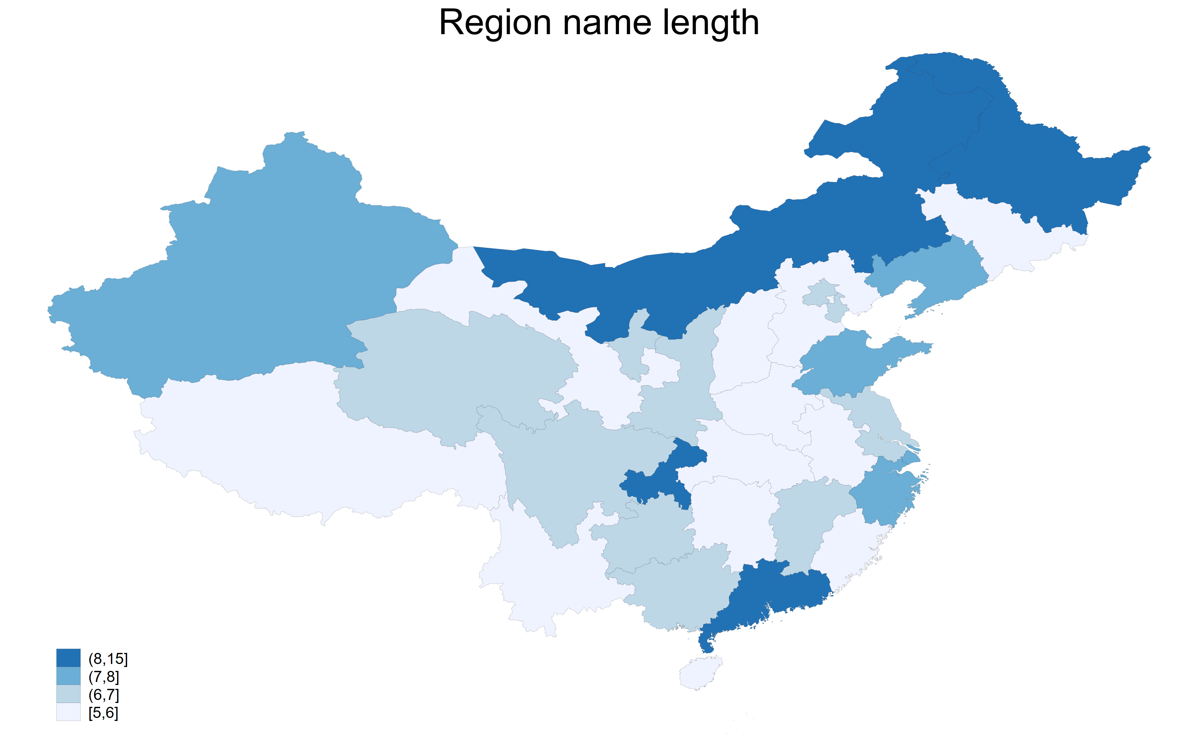
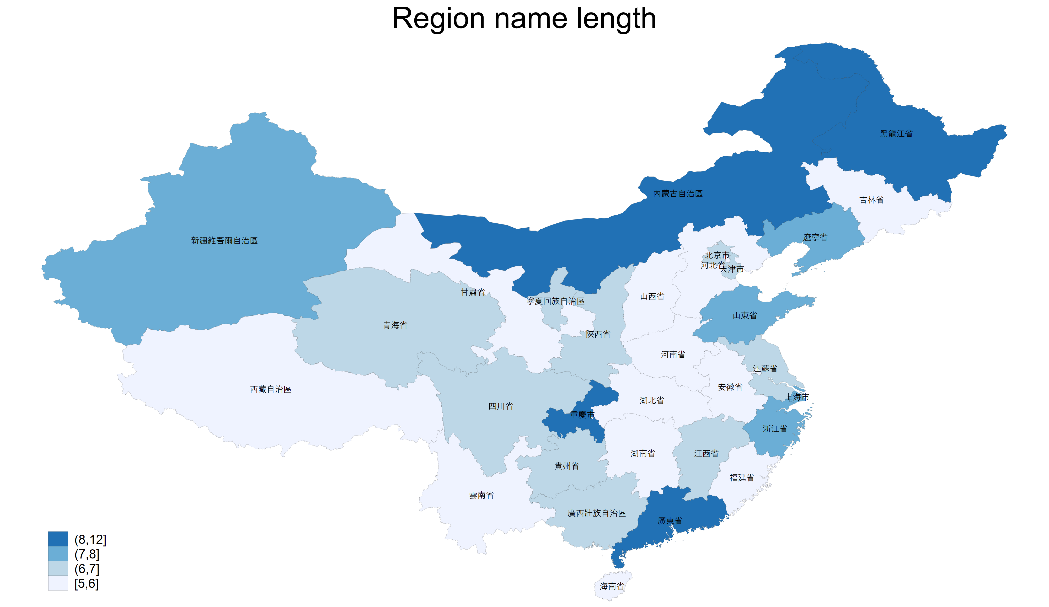
Besides, I can decide to add the names of the regions in English, with the option, label(name), or in Chinese, label(name_zht). I use the commands preserve and restore to drop the names of the other regions and recover the full database afterward. Note that you need to run everything between preserve and restore at the same time:
**#*** Draw the map for Chinese regions with names **************

// Run everything between preserve and restore

*grmap, activate

preserve

keep if iso_a2 == "CN" & name != "Paracel Islands"

grmap length using ne_10m_admin_1_states_provinces_shp.dta ///
 if iso_a2 == "CN", id(_ID) ///
 fcolor(Blues)  ///
 osize(vvthin vvthin vvthin vvthin) ///
 ndsize(vvthin) ///
 ndfcolor(gray) clmethod(quantile) ///
 title("Region name length") label(xcoord(_CX) ycoord(_CY) ///
 label(name_zht) size(*.5))

graph rename Graph map_china_regions, replace

graph export figures\map_china_regions.png, as(png) ///
 width(4000) replace
graph export figures\map_china_regions.pdf, as(pdf) ///
 replace

restore
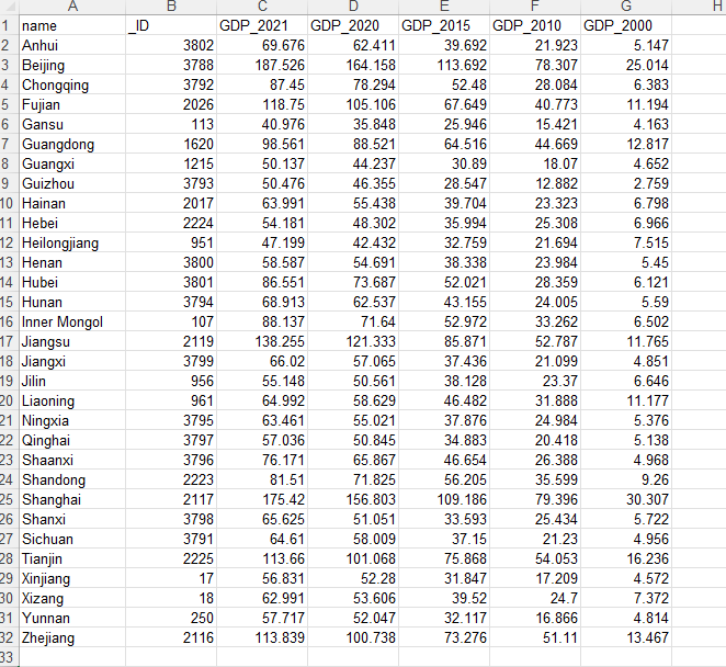
I can also use some data about regional GDP for Chinese provinces that you can find here: http://www.stats.gov.cn/english/. Then, I change the beginning of the code as follows to merge the data with Natural Earth’s data. I merge the data with the identifier _ID (the Excel file has to be prepared in advance to have a matching between the regions and the identifiers):
**#******** Download the map files *****************************

/*
https://www.naturalearthdata.com/
http//www.naturalearthdata.com/download/10m/cultural/
ne_10m_admin_1_states_provinces.zip
*/

spshape2dta data\ne_10m_admin_1_states_provinces, replace

// Download Regional GDP for China and merge it

import excel data\Regional_GDP.xlsx, sheet("Feuil1") ///
 cellrange(B1:G32) firstrow clear

save Regional_GDP.dta, replace

use ne_10m_admin_1_states_provinces.dta, replace

merge 1:1 _ID using "Regional_GDP.dta", nogenerate
Then, I draw the map of the GDP per person in 2021 for Chinese provinces in Chinese Yuan. Depending on the number of classes for your absolute frequencies, you can choose the thickness of the borders with the option osize(). The number of elements in the parenthesis will depend on your number of classes. For example, you can use osize(vvthin vvthin vvthin vvthin) if you have 4 classes, add more vvthin if you have more classes:
// Run everything between preserve and restore

preserve

format GDP_* %4.2f

keep if iso_a2 == "CN" & name != "Paracel Islands"

grmap GDP_2021 using ne_10m_admin_1_states_provinces_shp.dta ///
 if iso_a2 == "CN", id(_ID) ///
 fcolor(YlOrRd)  ///
 osize(vvthin vvthin vvthin vvthin) ///
 ndsize(vvthin) ///
 ndfcolor(gray) clmethod(quantile) ///
 title("GDP per capita in thousands of Chinese Yuan (2021)") ///
 label(xcoord(_CX) ycoord(_CY) ///
 label(name) size(*.5) length(50))

// use osize(vvthin vvthin vvthin vvthin) if you have 4 classes
// add more vvthin if you have more classes

graph rename Graph map_china_regions_gdp, replace

graph export figures\map_china_regions_gdp.png, as(png) ///
 width(4000) replace
graph export figures\map_china_regions_gdp.pdf, as(pdf) ///
 replace

restore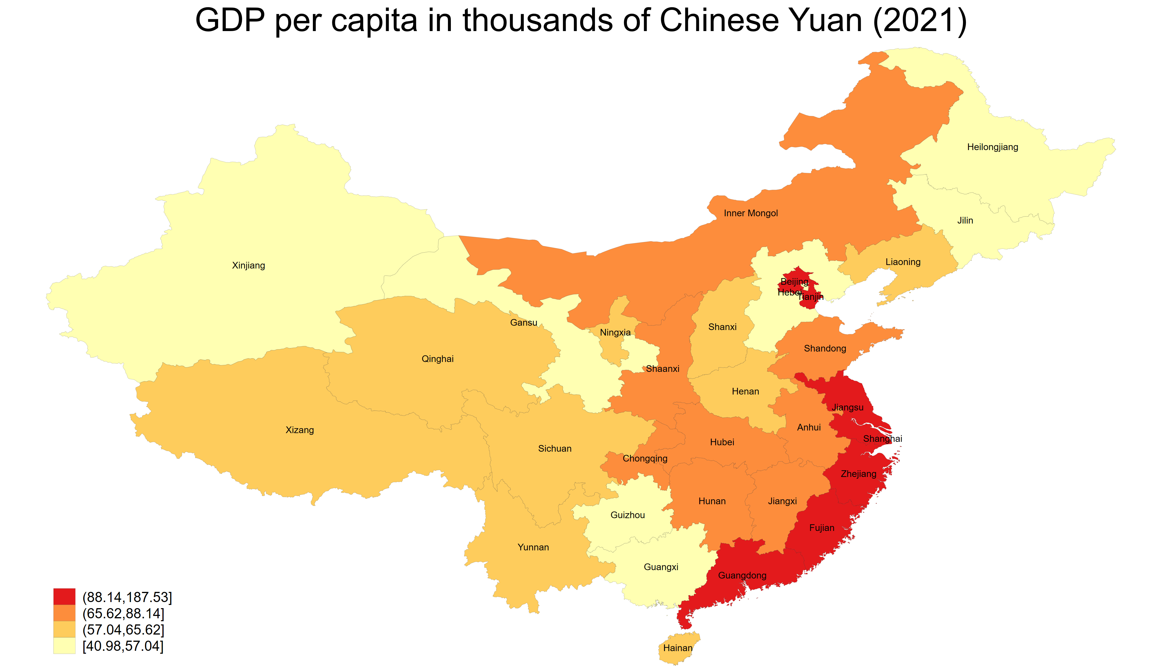
Last example, for the Chinese provinces, I can also use the new geoplot package (https://github.com/benjann/geoplot). The strength of this package is “Multiple layers of elements such as regions, borders, lakes, roads, labels, and symbols can be freely combined”, as mentioned in the description of the package on Ben Jann’s GitHub. First, I install the recommended and necessary packages. Then, I create my first frame with the information that I gathered from the previous maps, the dta file, ne_10m_admin_1_states_provinces.dta, the shp file, ne_10m_admin_1_states_provinces_shp.dta, the regions’ ID (_ID) and the coordinates, (_CX _CY). In the geoplot command, I use the option in the area, line, and label sub-commands to customize the appearance of the regions, the borders, and the region’s name, respectively. Lastly, I use the “global” option to place the legend and put a title on the map:
**#*** Use Geoplot for Chinese regions *************************

/*
ssc install palettes, replace
ssc install colrspace, replace
ssc install moremata, replace
net install geoplot, replace ///
 from(https://raw.githubusercontent.com/benjann/geoplot/main/)
*/

*help colorpalette

// Run everything between preserve and restore

preserve

geoframe create regions ///
 ne_10m_admin_1_states_provinces.dta, id(_ID) ///
 coord(_CX _CY) ///
 shpfile(ne_10m_admin_1_states_provinces_shp.dta) ///
 replace

keep if iso_a2 == "CN" & name != "Paracel Islands"

merge 1:1 _ID using "Regional_GDP.dta", nogenerate

format GDP_* %4.0f

geoplot ///
 (area regions GDP_2021, color(Blues) ///
   label("@lb-@ub (N=@n)") ///
   levels(5, quantile weight(GDP_2021))) ///
 (line regions, lwidth(vvthin)) ///
 (label regions name, size(tiny) color(black)), ///
  legend(position(sw)) ///
  title("GDP per capita in thousands of Chinese Yuan (2021)")

graph rename Graph map_china_regions_geoplot, replace

graph export figures\map_china_regions_geoplot.png, as(png) ///
 width(4000) replace
graph export figures\map_china_regions_geoplot.pdf, as(pdf) ///
 replace

restore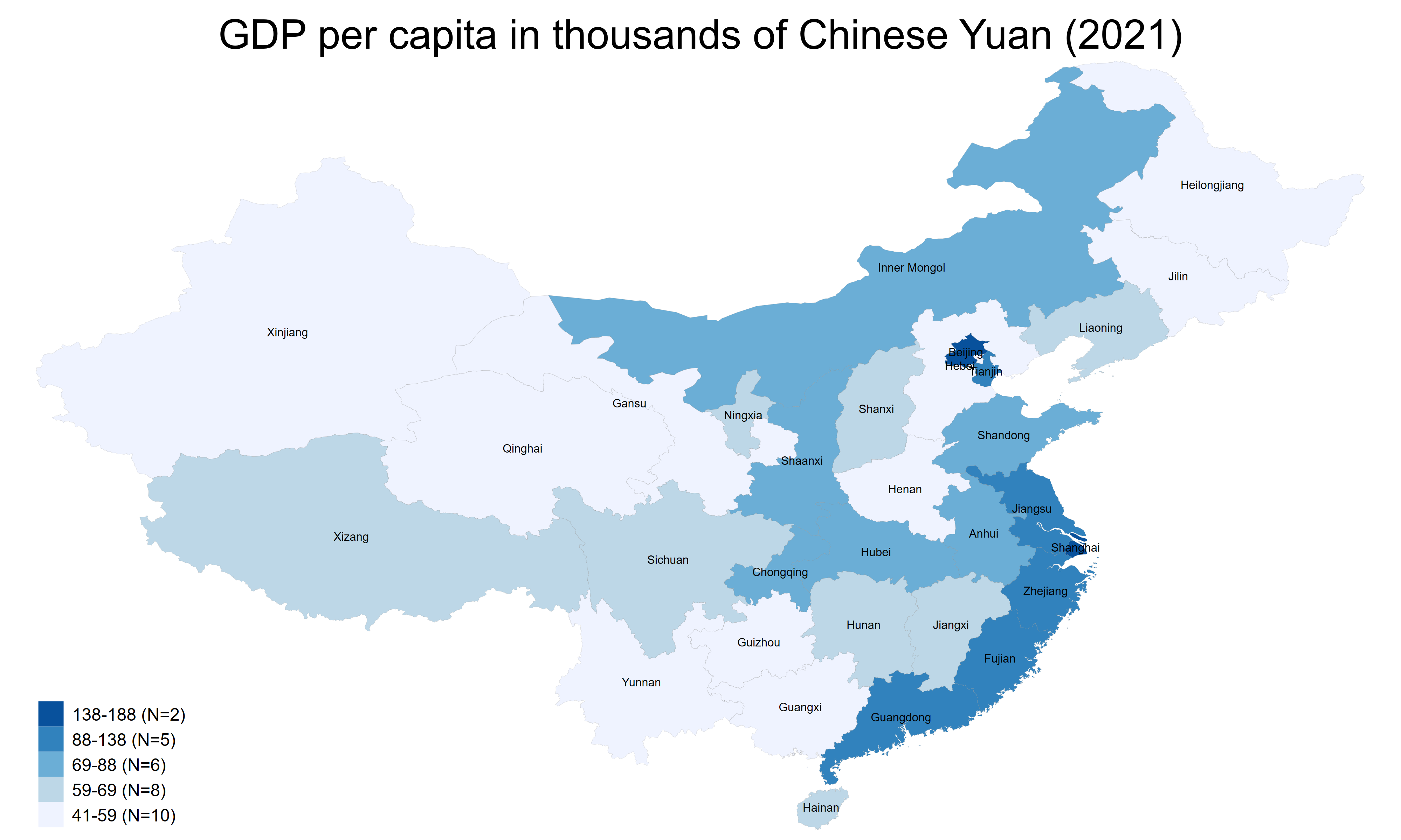
Finally, we will use information on populated places on the Natural Earth website to draw the map below:

First, I download the files for populated places and I sort ID in the SHP file, then do not forget to rename ISO_A2 iso_a2 to prepare the merging in the next step:
*#******** Download the map files *****************************
/*
https://www.naturalearthdata.com/http//www.naturalearthdata.com/download/10m/cultural/ne_10m_populated_places.zip
*/
spshape2dta data\ne_10m_populated_places, replace
// Sort ID in the SHP file
use ne_10m_populated_places_shp.dta, replace
/*
https://www.statalist.org/forums/forum/
general-stata-discussion/general/
1583924-very-weird-spmap-problem-master-data-not-sorted
*/
sort _ID
save ne_10m_populated_places_shp.dta, replace
use ne_10m_populated_places.dta, replace
keep if ISO_A2 == "CN"
sort POP_MAX
/*
grmap POP_MAX using ne_10m_populated_places_shp.dta ///
if ISO_A2 == "CN", id(_ID) ///
fcolor(Blues) ///
osize(vvthin vvthin vvthin vvthin) ///
ndsize(vvthin) ///
ndfcolor(gray) clmethod(quantile) ///
title("Populated Places")
*/
geoframe create towns ///
ne_10m_populated_places.dta, id(_ID) ///
coord(_CX _CY) ///
shpfile(ne_10m_populated_places_shp.dta) ///
replace
geoplot ///
(point towns if ISO_A2 == "CN" ///
& POP_MAX>1000000, color(black)) ///
(label towns NAME if POP_MAX>5000000 & ///
ISO_A2 == "CN", color(red) size(small)) ///
, legend compass
rename ISO_A2 iso_a2
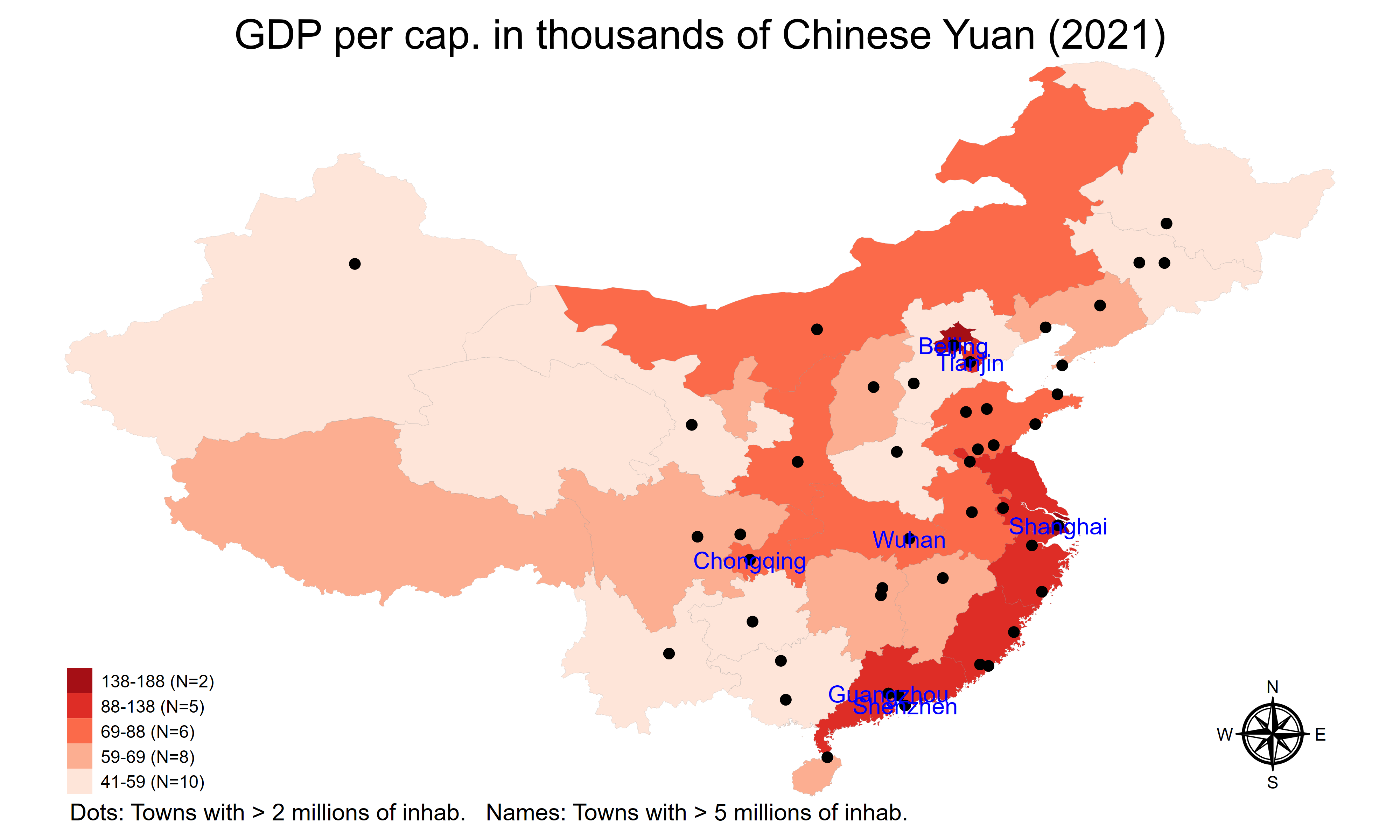
save ne_10m_populated_places.dta, replaceHere, I merge the regions and towns data to create two geoframes in the same dataset:
// Merge Provinces data and Towns data

use ne_10m_admin_1_states_provinces.dta, replace

merge m:m iso_a2 using "ne_10m_populated_places.dta", nogenerate

keep if iso_a2 == "CN"

// Create two geoframes

geoframe create towns ///
 ne_10m_populated_places.dta, id(_ID) ///
 coord(_CX _CY) ///
 shpfile(ne_10m_populated_places_shp.dta) ///
 replace


geoframe create regions ///
 ne_10m_admin_1_states_provinces.dta, id(_ID) ///
 coord(_CX _CY) ///
 shpfile(ne_10m_admin_1_states_provinces_shp.dta) ///
 replace

keep if iso_a2 == "CN" & name != "Paracel Islands"

merge 1:1 _ID using "Regional_GDP.dta", nogenerate

format GDP_* %4.0f
Finally, I draw the map with two layers, the region layer as before, and the new town layer. Do not forget to save the frames and the data at the end of your own code:
// Draw the map with two layers

geoplot ///
 (area regions GDP_2021, color(Reds) ///
   label("@lb-@ub (N=@n)") ///
   levels(5, quantile weight(GDP_2021))) ///
 (line regions, lwidth(vvthin)) ///
 (point towns if iso_a2 == "CN" ///
  & POP_MAX>2000000, color(black)) ///
 (label towns NAME if POP_MAX>5000000 & ///
  iso_a2 == "CN", color(blue) size(small)) ///
  , ///
  legend(position(sw)) compass ///
  title("GDP per cap. in thousands of Chinese Yuan (2021)") ///
  note(Dots: Towns with > 2 millions of inhab. ///
  Names: Towns with > 5 millions of inhab.)

graph rename Graph map_china_regions_frame, replace

graph export figures\map_china_regions_frame.png, as(png) ///
 width(4000) replace
graph export figures\map_china_regions_frame.pdf, as(pdf) ///
 replace

frame dir

frames save myframeset, ///
 frames(regions towns regions_shp towns_shp) replace

save data/maps_regions_towns.dta, replace
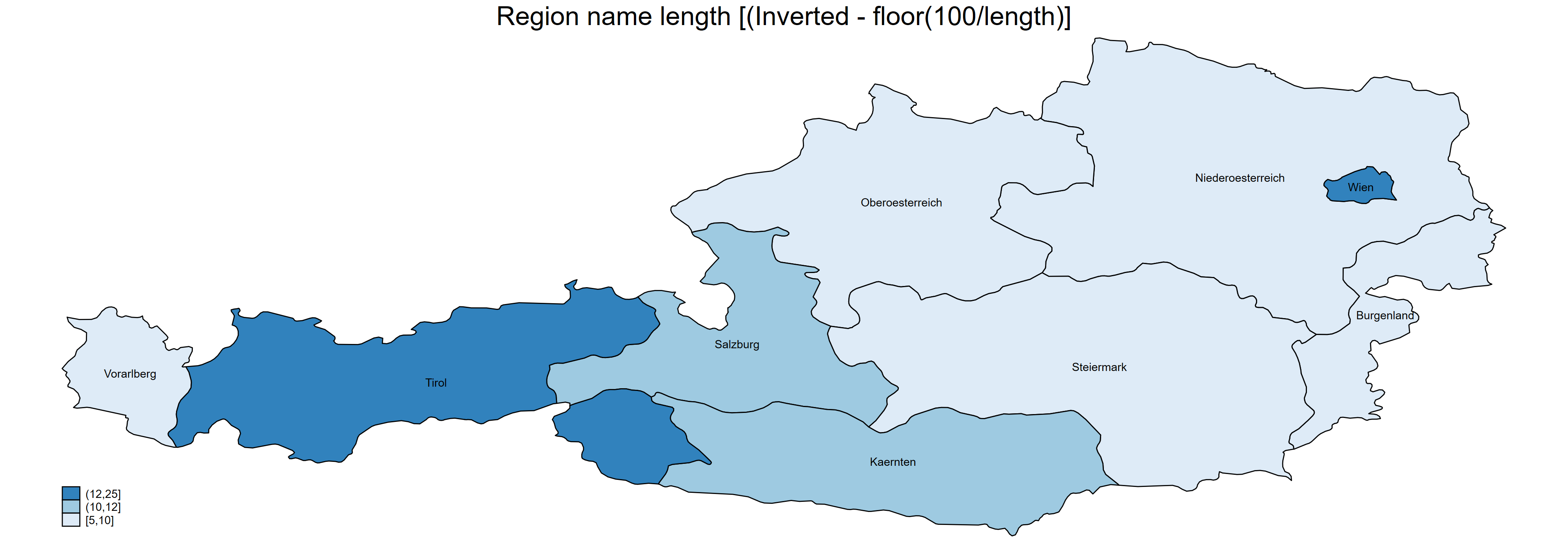
(Step B again) I can change the country ISO 2 code to draw another country. We can try with Austria. Then, I need to reverse the colors because the region of Wien is completely inside the region of Niederoesterreich, and will inherit the color of this last region if we use standard colors:
**#*** Draw the map for Austrian regions ************************

// Run everything between preserve and restore

generate length2 = floor(100/length)

// Inverse the colors, bc Wien is inside Niederoesterreich...

preserve

keep if iso_a2 == "AT"

grmap length2 using ne_10m_admin_1_states_provinces_shp.dta ///
 if iso_a2 == "AT", id(_ID) ///
 fcolor(Blues)  ///
 ndfcolor(gray) clmethod(quantile) ///
 title("Region name length [(Inverted - floor(100/length)]") ///
 label(xcoord(_CX) ycoord(_CY) ///
 label(gn_name) size(*.75) length(22))

*Wien is inside Niederoesterreich...

graph rename Graph map_austria_regions, replace

graph export figures\map_austria_regions.png, as(png) ///
 width(4000) replace
graph export figures\map_austria_regions.pdf, as(pdf) ///
 replace

restore
(Step B again) We can try for French regions, but we need to adjust some regions which are not located in Metropolitan France for readability purposes. I use the split command to have the department number (https://en.wikipedia.org):
**#*** Draw the map for French regions *************************

// Run everything between preserve and restore

preserve

capture drop gn_a1_code1  gn_a1_code2  gn_a1_code3

split gn_a1_code, parse(.)

rename gn_a1_code2 dept

keep if iso_a2 == "FR" & name != "Guyane française" ///
 & name != "Guadeloupe" & name != "La Réunion" ///
 & name != "Martinique" & name != "Mayotte"

grmap length using ne_10m_admin_1_states_provinces_shp.dta ///
 if iso_a2 == "FR" & name != "Guyane française" ///
 & name != "Guadeloupe" & name != "La Réunion" ///
 & name != "Martinique" & name != "Mayotte", id(_ID) ///
 fcolor(Blues)  ///
 osize(vvthin vvthin vvthin vvthin) ///
 ndsize(vvthin) ///
 ndfcolor(gray) ///
 title("Region name length") label(xcoord(_CX) ycoord(_CY) ///
 label(dept) size(*.5) length(10))

graph rename Graph map_france_regions, replace

graph export figures\map_france_regions.png, as(png) ///
 width(4000) replace
graph export figures\map_france_regions.pdf, as(pdf) ///
 replace

/*
https://www.wikiwand.com/en/Departments_of_France
#Current_departments
*/

restore
(Step B again) Let us pursue with the Tunisian regions with their names in Latin, with the option label(name) and in Arabic, with the option label(name_ar):
**#*** Draw the map for Tunisian regions ***********************


/*
https://www.statalist.org/forums/forum/general-stata-discussion/general/1683184-drawing-country-maps-on-stata
*/

// Run everything between preserve and restore

preserve

keep if iso_a2 == "TN"

grmap length using ne_10m_admin_1_states_provinces_shp.dta ///
 if iso_a2 == "TN", id(_ID) ///
 fcolor(Blues)  ///
 ndfcolor(gray) ///
 title("Region name length") label(xcoord(_CX) ycoord(_CY) ///
 label(name) size(*.5))

graph rename Graph map_tunisia_regions, replace

graph export figures\map_tunisia_regions.png, as(png) ///
 width(4000) replace
graph export figures\map_tunisia_regions.pdf, as(pdf) ///
 replace

restore

preserve

keep if iso_a2 == "TN"

grmap length using ne_10m_admin_1_states_provinces_shp.dta ///
 if iso_a2 == "TN", id(_ID) ///
 fcolor(Blues)  ///
 ndfcolor(gray) ///
 title("Region name length") label(xcoord(_CX) ycoord(_CY) ///
 label(name_ar) size(*.75) length(30))

graph rename Graph map_tunisia_regions_ar, replace

graph export figures\map_tunisia_regions_ar.png, as(png) ///
 width(4000) replace
graph export figures\map_tunisia_regions_ar.pdf, as(pdf) ///
 replace

restore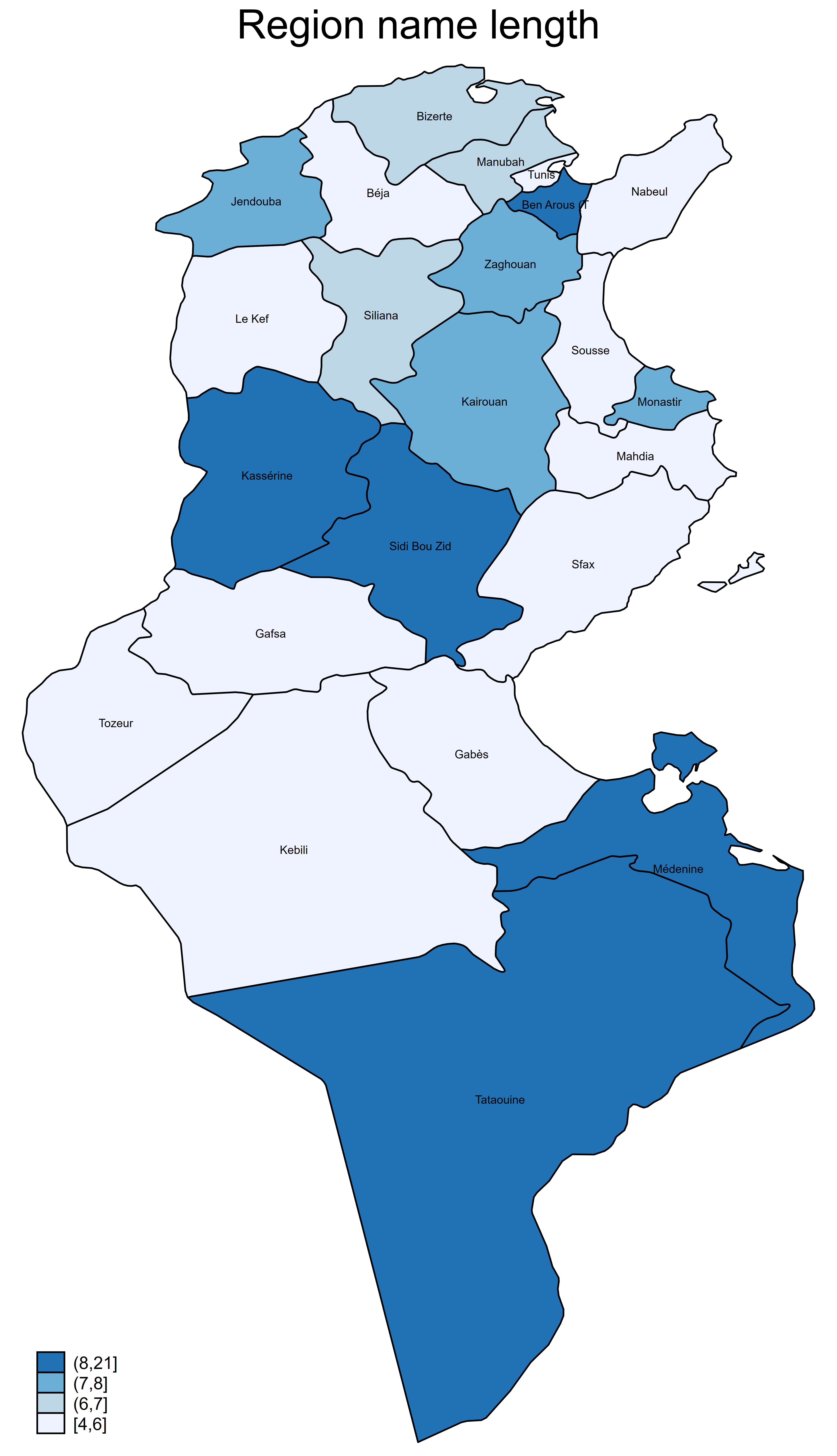

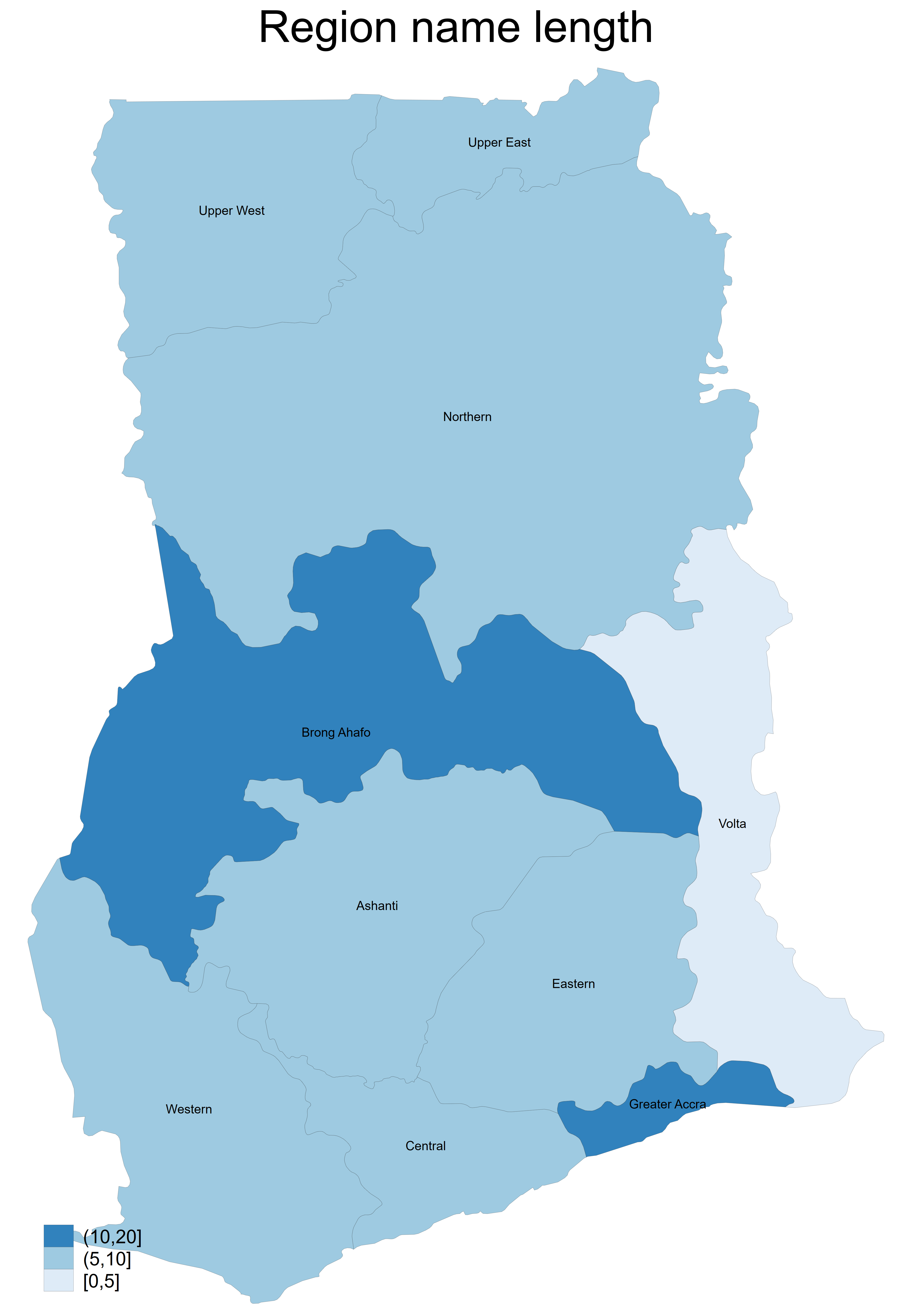
(Step B again) Let us conclude with the Ghana’s regions, in order to have more control on the legend, we will use specific boundaries for the classes with clmethod(custom) clbreaks(0 5 10 20). Use custom break if some regions are not displayed with the quantile method, and finally save the data in the desired folder:
**#*** Draw the map for Ghana's regions ***********************

// Run everything between preserve and restore

preserve

keep if iso_a2 == "GH"

grmap length using ne_10m_admin_1_states_provinces_shp.dta ///
 , id(_ID) ///
 fcolor(Blues)  ///
 osize(vvthin vvthin vvthin vvthin) ///
 ndsize(vvthin) ///
 ndfcolor(gray) ///
 title("Region name length") label(xcoord(_CX) ycoord(_CY) ///
 label(name) size(*.5) length(30)) clmethod(custom) ///
 clbreaks(0 5 10 20)

// Use custom break if some regions are not displayed with the
// quantile method

graph export figures\map_ghana_regions.png, as(png) ///
 width(4000) replace
graph export figures\map_ghana_regions.pdf, as(pdf) ///
 replace

restore

save data\maps_region.dta, replace

***************************************************************
As we have seen in this blog, it is possible to draw maps in Stata at the regional level in some simple steps. The files for replicating the results in this blog are available on my GitHub.
4 Comments
[…] Drawing Maps for the Chinese regions with Stata [Updated with Geoplot] […]
[…] Drawing Maps for the Chinese regions with Stata [Updated with Geoplot] Bivariate Maps for Chinese Regional Data (Update) […]
[…] Drawing Maps for the Chinese regions with Stata [Updated with Geoplot] […]
[…] Drawing Maps for the Chinese regions with Stata [Updated with Geoplot] […]