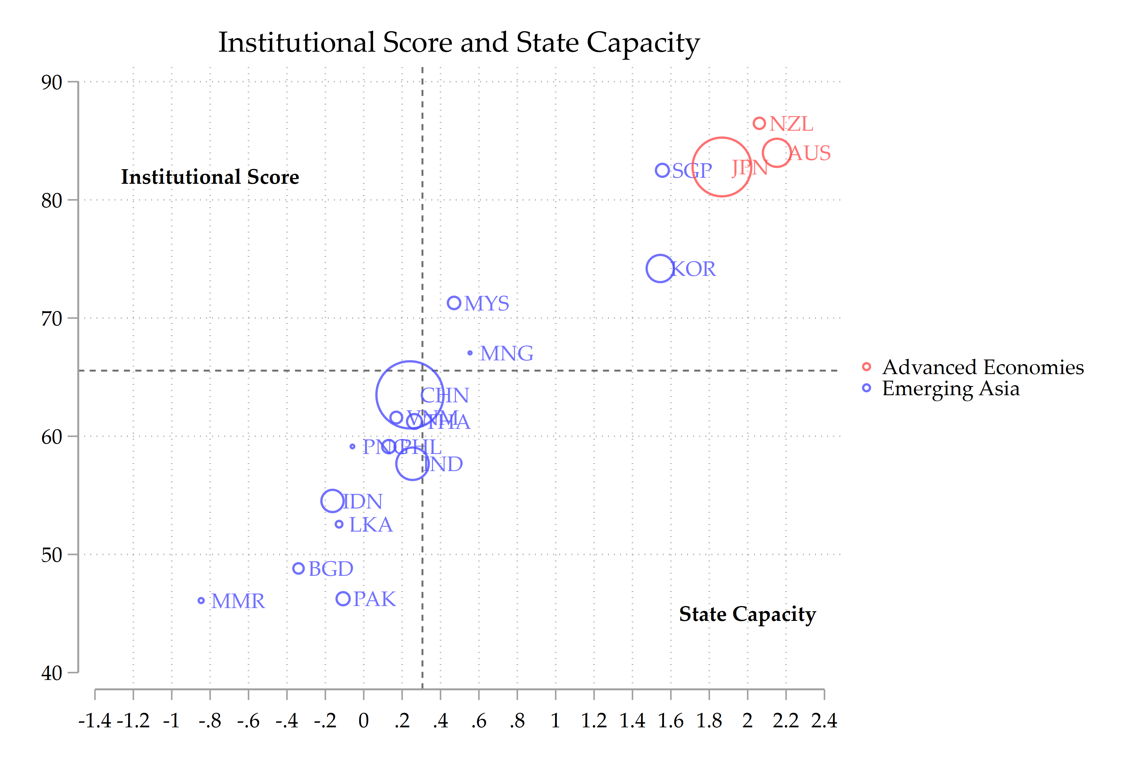
For an ongoing project with Joshua Aizenman for the ADBI, we have to explore the linkages between the State Capacity (available here) and the Institutional Score (available here). The picture below present the averages of these two measures since the 1960s. The horizontal and vertical dotted lines are the averages for the Institutional Score and the State Capacity. As you can see, the quadrants of high Institutional Score, on the one hand, and low State Capacity and low Institutional Score and high State Capacity, on the other hand, are empty. In the long run, institutions and state capacity co-evolve, each reinforcing the other.
Stata code below for pedagogical purposes:
twoway (  ///
  scatter INST Capacity [w=rGDP_USD], ///
  mlabel(imfcode) mlabsize(small) colorvar(idc) colordiscrete ///
  zlabel( , valuelabel) coloruseplegend ///
  xlab(-1.4(0.2)2.4) ylab(40(10)90) ///
  ytitle("") xtitle("") ///
  title("Institutional Score and State Capacity") ///
  name(Vmap, replace) ///
 text(82 -0.8  "{bf:Institutional Score}", size(small)) ///
 text(45 2  "{bf:State Capacity}", size(small)) ///
  colorlist(blue*0.7%80 red*0.7%80)  ///
  xline(.3058578) yline(65.55)  ///
  )

 graph export SCINTmap.png, as(png) width(4000) replace
That’s all for today. See you soon.