I am still exploring how to draw a Voronoi treemap. Besides, I found a very handy way to plot treemaps with subgroups using a Jupyter notebook. By using the following Python code below, you will be able to reproduce the following picture:
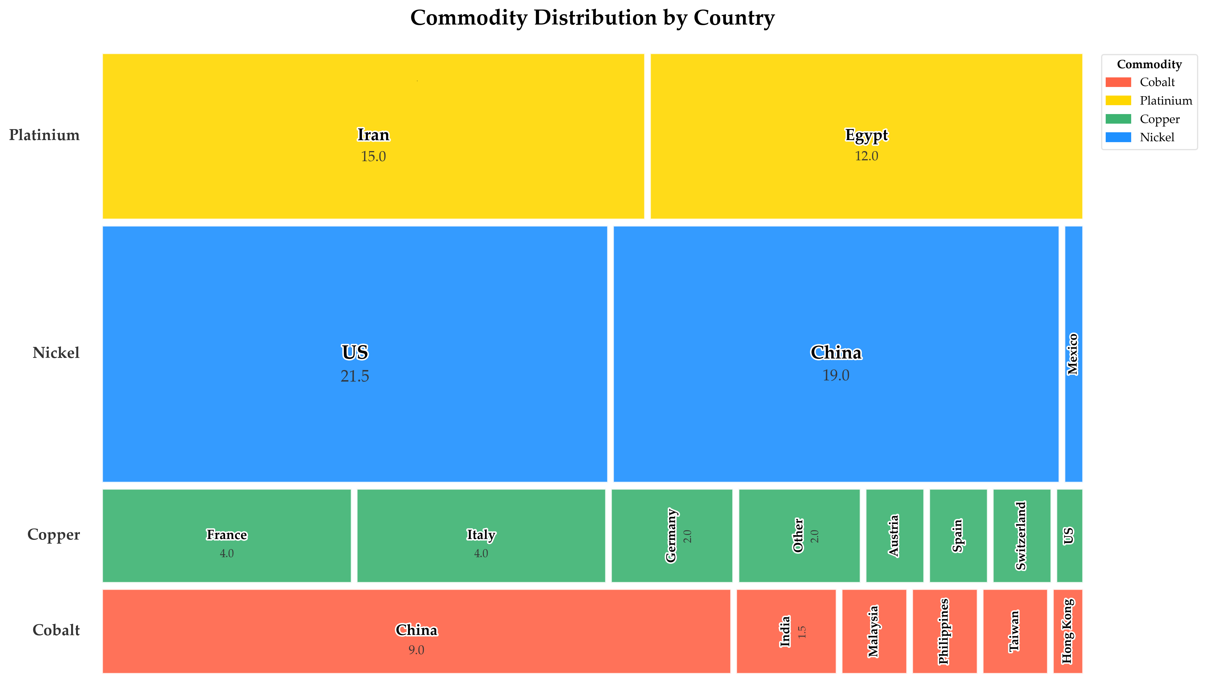
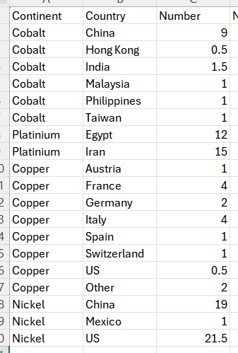
I used the Anaconda Assistant 4.1.0 and ChatGPT 4o to refine the code. Remarks and comments are welcome. The code is reproduced below and the data looks like this:
import pandas as pd
import matplotlib.pyplot as plt
import matplotlib.patches as patches
import matplotlib.patheffects as path_effects

# Load Excel data
df = pd.read_excel("PlotDB.xlsx", sheet_name="Feuil1")
df = df.dropna(subset=["Continent", "Country", "Number"])
df['Normalized'] = df['Number'] / df['Number'].sum()

# Color map
color_map = {
    'Cobalt': '#FF6347',
    'Platinium': '#FFD700',
    'Copper': '#3CB371',
    'Nickel': '#1E90FF'
}
df['Color'] = df['Continent'].map(color_map)

# Plot setup
fig, ax = plt.subplots(figsize=(14, 8), facecolor='white')
current_y = 0
padding = 0.005
grouped = df.groupby('Continent')
max_value = df['Number'].max()

# Global font
plt.rcParams['font.family'] = 'Palatino Linotype'

for commodity, group in grouped:
    group_total = group['Normalized'].sum()
    group_height = group_total
    current_x = 0

    # Commodity title
    ax.text(
        -0.02, current_y + group_height / 2,
        commodity,
        ha='right', va='center',
        fontsize=13, fontweight='bold',
        color='#333333',
        fontname='Palatino Linotype'
    )

    group = group.sort_values('Number', ascending=False)

    for _, row in group.iterrows():
        box_width = row['Normalized'] / group_total
        rect_x = current_x + padding / 2
        rect_y = current_y + padding / 2
        rect_width = box_width - padding
        rect_height = group_height - padding

        # Draw rectangle
        rect = patches.Rectangle(
            (rect_x, rect_y),
            rect_width, rect_height,
            facecolor=row['Color'],
            edgecolor='white',
            linewidth=1.5,
            alpha=0.9
        )
        ax.add_patch(rect)

        # Metrics
        area = rect_width * rect_height
        value_proportion = row['Number'] / max_value
        overall_pct = row['Normalized'] * 100
        font_size = max(8, min(16, 10 + value_proportion * 6))
        is_wide = rect_width >= rect_height
        rotation = 0 if is_wide else 90

        center_x = rect_x + rect_width / 2
        center_y = rect_y + rect_height / 2

        # ✨ Increased spacing slightly for both orientations
        if is_wide:
            spacing = (0.003 + font_size / 2000) * 3.5  # horizontal
        else:
            spacing = (0.003 + font_size / 2000) * 2.0  # vertical

        if area > 0.004:
            # --- Country name ---
            ax.text(
                center_x, center_y,
                row['Country'],
                ha='center', va='center',
                fontsize=font_size,
                fontweight='bold',
                rotation=rotation,
                color='black',
                fontname='Palatino Linotype',
                path_effects=[
                    path_effects.Stroke(linewidth=2.5, foreground='white'),
                    path_effects.Normal()
                ]
            )

            # --- Number (if applicable) ---
            if overall_pct >= 1 and area > 0.01:
                if is_wide:
                    number_x = center_x
                    number_y = center_y - spacing
                else:
                    number_x = center_x + spacing
                    number_y = center_y

                ax.text(
                    number_x, number_y,
                    f"{row['Number']:.1f}",
                    ha='center', va='center',
                    fontsize=font_size * 0.85,
                    rotation=rotation,
                    color='#333333',
                    alpha=0.95,
                    fontname='Palatino Linotype'
                )

        current_x += box_width
    current_y += group_height + padding

# Add legend
legend_handles = [patches.Patch(color=color_map[comm], label=comm) for comm in color_map]
legend = plt.legend(
    handles=legend_handles,
    title="Commodity",
    loc='upper left',
    bbox_to_anchor=(1.01, 1),
    frameon=True,
    facecolor='white',
    edgecolor='#dddddd'
)
legend.get_title().set_fontweight('bold')

# Layout & Save
ax.set_xlim(0, 1)
ax.set_ylim(0, current_y)
ax.axis('off')
plt.title("Commodity Distribution by Country", fontsize=18, fontweight='bold', pad=20)
plt.tight_layout()
plt.savefig('commodity_treemap_spacing_both_adjusted.png', dpi=300, bbox_inches='tight', facecolor='white')
plt.show()