A cross-country bubble plot can communicate several dimensions at once: the position of each country, the relative size of its economy, and the region to which it belongs. The same richness can also make the graph difficult to read. Large bubbles overlap, regional colors compete for attention, and automatic country labels frequently sit on top of the observations they are supposed to identify.
In this post, I show how to construct a readable GDP-weighted bubble plot in Stata and highlight only four countries: the United States, South Korea, China, and India. Instead of relying on automatic marker labels, I place each label manually, draw a connector from the country’s bubble to its label, and preserve the regional color in the connector, text, and box border.
The data comes from the following research project:
Aizenman, J., Ito, H., & Saadaoui, J. (2026), Comparative Advantage and Openness under Global Fragmentation: Lessons from the Past 65 Years. (No w35242). National Bureau of Economic Research.
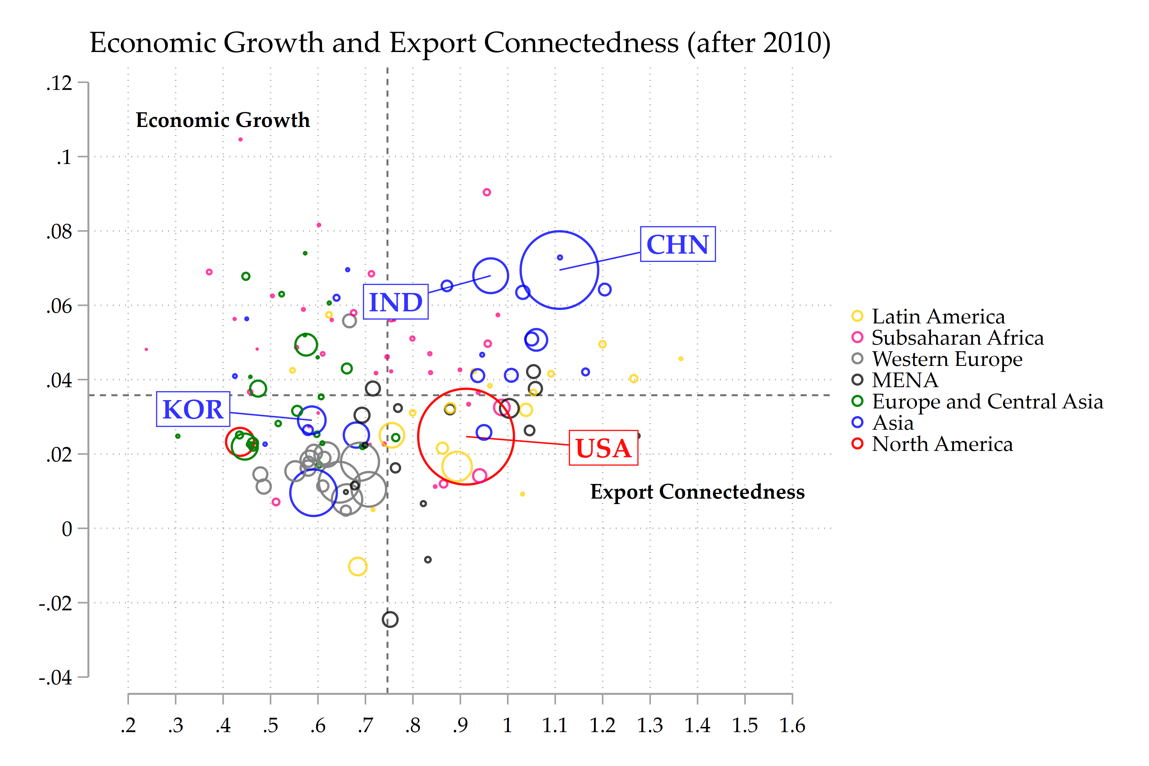
Figure 1. Economic growth and export connectedness after 2010. Bubble size reflects real GDP, colors identify regional groups, and the dashed lines indicate the selected reference values.
The figure plots economic growth on the vertical axis and export connectedness on the horizontal axis. Bubble size reflects real GDP, while bubble color identifies the country’s regional group. The code assumes that the data have already been reduced to one observation per country.
The central graphical idea is to build the figure in layers:
- Draw the four connector lines.
- Draw the GDP-weighted bubbles.
- Add the four boxed labels at manually selected coordinates.
This gives much more control than a conventional mlabel() specification.
Inspecting the variables
The graphing block begins with:
summ GeoC_exports growthThis provides a quick check of the two variables used in the figure:
GeoC_exports, on the horizontal axis;growth, on the vertical axis.
The summary statistics are not directly passed to the graph command. They are nevertheless useful for checking the scale of the variables before selecting axis limits, reference lines, and label offsets.
Retrieving the coordinates of the highlighted countries
The first substantive task is to retrieve the exact coordinates of USA, KOR, CHN, and IND:
foreach c in usa kor chn ind {

    local C = upper("`c'")

    quietly count if ISO3 == "`C'"

    if r(N) != 1 {
        display as error ///
            "Country `C' is absent or duplicated after collapse."
        exit 459
    }

    foreach v in growth INST hc GeoC_exports GeoV_exports Capacity {

        quietly summarize `v' if ISO3 == "`C'", meanonly

        if r(N) != 1 {
            display as error ///
                "Variable `v' is missing for country `C'."
            exit 459
        }

        local vlow = lower("`v'")
        local `vlow'_`c' = r(mean)
    }
}
The outer loop cycles through the four lowercase country codes:
usa kor chn indFor each country, the following line creates the uppercase ISO3 code:
local C = upper("`c'")Thus, when c is usa, the local macro C contains USA. This is the value used to identify the country in the dataset:
quietly count if ISO3 == "`C'"The next block checks that the country appears exactly once:
if r(N) != 1 {
    display as error ///
        "Country `C' is absent or duplicated after collapse."
    exit 459
}
This is important because the graph assumes one cross-sectional observation per country. If a highlighted country is missing or duplicated, the program stops rather than silently drawing an incorrect connector or label.
The inner loop then retrieves the values of several variables:
foreach v in growth INST hc GeoC_exports GeoV_exports Capacity {For the export-connectedness graph, only growth and GeoC_exports are subsequently used. The additional variables make the coordinate-retrieval block reusable for related figures.
For each variable, Stata runs:
quietly summarize `v' if ISO3 == "`C'", meanonlyBecause the dataset contains one observation per country, r(mean) is simply the country’s value of that variable.
The values are stored in local macros:
local vlow = lower("`v'")
local `vlow'_`c' = r(mean)
The call to lower() standardizes the variable name before constructing the local macro. For example, GeoC_exports becomes geoc_exports. The loop therefore creates locals such as:
`growth_usa'
`geoc_exports_usa'

`growth_kor'
`geoc_exports_kor'

`growth_chn'
`geoc_exports_chn'

`growth_ind'
`geoc_exports_ind'
This lowercasing step matters because Stata local macro names are case-sensitive. The local:
`geoc_exports_usa'is not the same as:
`GeoC_exports_usa'The subsequent code correctly uses the lowercase version when referring to the country’s actual data coordinate.
The inner safety check verifies that the selected variable is nonmissing:
if r(N) != 1 {
    display as error ///
        "Variable `v' is missing for country `C'."
    exit 459
}
Together, the two checks ensure that every highlighted country is unique and has valid coordinates.
Defining the connector styles
The connectors preserve the regional color of the corresponding bubble:
local connector_usa ///
    lcolor(red%95) ///
    lwidth(thin)

local connector_asia ///
    lcolor(blue%80) ///
    lwidth(thin)
The United States belongs to North America and is represented in red. Its connector therefore uses:
lcolor(red%95)South Korea, China, and India belong to the Asian group and use blue connectors:
lcolor(blue%80)The opacity modifiers %95 and %80 reproduce the colors used in the bubble layer. The connectors are deliberately thin:
lwidth(thin)They should identify the relationship between a bubble and a label without becoming visually dominant.
Matching the connector color to the bubble color is particularly helpful when a label is moved some distance away from its observation. The reader can follow both the geometry of the line and the regional color.
Formatting the label boxes
The common box style is stored in another local macro:
local box_common ///
    placement(c) ///
    box ///
    fcolor(white) ///
    margin(vsmall) ///
    lwidth(vthin) ///
    justification(center)
Each option performs a specific task.
Centering the label
placement(c)places the center of the annotation at the coordinates supplied to text().
Drawing the box
boxactivates a rectangular box around the text.
Setting the background
fcolor(white)gives the label box a white background. This separates the country code from bubbles, grid lines, and connector lines underneath it.
The comment in the code refers to a light-blue background, but the command itself uses fcolor(white). The actual background produced by this code is therefore white. A light-blue background would require replacing white with a light-blue Stata color.
Adding internal space
margin(vsmall)creates a small amount of padding between the country code and the box border.
Without this margin, the box would appear cramped, especially because the country codes are bold.
Keeping the border discreet
lwidth(vthin)uses a very thin border. The border remains visible because it will later be assigned the same color as the country’s regional bubble.
Centering the text
justification(center)centers the country code inside the box.
This common style is reused for all four labels. Only the text color and border color vary across countries.
Manually placing the labels
Automatic label placement is rarely satisfactory in a dense weighted scatter plot. A fixed clock position may work for a small bubble but overlap a large bubble. It also provides limited control when several highlighted observations are close to one another.
The code therefore creates a separate horizontal and vertical label coordinate for every country:
local GeoC_exports_labx_usa = `geoc_exports_usa' + .29
local GeoC_exports_laby_usa = `growth_usa' - .003

local GeoC_exports_labx_kor = `geoc_exports_kor' - .25
local GeoC_exports_laby_kor = `growth_kor' + .003

local GeoC_exports_labx_chn = `geoc_exports_chn' + .25
local GeoC_exports_laby_chn = `growth_chn' + .007

local GeoC_exports_labx_ind = `geoc_exports_ind' - .20
local GeoC_exports_laby_ind = `growth_ind' - .007
The general formula is:
label x-coordinate = bubble x-coordinate + horizontal offset
label y-coordinate = bubble y-coordinate + vertical offset
The offsets are expressed in the units of the corresponding axis.
For the horizontal axis, an offset of 0.25 means a movement of one-quarter of a unit of export connectedness. For the vertical axis, growth is expressed in decimal form, so an offset of 0.003 corresponds to 0.3 percentage point.
The horizontal and vertical scales are different. Consequently, offsets of 0.25 and 0.003 can produce visually comparable movements even though their numerical magnitudes are very different.
United States
local GeoC_exports_labx_usa = `geoc_exports_usa' + .29
local GeoC_exports_laby_usa = `growth_usa' - .003
The USA label is moved:
0.29unit to the right;0.003unit downward.
The U.S. bubble is large because of the GDP weight. Placing the label directly beside the center would leave it too close to, or even on top of, the bubble. The relatively large horizontal displacement moves the box beyond the bubble’s outer edge and into a less crowded area of the graph.
The small downward movement prevents the connector from being perfectly horizontal and helps distinguish the label from nearby observations around the horizontal reference line.
South Korea
local GeoC_exports_labx_kor = `geoc_exports_kor' - .25
local GeoC_exports_laby_kor = `growth_kor' + .003
The KOR label is moved:
0.25unit to the left;0.003unit upward.
The main movement is horizontal. The label remains close to Korea’s growth level but is placed in the relatively open left-hand portion of the graph.
This illustrates an important point about manual placement: keeping a label “close” does not necessarily mean using a small horizontal displacement. The relevant objective is to preserve an obvious connection while avoiding the surrounding observations. Here, the vertical movement is small, and the connector provides a clear visual link despite the leftward shift.
China
local GeoC_exports_labx_chn = `geoc_exports_chn' + .25
local GeoC_exports_laby_chn = `growth_chn' + .007
The CHN label is moved:
0.25unit to the right;0.007unit upward.
China has one of the largest bubbles in the Asian group. It is therefore necessary to move the label beyond the edge of the bubble rather than merely beyond its center.
The upward movement is larger than for the other countries. This places the label in the relatively empty upper-right area and separates it from India’s label and nearby Asian observations.
India
local GeoC_exports_labx_ind = `geoc_exports_ind' - .20
local GeoC_exports_laby_ind = `growth_ind' - .007
The IND label is moved:
0.20unit to the left;0.007unit downward.
India is located relatively close to China in the upper part of the graph. Moving India left and down, while moving China right and up, creates a clear visual separation between the two annotations.
This opposite-direction placement is often useful when two highlighted observations occupy the same neighborhood. Rather than trying to stack their labels, the code sends them toward different low-density areas.
The final placement can be summarized as follows:
| Country | Horizontal movement | Vertical movement | Resulting direction |
|---|---|---|---|
| USA | +0.29 | -0.003 | Right and slightly down |
| KOR | -0.25 | +0.003 | Left and slightly up |
| CHN | +0.25 | +0.007 | Right and up |
| IND | -0.20 | -0.007 | Left and down |
These offsets are not universal settings. They are tailored to this graph, its axis ranges, the location of nearby observations, and the relative size of the four bubbles.
Drawing the connector lines with pci
The twoway command begins with four pci layers:
(pci `growth_usa' `geoc_exports_usa' ///
     `GeoC_exports_laby_usa' `GeoC_exports_labx_usa', ///
     `connector_usa')
The syntax of pci is based on two pairs of immediate coordinates:
pci y1 x1 y2 x2For the United States:
y1 = actual growth value
x1 = actual export-connectedness value

y2 = label’s vertical coordinate
x2 = label’s horizontal coordinate
The command therefore draws a straight line from the center of the U.S. bubble to the center of the U.S. label box.
The same structure is repeated for Korea, China, and India:
(pci `growth_kor' `geoc_exports_kor' ///
     `GeoC_exports_laby_kor' `GeoC_exports_labx_kor', ///
     `connector_asia')

(pci `growth_chn' `geoc_exports_chn' ///
     `GeoC_exports_laby_chn' `GeoC_exports_labx_chn', ///
     `connector_asia')

(pci `growth_ind' `geoc_exports_ind' ///
     `GeoC_exports_laby_ind' `GeoC_exports_labx_ind', ///
     `connector_asia')
Although the line technically ends at the center of the label coordinates, the box is drawn over its final portion. In the completed graph, the visible connector therefore appears to terminate at the box border.
The connector layers are listed before the scatter layer. As a result, the bubbles are drawn on top of the beginning of each line. This creates a cleaner connection than drawing the lines over the bubble outlines.
Constructing the GDP-weighted bubble layer
The main scatter layer is:
(scatter growth GeoC_exports [w=rGDP_USD] if GeoC_exports != ., ///
    colorvar(cgroup)                                      ///
    colordiscrete                                         ///
    zlabel(, valuelabel)                                  ///
    coloruseplegend                                       ///
    colorlist(red%95 blue%80 green%95 black%75            ///
              gray%95 pink%75 gold%75)                    ///
    msymbol(circle_hollow))
Horizontal and vertical variables
The graph plots:
scatter growth GeoC_exportsThus:
growthis the y-variable;GeoC_exportsis the x-variable.
Scaling bubbles by real GDP
The marker weight is:
[w=rGDP_USD]Stata uses rGDP_USD to scale the markers. Countries with larger real GDP appear as larger bubbles.
The graph therefore combines three dimensions:
- export connectedness on the x-axis;
- economic growth on the y-axis;
- economic size through bubble size.
Restricting the sample
if GeoC_exports != .removes countries with missing export-connectedness values from the plot.
Using hollow circles
msymbol(circle_hollow)explicitly selects hollow circular markers.
This matters for two reasons. First, the marker shape no longer depends on the active graph scheme. Second, hollow circles make overlapping bubbles easier to inspect because they do not completely cover observations located inside or behind larger markers.
The marker size still comes from rGDP_USD; circle_hollow controls the marker’s shape and fill style.
Coloring countries by region
colorvar(cgroup)assigns bubble colors according to the regional classification stored in cgroup.
Because cgroup is categorical, the graph uses:
colordiscreteThe regional colors are supplied in:
colorlist(red%95 blue%80 green%95 black%75 ///
          gray%95 pink%75 gold%75)
The color list follows the numerical coding of cgroup. In the surrounding data construction, the categories are:
0  North America
1  Asia
2  Europe and Central Asia
3  MENA
4  Western Europe
5  Subsaharan Africa
6  Latin America
The corresponding colors are therefore:
North America              red
Asia                       blue
Europe and Central Asia    green
MENA                       black
Western Europe             gray
Subsaharan Africa          pink
Latin America              gold
The transparency levels, such as %80 or %95, soften the colors and reduce visual saturation.
Creating the regional legend
zlabel(, valuelabel)instructs Stata to use the value labels attached to cgroup, rather than displaying its numerical codes.
coloruseplegenduses a categorical color legend for the regional groups.
Later, the command contains:
legend(off)This suppresses the ordinary legend that would otherwise list the individual pci and scatter layers. The separate color legend generated through colorvar() remains the relevant legend for the graph.
Placing the labels with text()
The country boxes are added through graph-level text() options:
text(`GeoC_exports_laby_usa' `GeoC_exports_labx_usa' "{bf:USA}", ///
    `box_common' color(red%95) lcolor(red%95))
The syntax is:
text(y-coordinate x-coordinate "label", options)The coordinates are the manually constructed label coordinates, not the actual bubble coordinates.
For the United States:
text(`GeoC_exports_laby_usa' ///
     `GeoC_exports_labx_usa' ///
     "{bf:USA}", ...)
The enhanced-text notation:
"{bf:USA}"prints the country code in bold.
The shared box options are inserted through:
`box_common'The country-specific styling is then added:
color(red%95)
lcolor(red%95)
Here:
color()controls the text color;lcolor()controls the box-border color.
The USA label therefore uses red text and a red border.
The three Asian labels use blue text and blue borders:
text(`GeoC_exports_laby_kor' `GeoC_exports_labx_kor' "{bf:KOR}", ///
    `box_common' color(blue%80) lcolor(blue%80))

text(`GeoC_exports_laby_chn' `GeoC_exports_labx_chn' "{bf:CHN}", ///
    `box_common' color(blue%80) lcolor(blue%80))

text(`GeoC_exports_laby_ind' `GeoC_exports_labx_ind' "{bf:IND}", ///
    `box_common' color(blue%80) lcolor(blue%80))
This creates a consistent visual chain:
bubble color → connector color → text color → box-border colorThe connection remains clear even when the box is placed relatively far from the bubble.
Using text() instead of mlabel() is what makes this precise positioning possible. It also provides direct control over the box background, border, padding, and text formatting.
Axis formatting and internal titles
The axis tick marks are specified as:
xlab(0.2(0.1)1.6)
ylab(-.04(.02)0.12)
The horizontal axis runs from approximately 0.2 to 1.6 in increments of 0.1. The vertical labels run from -0.04 to 0.12 in increments of 0.02.
The conventional axis titles are removed:
ytitle("")
xtitle("")
Instead, the variable names are written inside the plotting area:
text(.11 .4 "{bf:Economic Growth}", size(small))
text(.01 1.4 "{bf:Export Connectedness}", size(small))
This gives the graph a more compact visual structure.
The first pair of numbers in each text() option is again the y-coordinate followed by the x-coordinate. Thus:
text(.11 .4 ...)places “Economic Growth” near the upper-left part of the plotting area, while:
text(.01 1.4 ...)places “Export Connectedness” near the lower-right part.
Adding the reference lines
The graph contains:
xline(.7464186)
yline(.0358013)
These commands add a vertical and horizontal benchmark line.
They divide the graph into four descriptive areas according to whether a country lies above or below the chosen values of export connectedness and growth.
The values are hard-coded in this block. This is appropriate when the graph must reproduce a fixed sample and specification. If the sample changes, these benchmarks should be recalculated in the surrounding code before the graph is drawn.
Giving the labels enough room
The option:
plotregion(margin(l+3 r+3))adds extra space on the left and right sides of the plot region.
This is especially useful for KOR, whose label is shifted left, and for USA and CHN, whose labels are shifted right. Without additional margins, a box placed near the boundary could be clipped or appear too close to the frame.
The graph is stored in memory under the name:
name(GeoC_exports, replace)The replace option allows an existing graph with the same name to be overwritten.
Exporting the figure
The final graph is exported as a high-resolution PNG:
graph export SCATTER/GeoC_exportsafter2010light.png, ///
    as(png) width(4000) replace
A width of 4,000 pixels is suitable for a blog post, presentation, or high-quality document. The replace option overwrites an earlier version of the file.
Complete code
// -----------------------------------------------------------------------------
**# Economic Growth and Export Connectedness
// -----------------------------------------------------------------------------

summ GeoC_exports growth

// -----------------------------------------------------------------------------
// Retrieve the coordinates of USA, KOR, CHN, and IND
// -----------------------------------------------------------------------------

foreach c in usa kor chn ind {

    local C = upper("`c'")

    quietly count if ISO3 == "`C'"

    if r(N) != 1 {
        display as error ///
            "Country `C' is absent or duplicated after collapse."
        exit 459
    }

    foreach v in growth INST hc GeoC_exports GeoV_exports Capacity {

        quietly summarize `v' if ISO3 == "`C'", meanonly

        if r(N) != 1 {
            display as error ///
                "Variable `v' is missing for country `C'."
            exit 459
        }

        local vlow = lower("`v'")
        local `vlow'_`c' = r(mean)
    }
}


// -----------------------------------------------------------------------------
// Annotation styles
// -----------------------------------------------------------------------------

// The label text, box border, and connector preserve the bubble color.
// USA belongs to North America and is red.
// KOR, CHN, and IND belong to Asia and are blue.

local connector_usa ///
    lcolor(red%95) ///
    lwidth(thin)

local connector_asia ///
    lcolor(blue%80) ///
    lwidth(thin)

// All country labels use a white background.

local box_common ///
    placement(c) ///
    box ///
    fcolor(white) ///
    margin(vsmall) ///
    lwidth(vthin) ///
    justification(center)

// Label coordinates

local GeoC_exports_labx_usa = `geoc_exports_usa' + .29
local GeoC_exports_laby_usa = `growth_usa' - .003

// KOR is moved to the left into a less crowded area.

local GeoC_exports_labx_kor = `geoc_exports_kor' - .25
local GeoC_exports_laby_kor = `growth_kor' + .003

local GeoC_exports_labx_chn = `geoc_exports_chn' + .25
local GeoC_exports_laby_chn = `growth_chn' + .007

local GeoC_exports_labx_ind = `geoc_exports_ind' - .20
local GeoC_exports_laby_ind = `growth_ind' - .007

twoway                                                       ///
    (pci `growth_usa' `geoc_exports_usa'                      ///
         `GeoC_exports_laby_usa' `GeoC_exports_labx_usa',     ///
         `connector_usa')                                     ///
    (pci `growth_kor' `geoc_exports_kor'                      ///
         `GeoC_exports_laby_kor' `GeoC_exports_labx_kor',     ///
         `connector_asia')                                    ///
    (pci `growth_chn' `geoc_exports_chn'                      ///
         `GeoC_exports_laby_chn' `GeoC_exports_labx_chn',     ///
         `connector_asia')                                    ///
    (pci `growth_ind' `geoc_exports_ind'                      ///
         `GeoC_exports_laby_ind' `GeoC_exports_labx_ind',     ///
         `connector_asia')                                    ///
    (scatter growth GeoC_exports [w=rGDP_USD]                  ///
        if GeoC_exports != .,                                 ///
        colorvar(cgroup)                                      ///
        colordiscrete                                         ///
        zlabel(, valuelabel)                                  ///
        coloruseplegend                                       ///
        colorlist(red%95 blue%80 green%95 black%75            ///
                  gray%95 pink%75 gold%75)                    ///
        msymbol(circle_hollow)),                              ///
    xlab(0.2(0.1)1.6)                                         ///
    ylab(-.04(.02)0.12)                                       ///
    ytitle("")                                                ///
    xtitle("")                                                ///
    title("Economic Growth and Export Connectedness (after 2010)") ///
    name(GeoC_exports, replace)                               ///
    text(.11 .4 "{bf:Economic Growth}", size(small))          ///
    text(.01 1.4 "{bf:Export Connectedness}", size(small))    ///
    text(`GeoC_exports_laby_usa'                              ///
         `GeoC_exports_labx_usa'                              ///
         "{bf:USA}",                                         ///
        `box_common' color(red%95) lcolor(red%95))            ///
    text(`GeoC_exports_laby_kor'                              ///
         `GeoC_exports_labx_kor'                              ///
         "{bf:KOR}",                                         ///
        `box_common' color(blue%80) lcolor(blue%80))          ///
    text(`GeoC_exports_laby_chn'                              ///
         `GeoC_exports_labx_chn'                              ///
         "{bf:CHN}",                                         ///
        `box_common' color(blue%80) lcolor(blue%80))          ///
    text(`GeoC_exports_laby_ind'                              ///
         `GeoC_exports_labx_ind'                              ///
         "{bf:IND}",                                         ///
        `box_common' color(blue%80) lcolor(blue%80))          ///
    xline(.7398374)                                           ///
    yline(.0358013)                                           ///
    legend(off)                                               ///
    plotregion(margin(l+3 r+3))

graph export SCATTER/GeoC_exportsafter2010light.png, ///
    as(png) width(4000) replace
Conclusion
The main contribution of this graphing strategy is the separation between the data coordinates and the annotation coordinates. The bubbles remain at their true values, while each country label is moved into a clearer part of the graph and connected back to the corresponding observation.
With a few country-specific offsets and layered pci, scatter, and text() elements, Stata can produce a bubble plot that remains informative without becoming cluttered.