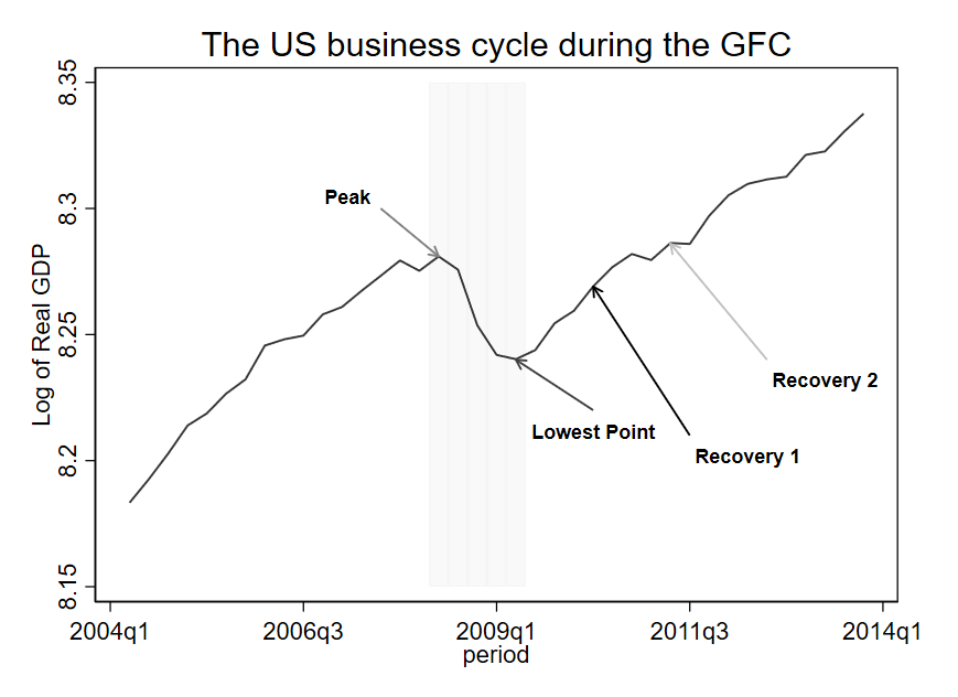
For an ongoing project on economic recoveries with Joshua Aizenman, Hiro Ito, Donghyun Park, and Gazi Salah Uddin, I have to make a graph to explain how we computed the recovery measures. Fortunately, I found a very useful feature in Stata to add plots to existing graphs. We are going to reproduce the following figure:
You have to install the package written by Ben Jann:
https://github.com/benjann/addplot
https://ideas.repec.org/c/boc/bocode/s457917.html
Let us start with by examining the code:
preserve
set scheme s1mono
// Scale up the bars
cap gen RGDP_p835=RGDP_p*8.35 // Max value in your graph
cap replace RGDP_p835=8.15 if RGDP_p835==0 // Min value in your graph
graph set window fontface "Arial"
keep if imfcode==111 & period>tq(2004q1) & period<tq(2014q1)
tw ///
 bar RGDP_p835 period, legend(pos(6)) color(gs15%45) ///
  graphregion(margin(r+5))  || ///
 tsline LRGDP, legend(off) ti(The US business cycle during the GFC) ///
 yti("Log of Real GDP") color(gs1%85)

 addplot: pcarrowi 8.3 190 8.281 193 (10) "{bf:Peak}"
 addplot: pcarrowi 8.22 201 8.24 197 (6) "{bf:Lowest Point}"
 addplot: pcarrowi 8.21 206 8.269 201 (5) "{bf:Recovery 1}"
 addplot: pcarrowi 8.24 210 8.286 205 (5) "{bf:Recovery 2}" mlcolor(black)
graph rename cycle, replace
graph export cycle.png, as(png) replace
restore
The first part in bold is quite standard and produces the following graph:

The second part allows you to add the arrows using pcarrowi, which is pcarrowi is an immediate version of twoway pcarrow:
preserve
set scheme s1mono
keep if imfcode==111 & period>tq(2004q1) & period<tq(2014q1)
tw bar RGDP_p period, yaxis(2) legend(pos(6)) color(gs15) || ///
 tsline LRGDP, legend(off) ti(The US business cycle during the GFC) ///
 xti("")

 addplot: pcarrowi 8.3 190 8.28 193 (10) "{bf:Peak}"
 addplot: pcarrowi 8.22 201 8.24 197 (6) "{bf:Lowest Point}"
 addplot: pcarrowi 8.21 206 8.269 201 (5) "{bf:Recovery 1}"
 addplot: pcarrowi 8.24 210 8.286 205 (5) "{bf:Recovery 2}" mlcolor(black)
graph rename cycle, replace
graph export cycle.png, as(png) replace
restore
You have to carefully choose the placement for the arrows, but overall, this a very handy command.
The recession depth, intensity, or amplitude can be measured as the difference of real GDP in log between the peak and the lowest point.
The recession length or duration can be measured as the number of quarters between the peak and the lowest point.
The “extent of the recovery” after 4 quarters can be measured as the difference of real GDP in log between the lowest point and the “recovery 1” point.
The “extent of the recovery” after 8 quarters can be measured as the difference of real GDP in log between the lowest point and the “Recovery 2” point.
Stay tuned for the working paper!