Recently, I had a very bad experience with a referee report. Basically, he/she told me that our paper has too many tables and that the number of tables is limited in top journals. Since then, I have been thinking about a good way to summarize the results of several models in a parsimonious way. It turns out that Ben Jann’s coeffplot is the perfect tool to do that.
We are going to use the data in the following NBER working paper and decompose the institutional score to identify the different channels, as suggested by one of the participants during my seminar at the Bank of Korea.
The following code snippet produces the estimates, plots the coefficients for 12 different models, and makes the table for these 12 different models. The left-hand-side variable is the cumulative exchange rate depreciation after the election of Donald Trump. Please note that the coefficients have been normalized to have a similar magnitude in the figures.
ssc install coefplot
graph set window fontface "Palatino Linotype"
set scheme s2mono
estimates clear
foreach v in extconf_2023 bureau_2023 corruption_2023 demoacc_2023 ethnictens_2023 govstab_2023 intconf_2023 laworder_2023 milpol_2023 reltensions_2023 socioeco_2023 invprofile_2023 {
local variables ///
"REERmis2020 ers_2020 kaopen_2021 CAB_2022 TRADEBAL_2022"
*summ `variables', detail
reg dFXmax `v' `variables', robust
estimate store BOKmax`v'
}
coefplot BOKmax*, drop(_cons) xline(0) legend(off) ///
order(REERmis2020 ers_2020 kaopen_2021 CAB_2022 TRADEBAL_2022 ///
extconf_2023 bureau_2023 corruption_2023 demoacc_2023 ethnictens_2023 ///
govstab_2023 intconf_2023 laworder_2023 milpol_2023 reltensions_2023 ///
socioeco_2023 invprofile_2023) title("Initial Depreciation") ///
name(max, replace)
graph export BOKmax.png, as(png) width(4000) replace
# delimit ;
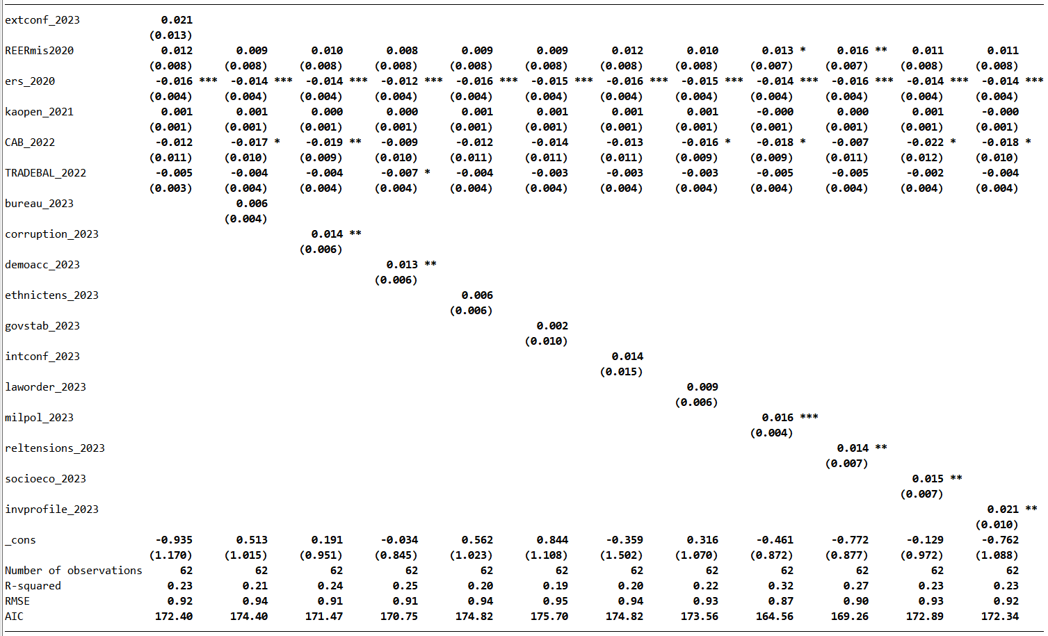
etable, estimates(BOKmax*) column(index)
mstat(N) mstat(r2) mstat(rmse) mstat(aic)
stars(.10 "*" .05 "**" .01 "***", attach(_r_b))
showstarsnote
cstat(_r_b, nformat(%7.3f))
cstat(_r_se, nformat(%7.3f))
novarlab;
# delimit cr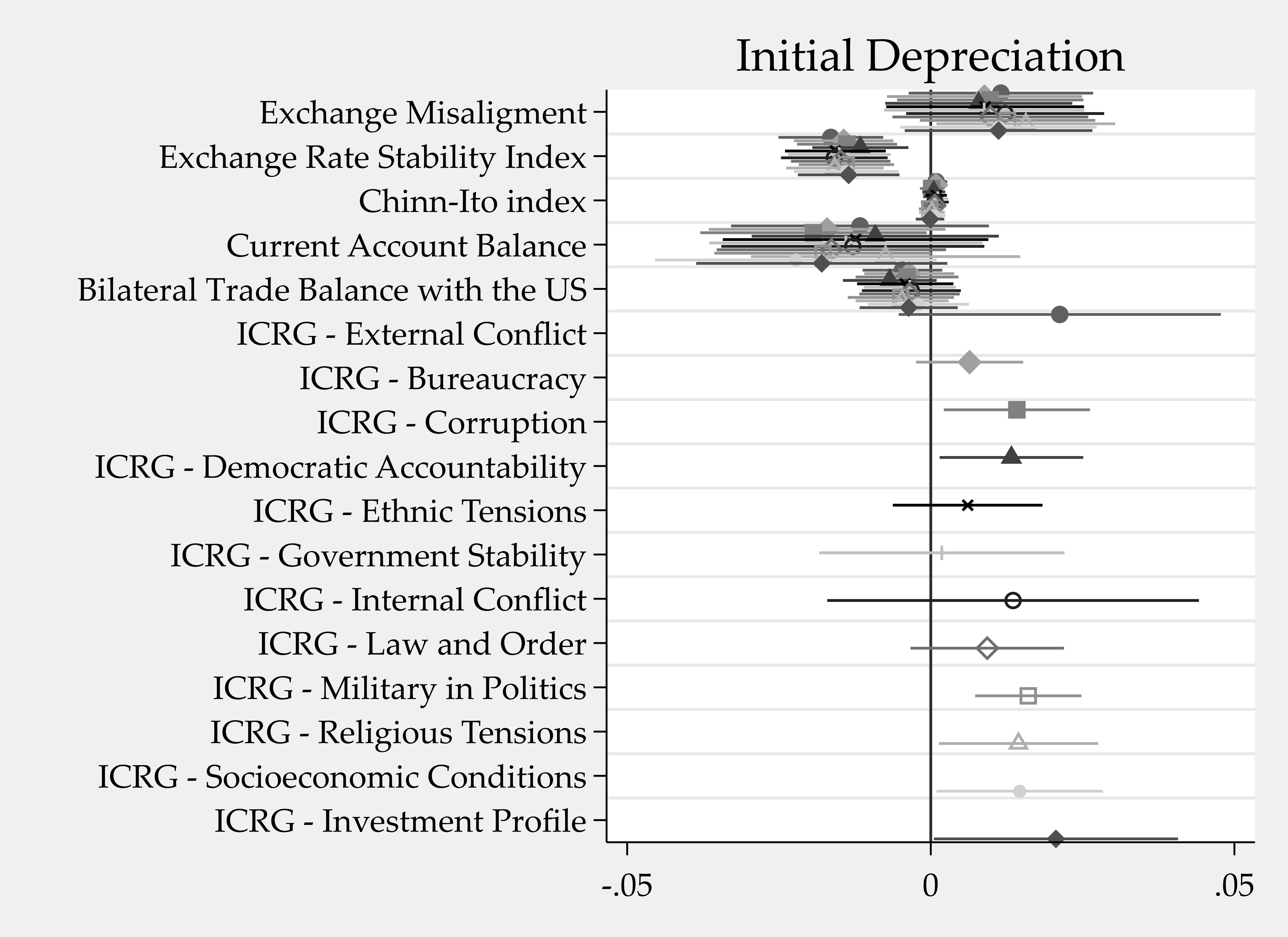
The 95% confidence interval indicates that some dimensions of the ICRG institutional score before the event caused an additional depreciation. Indeed, this is more parsimonious than the following table:
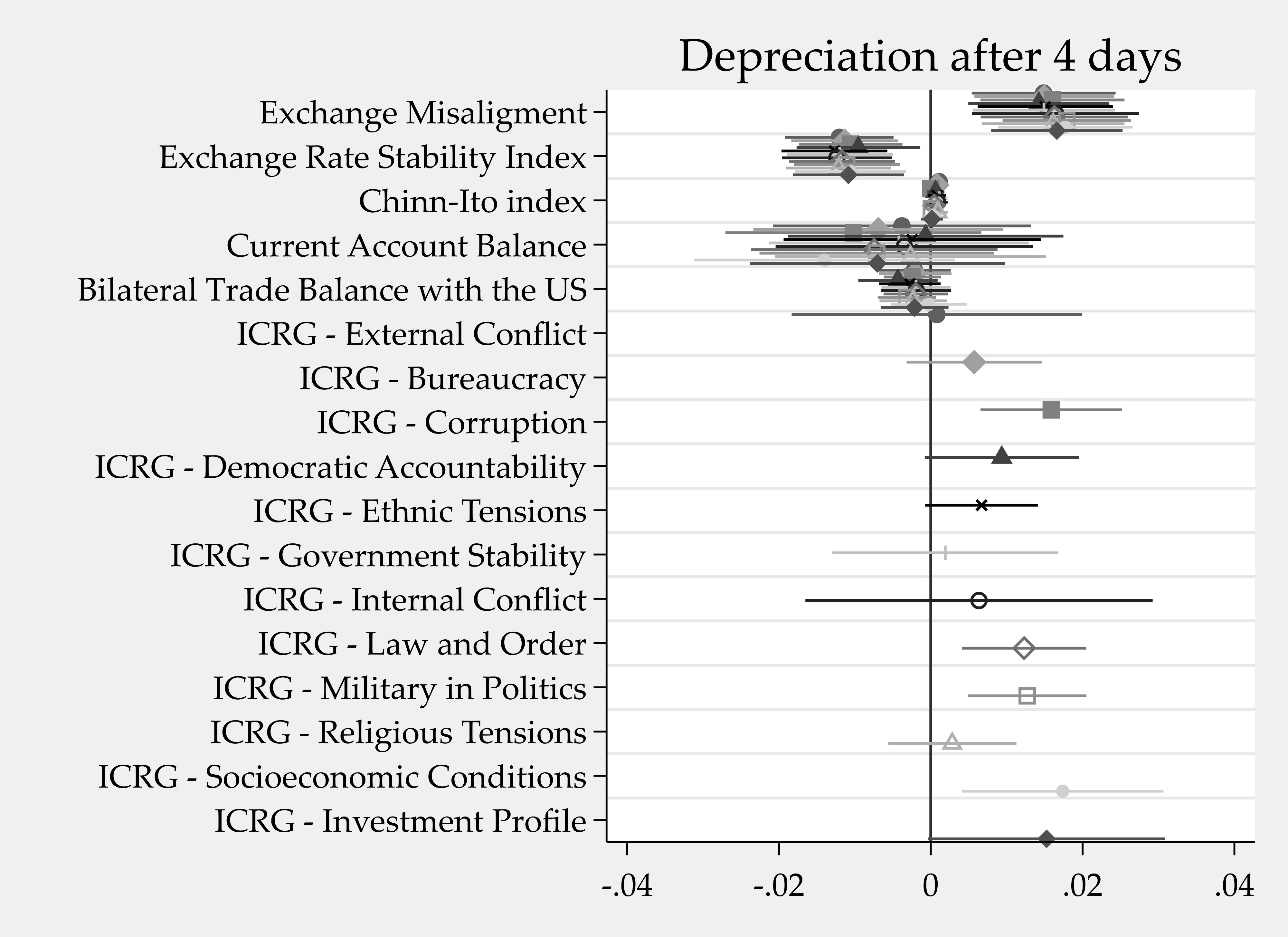
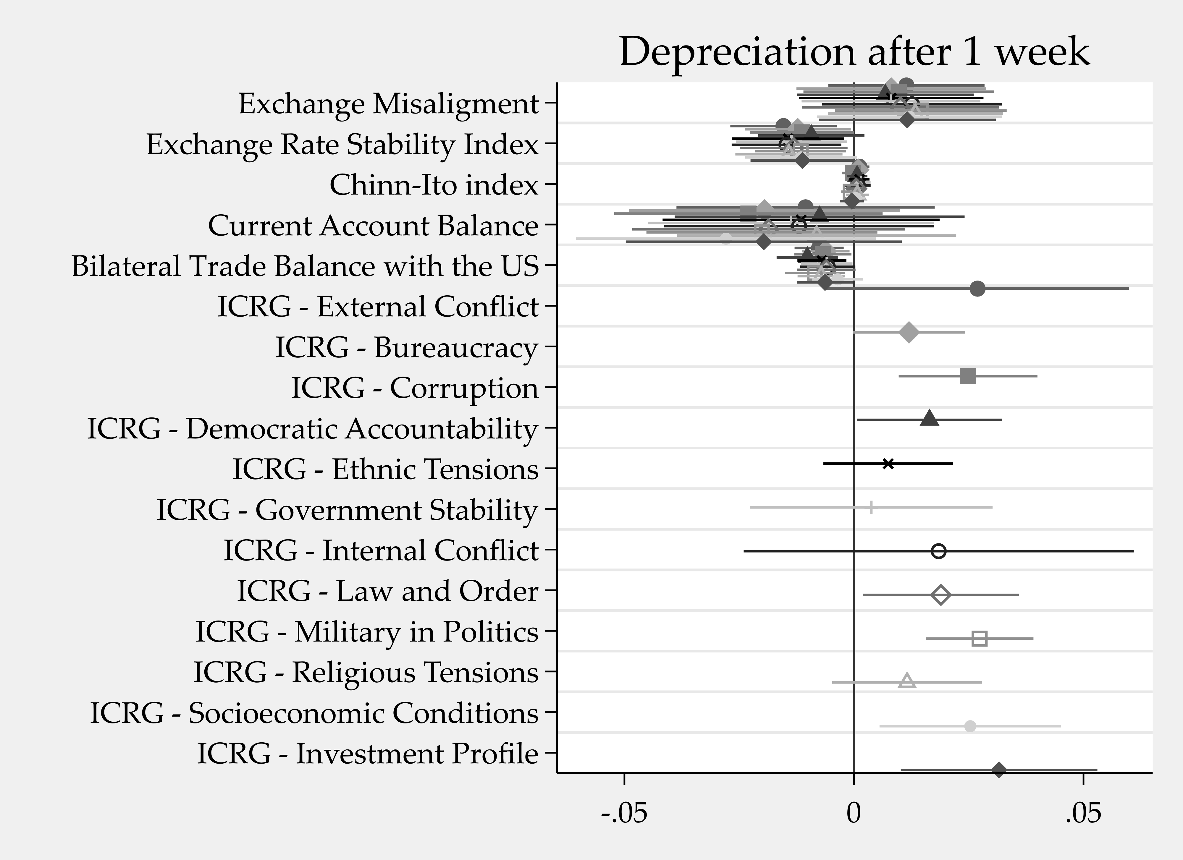
For the depreciation after 4 days and after 1 week, coeffplot is also very useful:
1 Comment
[…] Using coefplot to visualize the results of several models with Stata (1 565 visits): https://www.jamelsaadaoui.com/using-coefplot-to-visualize-the-results-of-several-models-with-stata/ […]